And she’s off! Rogue painting #2

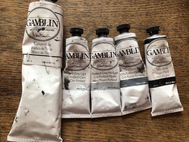
Now that I knew how to shade, I figured the world was my oyster (and hey, the world was just a ball — and now I could paint that! ). So despite Jim’s admonitions for having gotten ahead of myself with my last rogue painting, I thought I’d dive in and try a still life. After all, I now had all the tools (including this handy-dandy Proportional Divider – how do I love thee!). Also, I’d been reading the highly motivational “Daily Painting,” by Carole Marine, and was inspired to try to fit painting into my life, well, daily.

Luckily, it was a Saturday, and Olive had a friend over, which meant she was entertained and I was free to have a marathon paint session. (Carole Marine talks about finishing small still lifes [lives?] within 1-3 hours, but I’m a very slow painter at this point.) As you may be realizing, I have a tendency to want to rush ahead (and that’s a GOOD thing), so I didn’t want to paint no stupid apple. Instead, I chose something a bit more challenging, but with very little color, so I wouldn’t be distracted (and wouldn’t be wanting what I just…couldn’t… have):

bust
Was he the reason my hydrangeas wouldn’t grow?

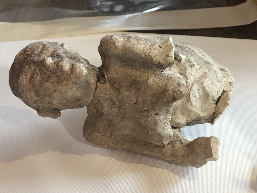
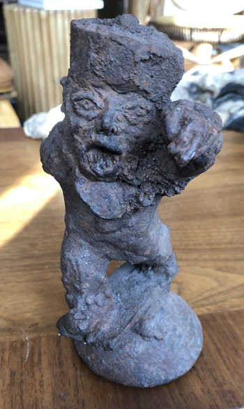
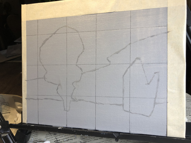
Until a couple of years ago, we lived in a house with a garden, and I was always digging in there and finding the coolest things: a marble foo dog; ancient farming equipment; two super-creepy iron sculptures which have nothing to do with this post but which I just have to show anyway; and the aforementioned slightly less cool…high school art project?…that I decided to use as my model.

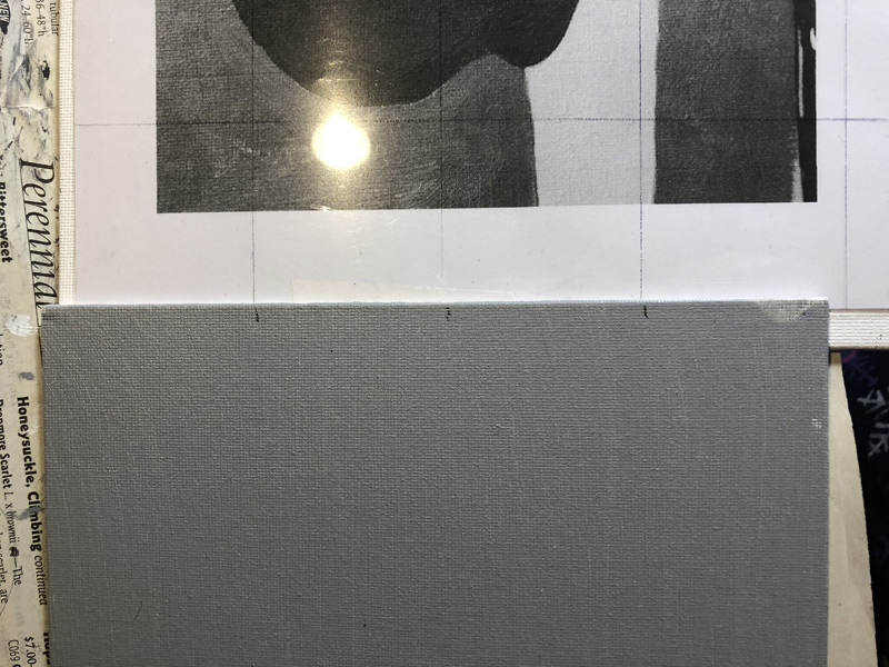
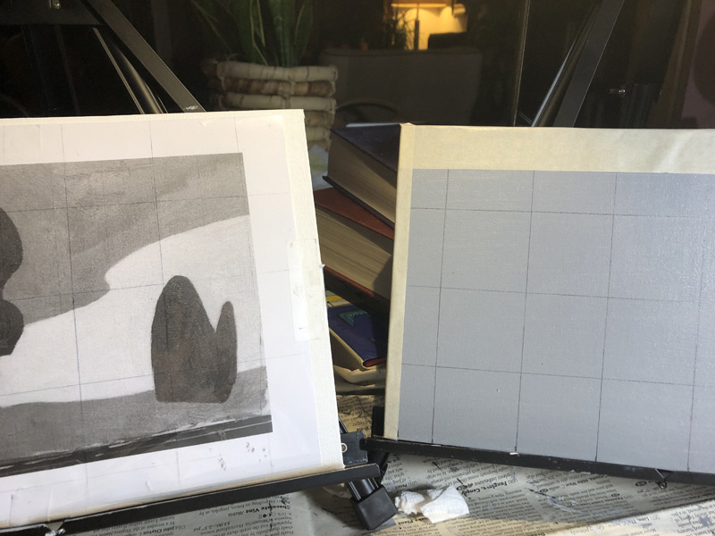
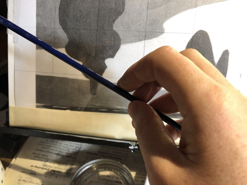
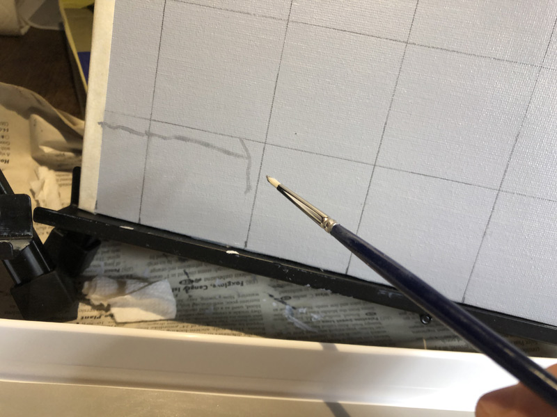
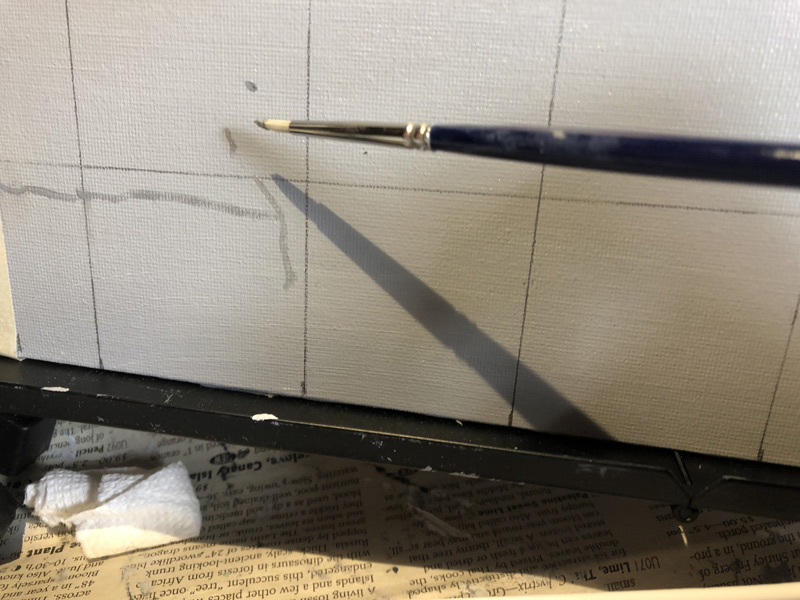
Until this point, all of my paintings had been copied from another painting — working with a grid and very systematically plotting each point. I wasn’t even changing the scale or the positioning: The original paintings were the exact size we’d be painting them — we just created our paintings in the same corner of the canvas where they’d appeared on their clipboards, and taped off any overhang. When I’d sat down to paint a still life, I hadn’t thought about how big a leap it would be from our class assignments. After all, I knew how to shade now, and I already knew how to tone my canvas, and how to draw out my subject matter (and how to hold my paintbrush!). How hard could it be?

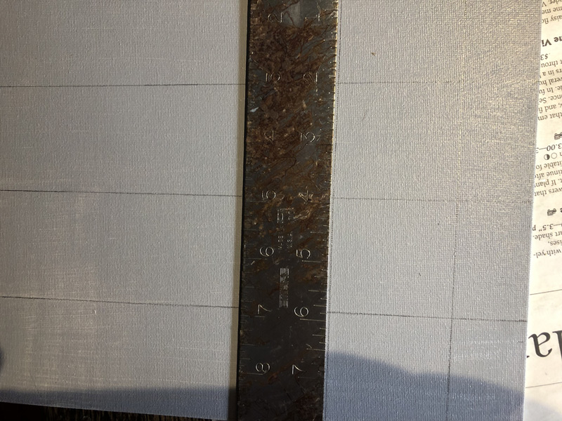
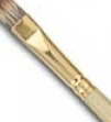
Turns out, very. Working without the grid, I found myself relying very heavily on my proportional divider. This is a tool that looks like an off-center X — on one side is a small pincer that you hold in front of your object to determine the length of a line or the width of a segment; on the other, a larger version of the same that opens or closes to show how that width would scale up or down, depending on your settings. It allows you to more easily scale up an item and still keep everything proportional, and is a godsend for those of us whose brains don’t work that way. But it’s slow to measure every little thing (as I’m always wont to do) and not always accurate, as a tiny miscalculation of the width on the small side can be a huge shift in width on the large side.

The other thing I found difficult was the lighting in my “studio.” Since I live in a small condo, my “studio” is really just a section of my living room. In attempting to make my painting more “daily,” I’ve carved out a period really — insanely — early in the morning, before anyone else is up and before I need to start work. This means I’m usually painting when it’s dark outside.

I wish I had a dedicated space in which to paint, but I can’t see it happening until, say, my daughter moves off to college (and unfortunately she’s not the next Doogie Houser). I’m loving learning to paint, but I’m not committed enough to, say, install florescent lighting in my beautiful public space.

Instead, I’ve been trying to make do, and my efforts have either been too minimal (where I can’t see my canvas or subject very well, and end up with little halos around everything) or too much (where I have a florescent bulb perched on a bookcase over my shoulder, making everything shadowy). I can’t seem to get it right.

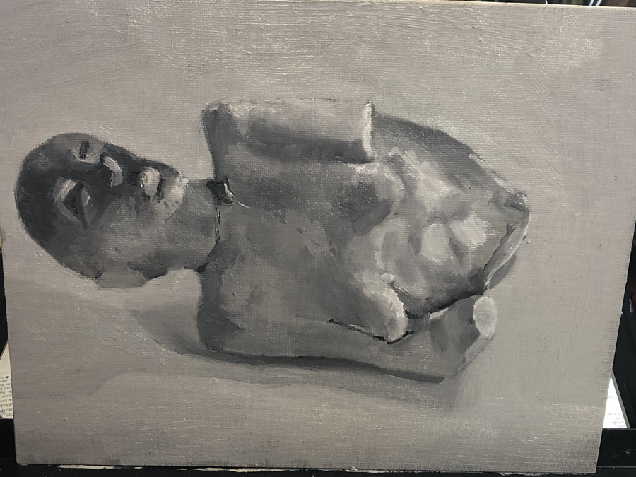
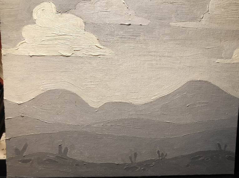
This first still-life shows my struggle. Since it was a Saturday, I was able to start in the afternoon, and the body shows that. But look at that weird dark face! By the time I got to that area, the sun had gone down, I had turned on my florescent, and the entire thing was in shadow, with my florescent spotlight dramatically illuminating the eye sockets and upturned nose. That would be fine it was consistent throughout the entire composition, but it’s completely out of place.

Likewise, I need to train myself to get up and take a break when I start to just. want. to. be. DONE. I’d reached that point before putting in any of the details in the stomach region, and it shows. Instead of the swirls of plaster, I’d basically just thrown in a mix of lighter and darker brush strokes, which looks cloudy rather than solid and scratchy.

Things I did well:

Top arm/shoulder shading and top boob
Crack in plaster around neck (though the larger crack/hole is a bit much)
Shadows under the body
Proportions are reasonably accurate

Things I could improve:

Bottom boob looks like she has a skin disease
Lighting on face
Texture does not look rough enough (especially on stomach)
Composition: Just plopped there, centered and floating in space.


Why do we paint like we do?

In the few weeks I’ve been painting, I’ve realized how little I know about even its most basic tenets. I didn’t know — and now do — how to tone a canvas, how to clean and preserve my brushes, even how to hold a paintbrush. Now I was learning what I thought I knew as a four-year-old: how to put down paint.

After completing our drawings of Dopey and the Oven Mitt, it was time to fill them in. Prior to my rogue gun-jumping first painting, I would’ve thought that this process was easy-peasy — just like Paint by Numbers, right? Not, apparently, so fast.

As I’m learning, one of the keys to painting accurately is separating what you see from what you think you know. You think you know that the ocean is blue; if you don’t consciously work to erase that preconception, you’ll ignore the evidence before you and choose colors much less varied and interesting than what nature has presented. Likewise, you think your fingers are long and tapered, but from many angles they’re foreshortened and squat: Paint them as you think they are, and you’ll look like a cartoon.

It’s difficult work, erasing these preconceived notions. To do it, we need to rely on tricks that divorce our lines — which have no particular meaning — from the objects we’re painting, which are filled with it.

This process starts with our very first strokes. Rather than simply filling in our shape with paint, like we’ve all been taught to do throughout our lives, we instead paint in patches, silver-dollar-sized regions that might contain two or more different areas of color or value.

IMG_3027

According to Jim, ideally you’d start with your darkest value, then medium, then light.

As I mentioned in my last post, we’re using the “fat over lean” process of painting — creating our paintings by laying down thin layers of paint that we then let dry before continuing to add to and revise. In order to keep the ability to revise the edges in future iterations, and to minimize the possibility that our surface will crack, we want to avoid the ridges that might come from having excess paint on our brushes when we come up to an edge. To do this we first touch down our brush well away from an edge and then paint toward it. Only when the paint has significantly thinned do we then paint along the edge.

Another way to make sure we’re not getting bamboozled by the “object-ness” of what we’re painting is to use a large hand mirror placed against our foreheads and reflecting on our painting and the subject we’re painting from, causing us to see them upside-down and backwards. This helps to break the connection between the shapes and lines that we’ve painted and the object that they represent, so that we can better see flaws in our angles, proportions, and values without the brain jumping in and trying to make our item look more vase-like, or hand-like, or in our case, oven-mitt-like.

So how did this all translate to Dopey and the Oven Mitt?

Remember, here was what I was painting:

withgrid

And here’s the final product:

IMG_0699

Wait — is that a perfect copy? Is she really that good?

No! Psych — they’re the same! I didn’t have access to the original, so I just showed my finished painting instead.

But now, here’s the original:

church_by_river_wm

Still pretty close, right?

083116_AboveTheFireplace_9
Lookin’ good!

My very first painting. Don’t blame the school!

Most of the biggest fights I’ve ever had with my husband came down to the fact that I’m a take-charge, active person, and he’s a passive cow. (He might’ve framed these fights differently. It’s MY blog.) So after so sensitively drawing Dopey and the Oven Mitt, I was anxious to lay in some paint. I had a space above the fireplace ready for it, and I don’t like to wait. (And that’s a GOOD thing.)

Alas, class wasn’t for another week, and my drawing was still locked up in The Art Academy’s thermohygrometer-monitored (I assume) vaults. But now that I had da skillz, I could start over — I could keep moving ahead!

Unfortunately, I wasn’t able to find this particular work in any of my old art history books. Instead, I searched online for something with the same clean lines, and found this:

istock

I knew I might have trouble with the little “iStock by Getty Images,” but the rest looked pretty easy. After all, I already knew how to tone my canvas, hold my paintbrushprepare my palette, and draw with a grid. Also, I had been through childhood. I figured I got this.

So after preparing my palette and grid and drawing my lines (and holding my paintbrush!), I picked out some greys to use. (I probably would’ve gone straight for color — I don’t like to wait — but we hadn’t bought any). And I painted.

Pretty good, right?

firstpic

I mean, I knew I had some trouble with the little protuberances at the bottom — that I can blame on a bad lighting situation — but my curves looked pretty good, and I even did that cool gradient thing in the sky. We hadn’t even been taught that — extra credit!!

Then I brought it to class to show Jim.

I didn’t want to be one of those little suck-ups who does extra homework and then shows it off to the teacher — I know everyone hates that kid (I was that kid). So I framed it in terms of a question I really did want to know: When would I add the protuberances? Would I actually draw in those little details, or lay them in over the top of the other paint? But really, I wanted him to praise my natural talent. (I’m still a little suck-up at heart.)

He didn’t.

Jim is a very positive person, and I could see on his face that he was struggling mightily to say something kind. “It’s really great that you’re so…enthusiastic,” he managed. “But we’ll be talking more about the right way to put down paint in tonight’s demo.” The right way. Ouch.

The fact that there was a right way, though — even for such a simple painting — was obviously news to me. In my next post, I’ll show you what it was.

Back to Kindergarten! Drawing using a grid

Did you have a book like this when you were a kid?

plants-and-zombies
I like his other book better: “How to Draw Blenders and Policemen”

If you’re anything like me, you’d probably feel pretty silly purchasing a book like this as an adult, subject matter aside. Even for those of us who never learned to draw, we know we really should be beyond making little grids and copying lines into them. Learning to draw using this method is pretty much the equivalent of learning how to paint by using Paint by Numbers.

Right?

Apparently not.

When we came to class our second day, Jim had already laid out the subject matter for our Very First Painting: a gridded mimeograph of… one of the Seven Dwarves talking to an oven mitt…?

image with grid
This will be usefu…oh, wait, I don’t have hands.

Our mission: Create a faithful representation of this early work of Surrealism, using a grid to guide us.

Taking out the toned canvasses we’d created in class the week before, we gridded them up in 2″x2″ squares using T-squares.

laying out a painting grid
Matching up my lines. Forgot to mark the top!

laying out a grid for painting
I’m not a T-square, but I play one in this demo

Note: Don’t use a graphite drawing pencil for this step. Use a regular #2. Over many, many years, as your oil paint gets more transparent, graphite will come to the top and be visible. (Of course, I hope to be beyond drawing with grids by the time I’m creating anything worth saving.)

mona-lisa.jpg!Large
Is there a grid under there?

Then, we mixed our palettes, and after a demonstration from Jim, we were ready to draw.

grid and painting
All ready! I’m right-handed, so my painting goes on the right.

I used my long watercolor brush for this. I started with a shorter brush, but I was told I couldn’t hold it in the proper way for drawing with a brush that short.

Choose a color that’s similar to the color of your toned canvas, but slightly lighter or darker. You want to be able to see it, but it shouldn’t stand out.

We started with just two dots. Easy-peasy! (Jim congratulated us on successfully completing our dots. It’s a very positive place!)

Using the grids was very helpful. How close to the top of the square should my line be?

canvas with dots
I made dots!!!

Also, what was the angle of the line I was drawing? For this, we needed to use our brush as an “angle machine.”

holding up brush to check angle
Figuring out an angle.

First, I’d mark a dot where I think it should be in order to get the correct angle. Then, I’d test the angle against the original and steadily move my arm over to my painting to compare. Then I’d adjust the position if necessary.

canvas with shaky lines
Now I know why we’re using a kiddie drawing technique. Holding the brush this way gives me the motor skills of a 5-year-old!

Don’t worry if you’re off with your dots or even your lines. For better or worse, oil paint dries veeerrryy slowly. You can always blot out the offender with a paper towel. Also don’t worry if you’re unsteady — it’s much easier to get a better line when we’re filling everything in with paint. Even Jim’s lines looked shaky when he demonstrated.

another canvas with shaky lines

Another thing to keep in mind is that we’re not drawing curves at this point. Everything should be basically straight. The line that I’m creating above is a curve in the original image. It would be very difficult to copy the curvature correctly, so instead we draw straight lines of the correct width for the straighter part of the curve (the isolated short line you see above) and then “connect the dots.” This gives us a better approximation of the curve then if we had tried it freehand. More curvature can be added when filling in the paint.

canvas with finished drawing
The finished product. Get that girl an agent!

So why do we use paint for drawing out our composition, rather than pencil?

Hey, I’m only in my second class! But I BELIEVE it has something to do with leading us into the “real” process we’ll be using to create our paintings in the future: underpainting.

And what’s an underpainting, you ask?

How could I not know this? How to hold a paintbrush

When was the first time you held a paintbrush? For me it was April 27, 1975 — give or take a few years. It’s one of those things no one remembers, because it happens so early and is so ubiquitous throughout our childhoods — how many paintings of bright suns and happy trees must exist in the scrapbooks of grandmas all over the world?

btatn23516tranh-16_22_49_895
I love you, Grandma!

How then did so many of us manage to get through elementary school (not to mention high school and beyond) never learning the proper way to hold a brush? Where were our art teachers? (I’m looking at YOU, Mr. Black.)

On our second day of class, every one of us adult art students choked up on our brush. It was difficult not to — we were attempting to draw with our brushes (more on that in the next post) and placing my hands far away from the tip made my lines wobble like an EKG.

abnormality-in-an-ekg
Clearly my lines need some medical attention.

According to Jim, we’re supposed to hold our brushes well back from the ferrule, and gently, so that someone could easily knock them out of our hands. Like this:

small-portrait-painting-oil-glazing-techniques_edited-1
Ouch!

…Not like this:

pexels-photo-1211793
Geez. Idiot.

The movement, according to Jim, is not in the fingers but in the arm. As an example, he told us about a particular famous artist (this anecdote would be a whole lot better if I could remember who the heck it was) who suffered from severe arthritis. Every morning  he’d have his assistants strap his brush …to his arm.

Weird.

Four weeks into class (just catching up to real time with this blog) I still find this technique pretty awkward, especially when I first sit down. A few minutes into painting, though, it starts to feel more natural, and I do think I’m starting to see an improvement in my lines from week to week.

Hey, at least I don’t have to do it like this:

huang-gofu-painting
It’s not in the toes, it’s in the leg…

The best way to clean your brushes? Hock a loogie

The last time I took a painting class, in my twenties, I hadn’t given much thought to the tools I was using. Everything was disposable to me then: I lived in a rental house, drove a hand-me-down car with a plastic-covered window, left my clothes on the floor and walked all over them. It would’t have occurred to me to thoroughly clean my brushes; I didn’t always remember to brush my own teeth. From what I can recall, I’d just swish those brushes in a jar of turpentine, pat them with a rag and throw them in my tackle box. Boom zoom.

I’m careful now. I like my things. I like my things, and I have a mortgage and a kid in private school, and it’s no fun to buy the same dang thing over and over again because it’s gotten too frustrating to use the one I crapped all over. So when Jim told us he would show us the 27-step method (or thereabouts) of keeping our brushes nice FOR LIFE, I paid attention.

brush
It’s called a “ferrule.” Impress your friends!

In the little washroom off the back, Jim held up a brush muddied with toner.  “You start by wiping with your paper towel from the end of the brush all the way up and over the ferrule,” he said. causing me to once again marvel at how many words our language must contain. “Pull your towel over the bristles and try to get as much paint off as you can.”

He demonstrated. After running the brush under water, he rolled the tip (and belly! Who knew brushes had such detailed anatomy?) in the brush cleaner. Putting a little water into the lid, he then painted inside it with the soapy brush. The paint started lifting, and he wiped off the excess with a paper towel. Then he repeated the process. And again. And again. Again. Again. Again. Again. Again. Again. Again. Again. Again. Again. Again. Again. Again. Again. Again. Again. Again. Again. Again. Again. Again. Again. Again. Again. Again.

(He might still be cleaning it. I left.)

masters
I’ve been cleaning this brush since they designed their packaging…


Then Jim showed us the icky part. Breathing deep from some swampy part of his interior, he spat a glistening wad into the lid and swished it around with his brush. “Spit is excellent for bristles,” he told us. “But what you really want to do is create a little cover for the brush, like this.” He took a small piece of paper towel and ….put it… in his mouth….

Anyway, he wet it. Is it just me, or does that give everyone the nails-on-a-blackboard chills?

Then he rolled the tip of the brush in the towel to create a damp little turban. This will dry stiff and keep the bristles from fraying when not in use.

Finally, he handed the brush and cleaner back to Classmate B.

“Wait, was that your stuff?” I asked. She nodded, still looking at her brush.

I’m not sure I’ll be able to do the paper-towel-mouth thing. Maybe when I buy my $400 sable-hair brush (though that I might take to the spa!). But I like the idea of giving myself a fighting chance of getting this painting thing right and not working against myself with crappy, worn-out materials.

Maybe I’m finally a grown-up!

paintbrush with paper towel cover
Feelin’ pretty in my spit hat

What would my great-great-great-great-great-great grandchild think? Priming and toning a canvas

Back in the days when I had my little studio set up in my apartment in Maine, if I wanted to paint with oils I’d buy a pre-primed canvas board from the art store, sit down to that bright white canvas, dip my brush first into a jar of turpentine and then into my paint and have at it. Surprise, surprise: I didn’t know what I was doing.

unprimed_cotton
Unprimed cotton canvas from Dick Blick. I suck (literally)!

That bright white canvas I was using had been primed but it hadn’t been toned. Raw, unprimed cotton or linen canvas is nubbly and absorbent; priming involves first applying size (a sealant made from animal glue that protects the canvas from the acids in the paint) and then ground (usually gesso), which gives the canvas a smooth, uniform texture and color and prevents your paints from getting sucked right into the canvas.  If you’re buying raw canvas, however,  you need to stretch it before you prime it, and for that you need stretchers and canvas pliers and yada yada yada that’s a whole other ball of wax I don’t know a thing about. Lot’s of other people do, though. Here’s one.

Why would you go through all that hassle? To save money, primarily; to use a canvas shape you can’t find pre-made; to have complete control of the surface of your painting. I get it, but I’m not there yet.

Instead, as absolute beginners, we’re using these Tara Fredrix acrylic-primed canvas panels. According to Jim, though, that’s only because these early experiments are likely just bound for the circular file. As we improve, we’ll want to avoid acrylic-primed canvas, especially – ESPECIALLY – acrylic-primed stretched canvas, which is complete garbage, and in two-hundred years will make our paintings such a mess of crazing that our conservators will tear their hair out trying to fix them up.

Ahem. Yes.

Exchange when Jim left the room:
Classmate M: Do any of you have a panel I can borrow? Wet Paint was out of them and they sold me acrylic-primed stretched canvas!
Classmate B, handing one to her: Yes, no need to fall on that particular sword…

auction pic
A 200-year-old painting I bought at an auction. Acrylic-primed?

Instead, our best option as we advance will be oil-primed linen canvas, although looking at the prices I don’t expect to be using this for “Still Life with Grey Pear #2”!

So that’s Priming… What about Toning?

red wine spill download
No one would even notice this on light grey!

Here’s a rule: Unless — and perhaps even if — we’re painting a Bichon Frise lost in a snowstorm, we never want to paint on a blank white canvas. There are two reasons: First, oil paint grows more transparent over time, and (here’s that 200 years thing again) we don’t want our descendants to see our paintings any brighter than we originally intended. For those of us less concerned with our legacies, though, painting on white is really just harder on the eyes: It’s much more difficult to judge value and color against white. Darks will appear darker, colors brighter (think of how that red wine stain pops against your new white couch) and we’ll end up compensating with our paint choices, leading to unintended results. Plus, if our paint is too thin in some areas we might see little white speckles poking through — blech.

Instead, we tone our canvas by laying down a thin, semi-translucent layer of paint mixed with toning medium.

Toning Medium

1 part Walnut Alkyd Medium (WAM is walnut oil to make your paint less stiff – I’ll get into this more in an upcoming post on creating your palette — mixed with alkyd for a faster dry time)
3 parts Gamsol (Gamsol is an Odorless Mineral Solvent — basically turpentine without the stink and braincell killers)

Mix!

It should look something like this:

WAM

…but less grody. Mine appears to be growing something.

Mark the level on your jar. The Gamsol will evaporate much more quickly than the WAM, and if you haven’t used very much you’ll be able to fill it to the line again with Gamsol.

Now we need to mix it with our paint. Which paint? For us, at this point, we’re using…grey. (Later, I’ve heard that it’s your painting’s dominant color, but I’ll get into that when I learn color.)

As you see on our materials list, we’re using Gamblin paints, mostly the Portland Greys (I used to live in Portland, and I can vouch for it being this color most of the year) with some white and black.

paints
The black is called Ivory Black. How weird is that?

Our goal is to create a mixture that’s around 60-80% light. If I’d like to be systematic, I’d use some Portland Grey Medium, Portland Grey Light, and Titanium White, all mixed together to a lovely pearly shade of kitten whiskers.

But in the few weeks I’ve been painting, I’ve already gotten lazy about this and just tend to mix all my leftover greys together after a painting session and brighten the whole mess up with white if necessary. As far as I can tell, it’s not an exact science.

Once your paint is mixed up, you can add the toning medium. This can be scooped up with your palette knife and dumped into your paint pile one or more times; then you continue to mash it all up and scrape it around until you get to the consistency of thick soup. Yum!

drippy
Drippy, but could be even drippier…

Lay your canvas out on newspaper — this is a mess and no job for an easel — and using the largest, widest of your brushes, paint it on.

paintingon
My photography is shite! This is actually a fairly light grey.

Then, fold up a paper towel or shop towel and lightly scrape it across the canvas, removing the excess. You’re done!

withpapertowels

Now, waaaaaiiiiiittttt….. It takes at least three days, if not longer, for your toned canvas to be ready to paint on. Go watch TV!

But first, you have a messy brush. Read on to find out how to clean it. (Spoiler alert: it involves spit!)