During the time when I was kept from the gym by my splinter (now healed), and kept from my studio by Jim’s admonitions on my light situation (now fixed), I was also kept from class by… well, there wasn’t any class. It was spring break (now over).
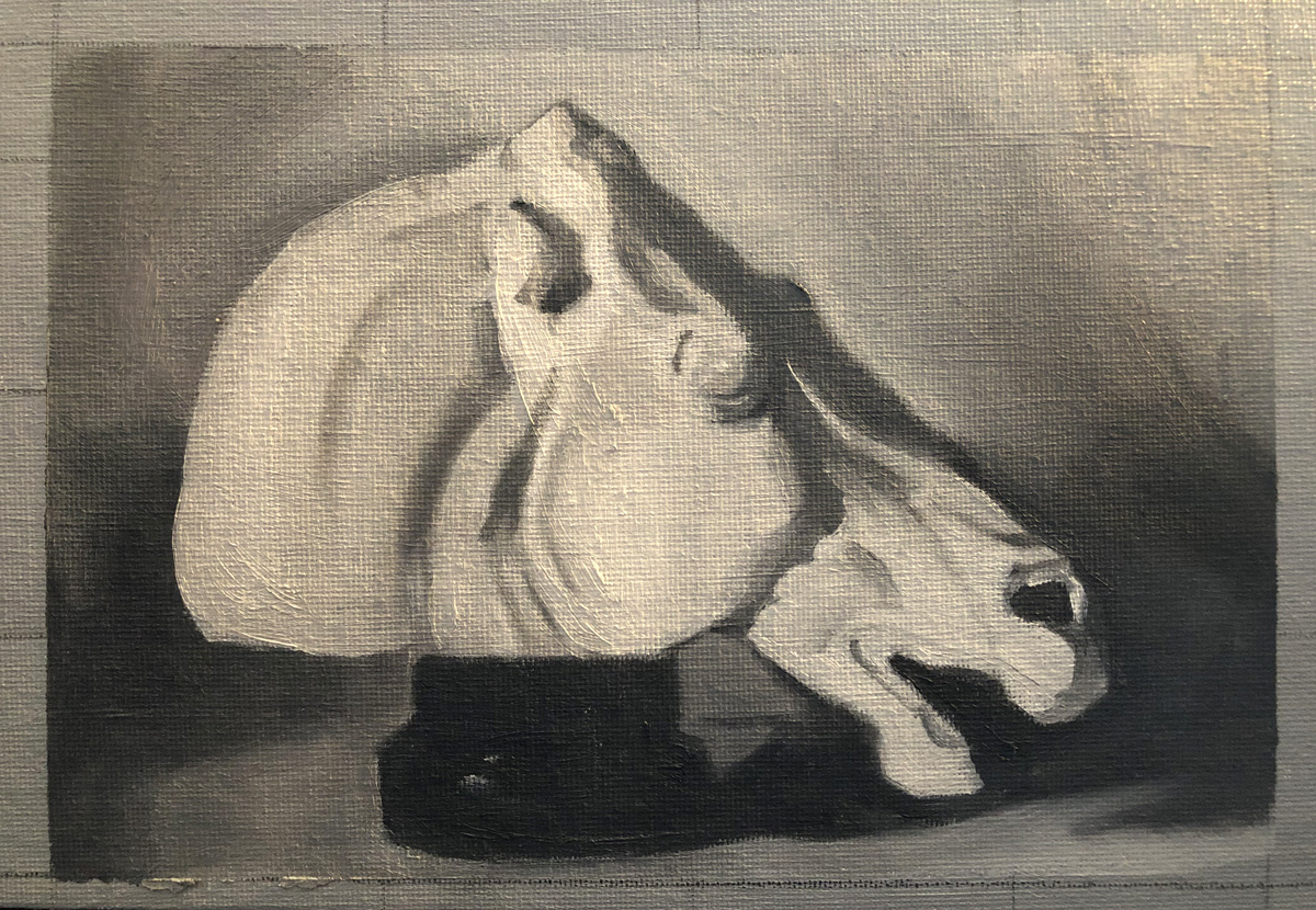
Since the assumption at The Art Academy seems to be that once you’re there, you never leave (there are people there who have been working on the same painting for years, apparently), there was no rushing to finish up the marble horse head paintings we were working on before we left before break; they were there waiting for us when we got in.
It was weird to go back to grey after my forays into color, but much much easier. I realized that I’ve been a bit lazy when it comes to color mixing at home — often I just mix something I think is in the ballpark and then go back and tweak it after the fact (that’s the beauty of oil painting — it’s incredibly forgiving). So I have been asking myself whether painting with color on my own is even a good idea — am I just teaching myself bad habits? I continue with it, though, because it’s fun, and ultimately, even if truly imperfect, I like the results much better — who wants to keep a grey painting? The last thing I want is to start feeling bored and uninspired — I figure, anything that keeps me painting on a regular basis has got to be for the best.
For this painting, we did what Jim called a “lay in”: We spent a couple of sessions painting the horse in a simplified form — blocking in the outline, background and some of the shading — and then our reference images were switched for others that had a lot more detail and we spent a couple more sessions painting those as well. The biggest issue I found was that in between session one or two of the detail work, I was given a different reference image (a common issue — I think they’re just handed out randomly in each class, and they’re all a bit different) and all the details were in different places than they were when I started them. This threw me for a loop, but Jim insisted that it really didn’t matter — ultimately, the exercise was just to practice recognizing and reproducing subtle values, as well as the process of first blocking in a simpler shape and then coming back to it for detail.
To me this felt like a big leap ahead from the box paintings we did for our last project, but completely manageable. Of course, I’ve obviously been painting on my own, but even if I hadn’t it would’ve still felt like the logical next step after shading and blurring. My nerdy self is still very excited by just how systematic this program seems to be. Looking forward to the next project!
Back in the days when I had my little studio set up in my apartment in Maine, if I wanted to paint with oils I’d buy a pre-primed canvas board from the art store, sit down to that bright white canvas, dip my brush first into a jar of turpentine and then into my paint and have at it. Surprise, surprise: I didn’t know what I was doing.
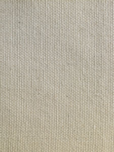
Unprimed cotton canvas from Dick Blick. I suck (literally)!
That bright white canvas I was using had been primed but it hadn’t been toned. Raw, unprimed cotton or linen canvas is nubbly and absorbent; priming involves first applying size (a sealant made from animal glue that protects the canvas from the acids in the paint) and then ground (usually gesso), which gives the canvas a smooth, uniform texture and color and prevents your paints from getting sucked right into the canvas. If you’re buying raw canvas, however, you need to stretch it before you prime it, and for that you need stretchers and canvas pliers and yada yada yada that’s a whole other ball of wax I don’t know a thing about. Lot’s of other people do, though. Here’s one.
Why would you go through all that hassle? To save money, primarily; to use a canvas shape you can’t find pre-made; to have complete control of the surface of your painting. I get it, but I’m not there yet.
Instead, as absolute beginners, we’re using these Tara Fredrix acrylic-primed canvas panels. According to Jim, though, that’s only because these early experiments are likely just bound for the circular file. As we improve, we’ll want to avoid acrylic-primed canvas, especially – ESPECIALLY – acrylic-primed stretched canvas, which is complete garbage, and in two-hundred years will make our paintings such a mess of crazing that our conservators will tear their hair out trying to fix them up.
Ahem. Yes.
Exchange when Jim left the room: Classmate M: Do any of you have a panel I can borrow? Wet Paint was out of them and they sold me acrylic-primed stretched canvas! Classmate B, handing one to her: Yes, no need to fall on that particular sword…
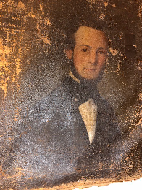
A 200-year-old painting I bought at an auction. Acrylic-primed?
Instead, our best option as we advance will be oil-primed linen canvas, although looking at the prices I don’t expect to be using this for “Still Life with Grey Pear #2”!
So that’s Priming… What about Toning?
No one would even notice this on light grey!
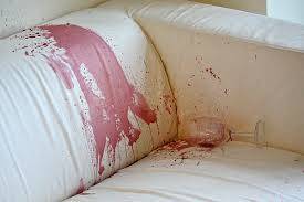
Here’s a rule: Unless — and perhaps even if — we’re painting a Bichon Frise lost in a snowstorm, we never want to paint on a blank white canvas. There are two reasons: First, oil paint grows more transparent over time, and (here’s that 200 years thing again) we don’t want our descendants to see our paintings any brighter than we originally intended. For those of us less concerned with our legacies, though, painting on white is really just harder on the eyes: It’s much more difficult to judge value and color against white. Darks will appear darker, colors brighter (think of how that red wine stain pops against your new white couch) and we’ll end up compensating with our paint choices, leading to unintended results. Plus, if our paint is too thin in some areas we might see little white speckles poking through — blech.
Instead, we tone our canvas by laying down a thin, semi-translucent layer of paint mixed with toning medium.
Toning Medium
1 part Walnut Alkyd Medium (WAM is walnut oil to make your paint less stiff – I’ll get into this more in an upcoming post on creating your palette — mixed with alkyd for a faster dry time) 3 parts Gamsol (Gamsol is an Odorless Mineral Solvent — basically turpentine without the stink and braincell killers)
Mix!
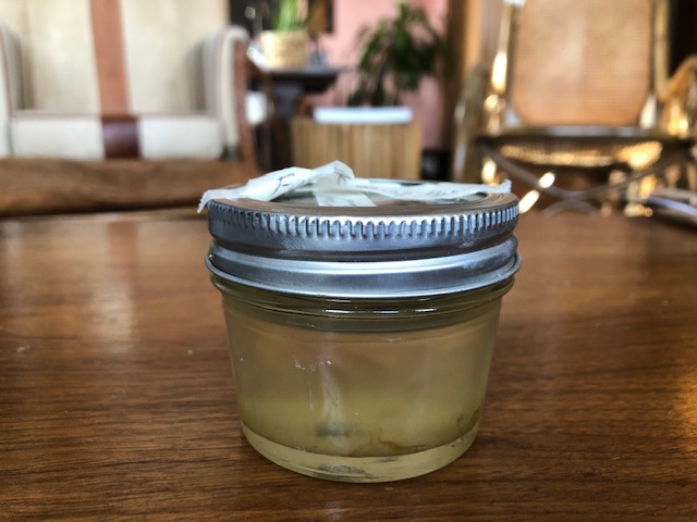
It should look something like this:
…but less grody. Mine appears to be growing something.
Mark the level on your jar. The Gamsol will evaporate much more quickly than the WAM, and if you haven’t used very much you’ll be able to fill it to the line again with Gamsol.
Now we need to mix it with our paint. Which paint? For us, at this point, we’re using…grey. (Later, I’ve heard that it’s your painting’s dominant color, but I’ll get into that when I learn color.)
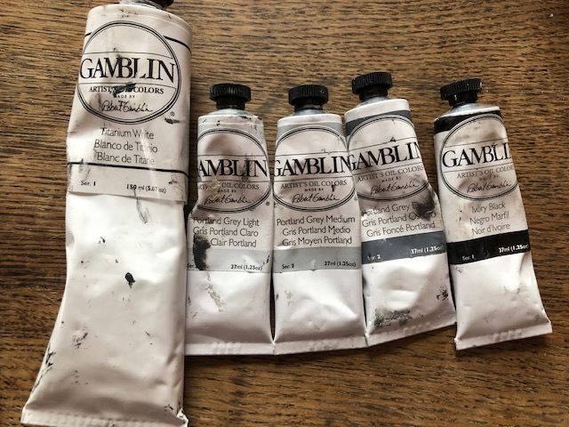
As you see on our materials list, we’re using Gamblin paints, mostly the Portland Greys (I used to live in Portland, and I can vouch for it being this color most of the year) with some white and black.
The black is called Ivory Black. How weird is that?
Our goal is to create a mixture that’s around 60-80% light. If I’d like to be systematic, I’d use some Portland Grey Medium, Portland Grey Light, and Titanium White, all mixed together to a lovely pearly shade of kitten whiskers.
But in the few weeks I’ve been painting, I’ve already gotten lazy about this and just tend to mix all my leftover greys together after a painting session and brighten the whole mess up with white if necessary. As far as I can tell, it’s not an exact science.
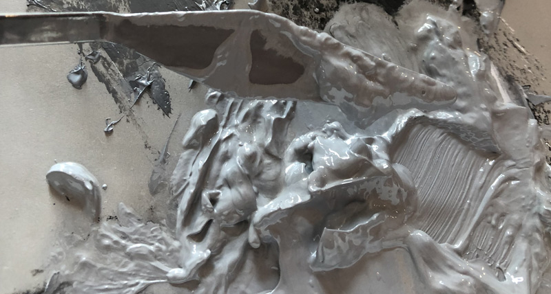
Once your paint is mixed up, you can add the toning medium. This can be scooped up with your palette knife and dumped into your paint pile one or more times; then you continue to mash it all up and scrape it around until you get to the consistency of thick soup. Yum!
Drippy, but could be even drippier…
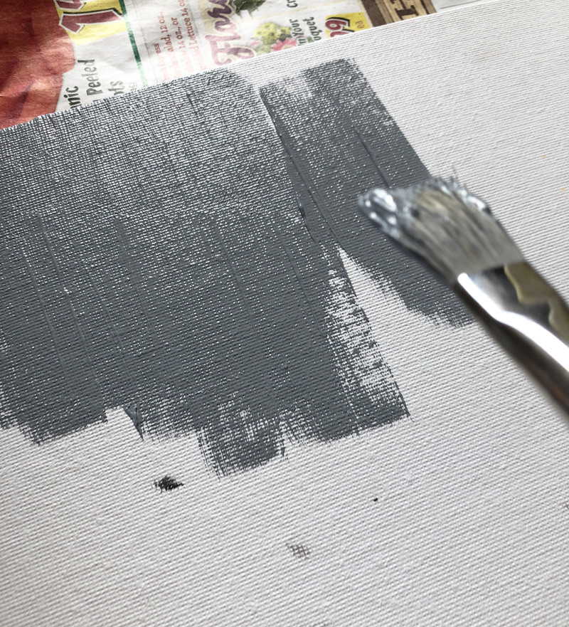
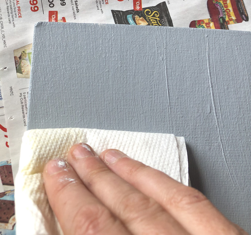
Lay your canvas out on newspaper — this is a mess and no job for an easel — and using the largest, widest of your brushes, paint it on.
My photography is shite! This is actually a fairly light grey.
Then, fold up a paper towel or shop towel and lightly scrape it across the canvas, removing the excess. You’re done!
Now, waaaaaiiiiiittttt….. It takes at least three days, if not longer, for your toned canvas to be ready to paint on. Go watch TV!
But first, you have a messy brush. Read on to find out how to clean it. (Spoiler alert: it involves spit!)