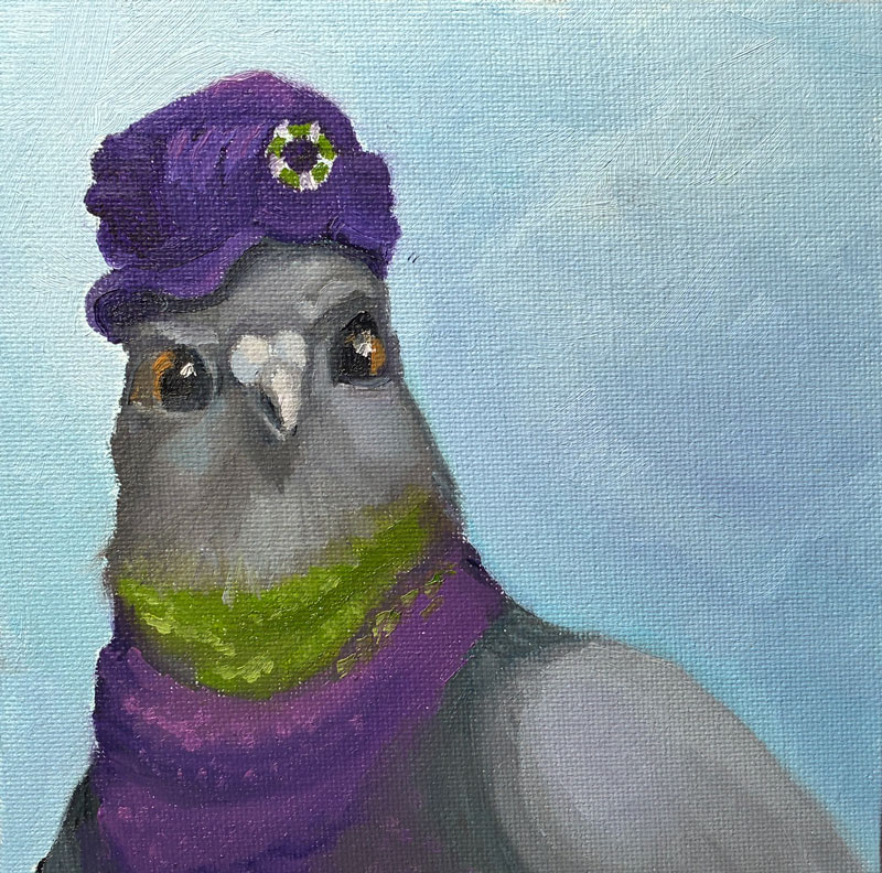
Fresh off the success of my “pigeon with a hat” painting, I thought I’d try something completely different: a duck in a hat! Maybe this will be my niche?
I’d originally anticipated painting a standard “barnyard” duck, but while looking for photos to study I came across this blue-billed marvel called a “ruddy duck.”
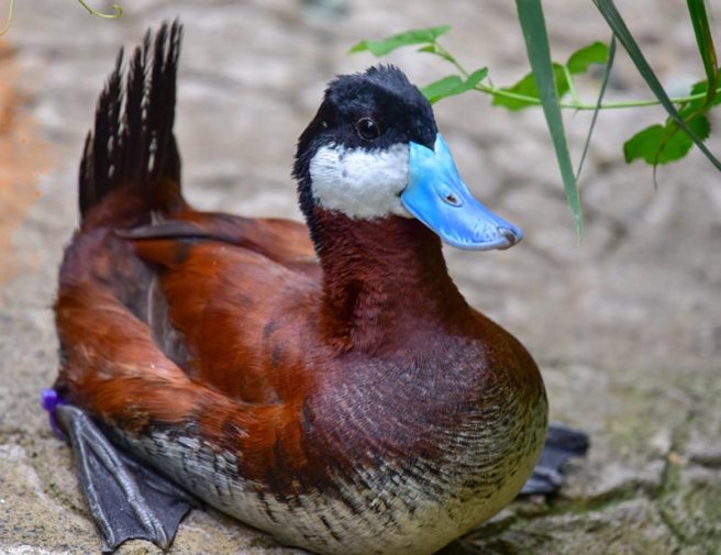
Copyright Sinclair Miller, Maryland Zoo in Baltimore
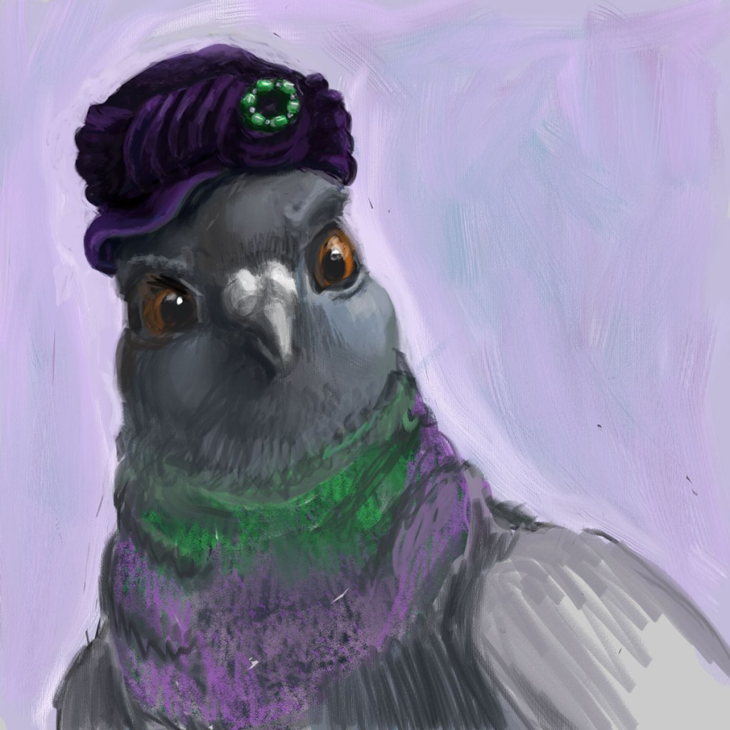
Here’s my original digital:
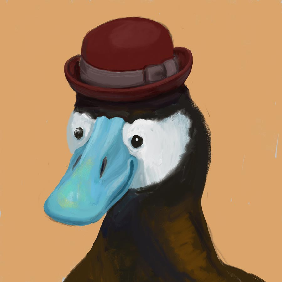
Apparently, my dapper gentleman is also a randy duck – the blue coloration only comes out when he’s hoping to mate (as does, of course, the stylin’ hat).
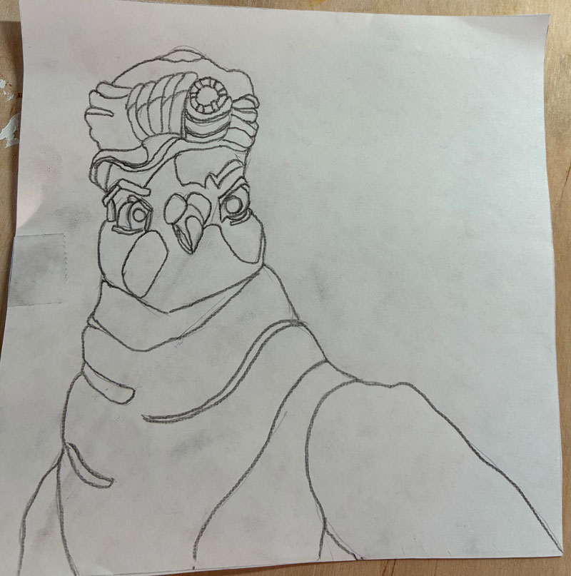
Since my pigeon was way off in her background-to-head ratio, I learned from my mistakes and blew up this feller larger in his frame than I’d originally drawn him. Then, rather than grid or freehand draw him like I did last time, I just printed out a black-and-white version of my digital drawing and used my graphite transfer paper to trace the lines of the black-and-white picture. But once again, I was foiled by my cheapness! Not wanting to waste too much printer ink, I used the “draft” setting, which created an image so washed-out and pixelated that I couldn’t follow the value changes, leading to mass confusion and a first painting that was yes, another “wiper.”
But we Irish-Lithuanians are made of strong stuff, and I set back in to try again. This time, I produced this:
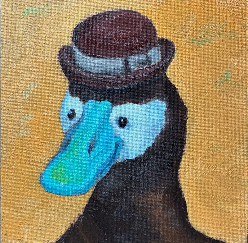
While it’s not terrible, and the beak turned out better than I’d expected in this second version, I made a giant mess of the hat — that little rim was tough! My background color, too, was not ideal: The orange—while a lovely color unto itself—is too saturated and draws attention away from the bill. Furthermore, Gemini had just told me that I should be painting with a 60/30 ratio of Gamsol to Walnut Alkyd, and my 50/50 mixture was too “fat.” So altogether, it seemed worth it to do one more pass, and begin to develop better processes and habits.
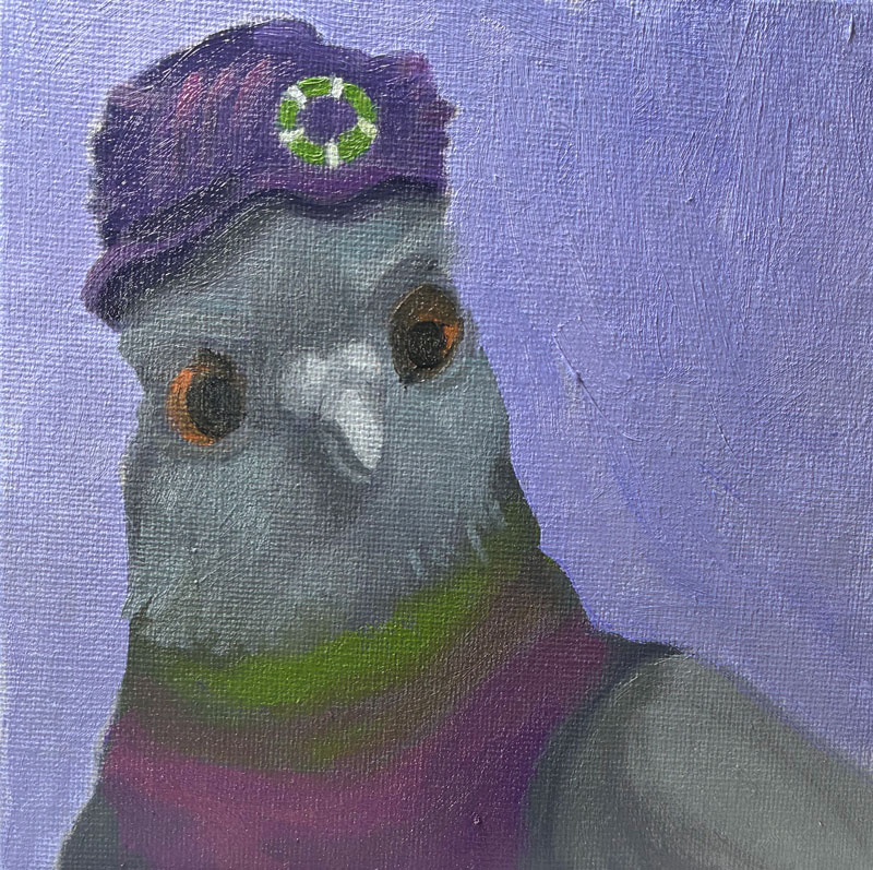
So, I went in for try 3, and produced this guy:
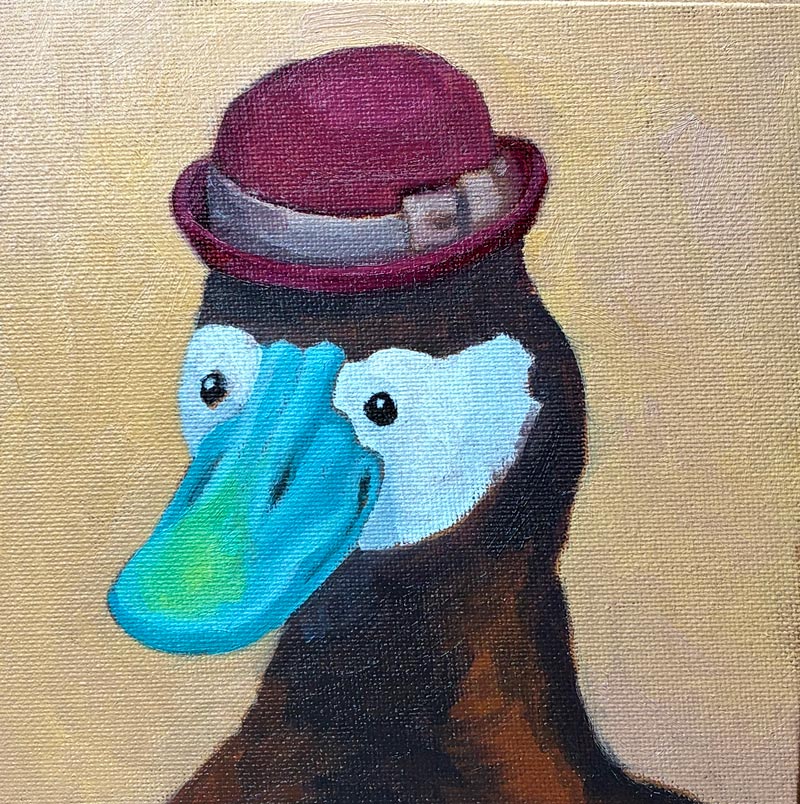
Mistakes, for sure — but altogether a very dapper gentleman!