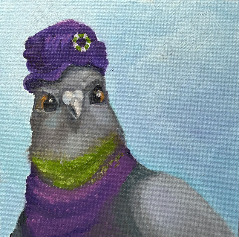
Fresh off the success of my “pigeon with a hat” painting, I thought I’d try something completely different: a duck in a hat! Maybe this will be my niche?
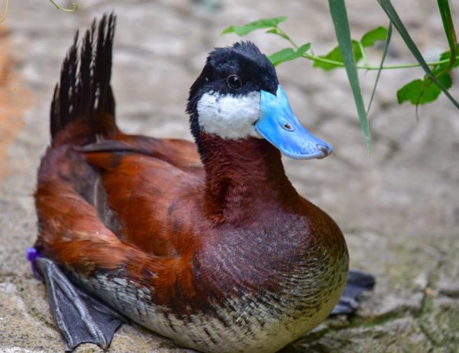
I’d originally anticipated painting a standard “barnyard” duck, but while looking for photos to study I came across this blue-billed marvel called a “ruddy duck.”
Copyright Sinclair Miller, Maryland Zoo in Baltimore
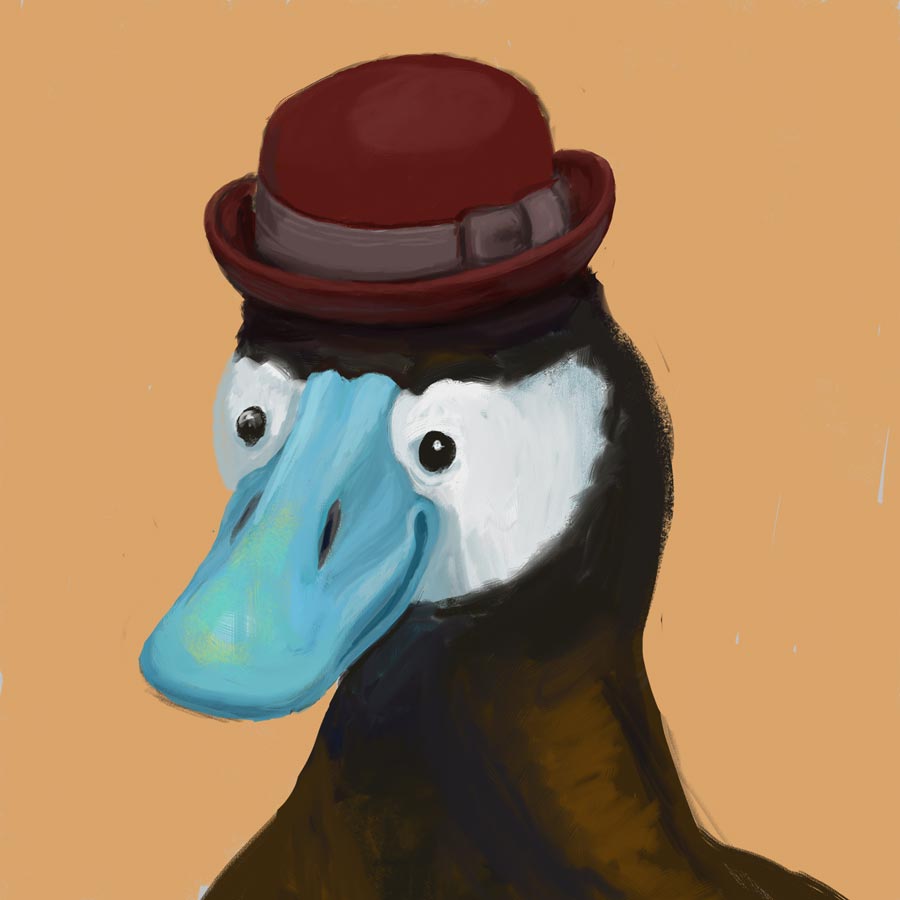
Here’s my original digital:
Good-lookin’ fella!
Apparently, my dapper gentleman is also a randy duck – the blue coloration only comes out when he’s hoping to mate (as does, of course, the stylin’ hat).
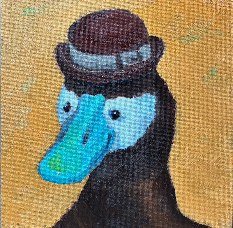
Since my pigeon was way off in her background-to-head ratio, I learned from my mistakes and blew up this feller larger in his frame than I’d originally drawn him. Then, rather than grid or freehand draw him like I did last time, I just printed out a black-and-white version of my digital drawing and used my graphite transfer paper to trace the lines of the black-and-white picture. But once again, I was foiled by my cheapness! Not wanting to waste too much printer ink, I used the “draft” setting, which created an image so washed-out and pixelated that I couldn’t follow the value changes, leading to mass confusion and a first painting that was yes, another “wiper.”
But we Irish-Lithuanians are made of strong stuff, and I set back in to try again. This time, I produced this:
Eek — need to up my photography game!
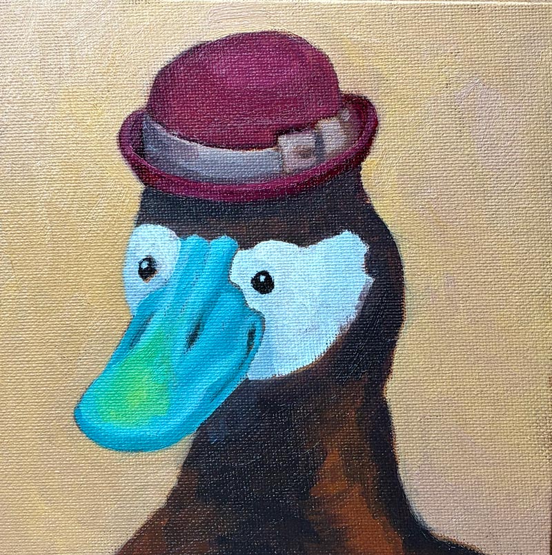
While it’s not terrible, and the beak turned out better than I’d expected in this second version, I made a giant mess of the hat — that little rim was tough! My background color, too, was not ideal: The orange—while a lovely color unto itself—is too saturated and draws attention away from the bill. Furthermore, Gemini had just told me that I should be painting with a 60/30 ratio of Gamsol to Walnut Alkyd, and my 50/50 mixture was too “fat.” So altogether, it seemed worth it to do one more pass, and begin to develop better processes and habits.
So, I went in for try 3, and produced this guy:
Mistakes, for sure — but altogether a very dapper gentleman!
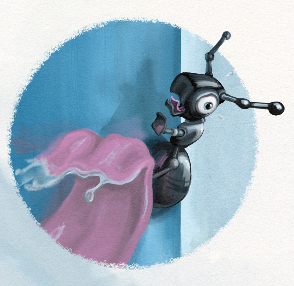
In my years of aspiring to be a children’s book illustrator, my “specialty” was emotive animals, like this terrified ant about to get scooped up by a hungry anteater:
So with my new dream of being an Etsy artist (no fine art aspirations for me!) I thought I’d see if I could create some original drawings that I would then attempt to recreate in actual paint.
What a pleasure to go back to digital after struggling with this new medium! And rather than worry about my finished product looking too “computer-y,” I could use my tools to figure out composition, expression, and color, and then give it the human touch in oils. This would also have the benefit of being reproducible, because I could grid it to create a template. I can almost smell the money!
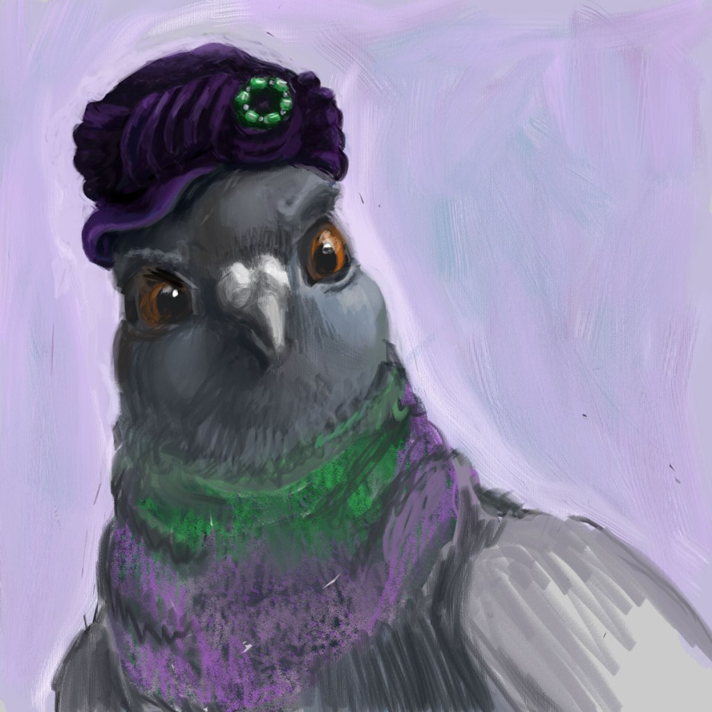
So, my first step was creating a picture of a pigeon in a hat. It’s rough, but I like her haughty expression and the rich purples and greens. I’m calling it “Well, I never!”:
Well, I never!
One thing I’d learned way back at the start of this blog was how to transfer an image onto canvas using a grid. In fact, I wrote a whole post about it. So I used Photoshop’s ruler with some guides, and marked the image on my screen into 6 1-inch squares, and then did the same on my canvas.
This method did indeed allow me to get (most of) the positioning correct, but it was time-consuming, and—frankly—pretty frickin boring, even for a tiny image. Moreover, I was once again tripped up by the actual painting, because in attempting to add detail in paint, everything got muddled again:
Clearly, I need professional advice! So I hopped over to one of my favorite cheap resources, Domestika, and watched the section on Portrait Painting with Oil that was part of this specialization series.
And I realized something — probably something obvious to anyone who’s been painting more than a week. I’d always heard that with alla prima, you were blending paint right on the canvas. But in the video, the artist mixed her paints for each section ahead of time. Sure, there was some blending on the canvas, and some in-between tones that she mixed up on the fly. But she wasn’t just getting close enough and then attempting to correct it on the canvas like I was. Instead, she was being planful — putting down all of her darkest tones (one stroke at a time), and then moving down the line until she’d finished every stroke of the subject’s skin.
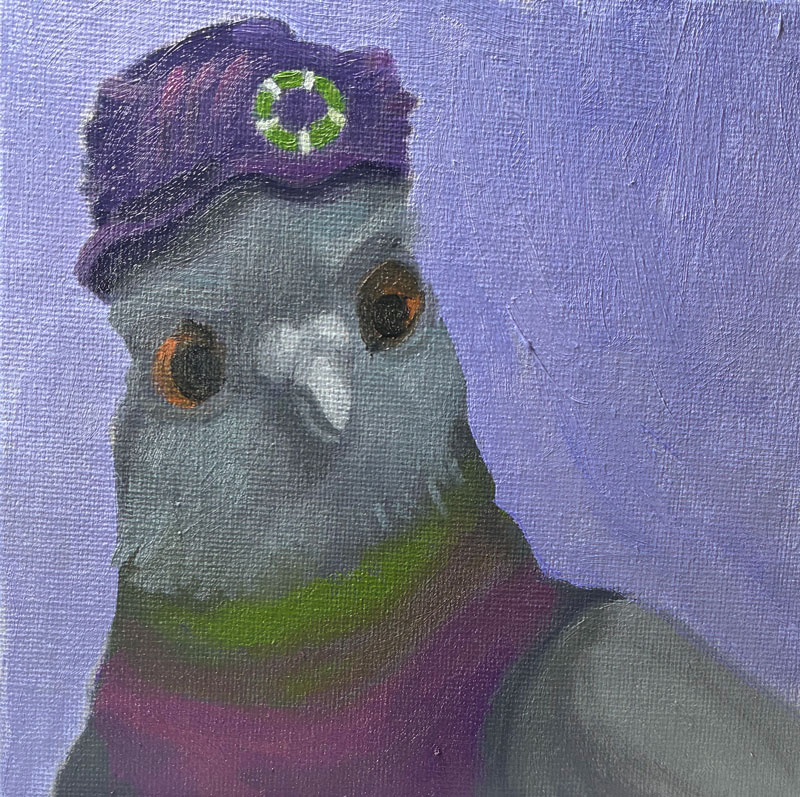
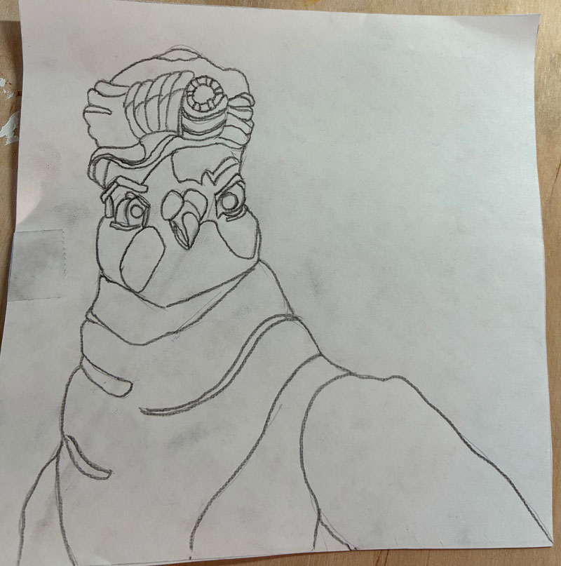
Worth a try! So, I started again — this time following the advice of my bestie Gemini and using Saral graphite transfer paper to first draw my pigeon on paper before transferring it to canvas:
Unfortunately, I did two things very wrong here. One — I attempted to avoid drudgery by free-drawing rather than gridding, which led to her having way too small a head and too big a background, and just being a bit “off” in her expression and physicality. Then, I thought it made sense for me to understand where all of my value changes were, so I added those lines right into my drawing, just like a paint-by-numbers. Yikes! Line overload! I ended up losing my way in them and having to once again edit on the canvas — though thankfully not as much as before.
But, but! I still think this represents a big leap forward for me. I’m sure I’ll cringe when I look back at this in a few months, but right now I’m feeling pretty proud!
Why painting 4 you ask? What became of 2 and 3? While I’ve sworn to document even my dismalest of efforts, I’m also not going to finish a painting that’s completely irredeemable (I’m lazy, remember. I’m also cheap — I’d rather save the paint and reuse the canvas).
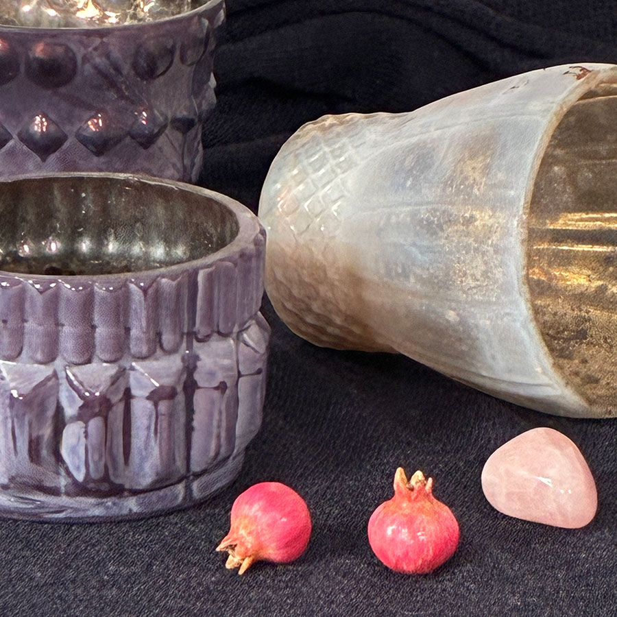
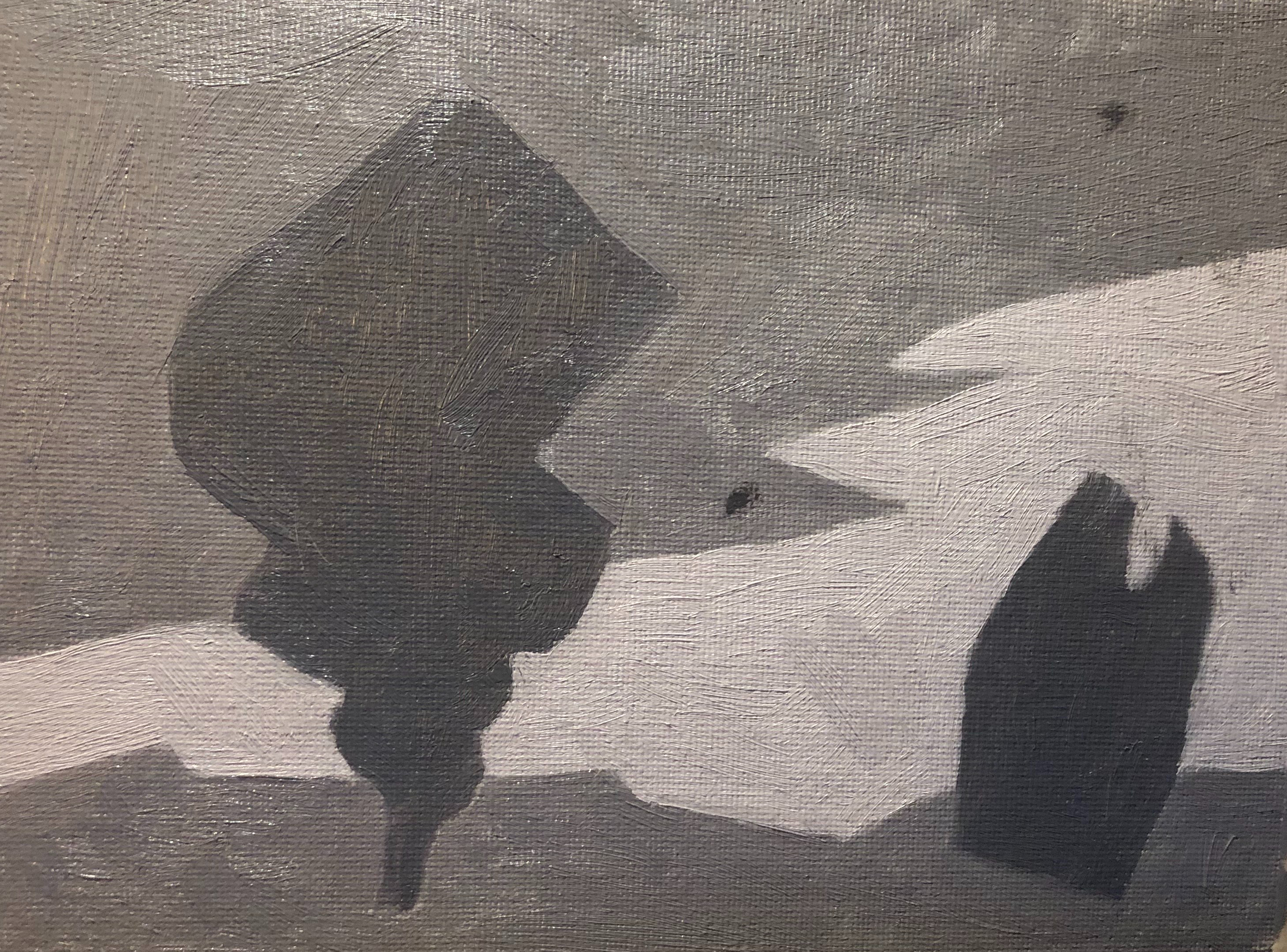
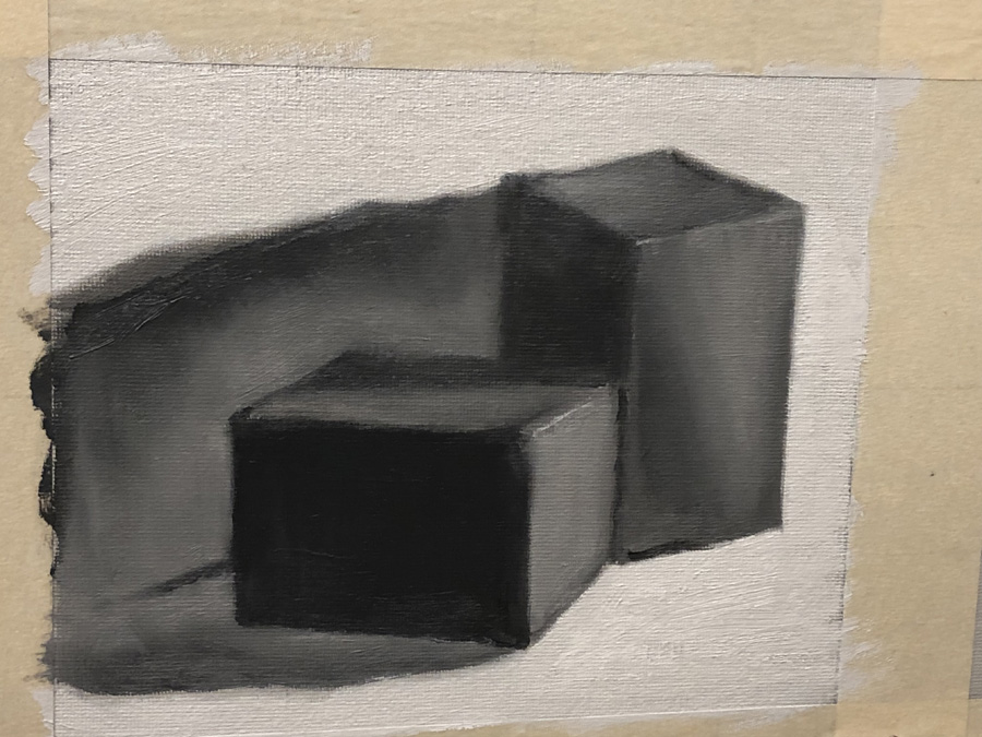
Since my bottle painting was such a raging success, I jumped right into another still life, this one even harder (cause that’s how I roll). Although I was painting from life and not a photo, this was the subject:
Pretty, right? Also very, very difficult. Now, over the years—since learning to draw from imagination at the tender age of 48—I’ve gotten pretty good at being able to picture something in my mind and draw it from any angle. But I need to really understand the form first, and I could not, for the life of me, understand the form of that purple candleholder at the left front. It has these sort of wedge shaped pieces radiating out like spokes, but the wedges are slightly rounded, and the top of the wedges are more triangular than the bottoms, which follow a gentle curve. Looking at it from a distance in my still life box, the random dark glaze plays all sorts of tricks of the eye so the whole thing just wasn’t making sense any more, and my paint kept getting gloppier and more muddled as I edited and edited.
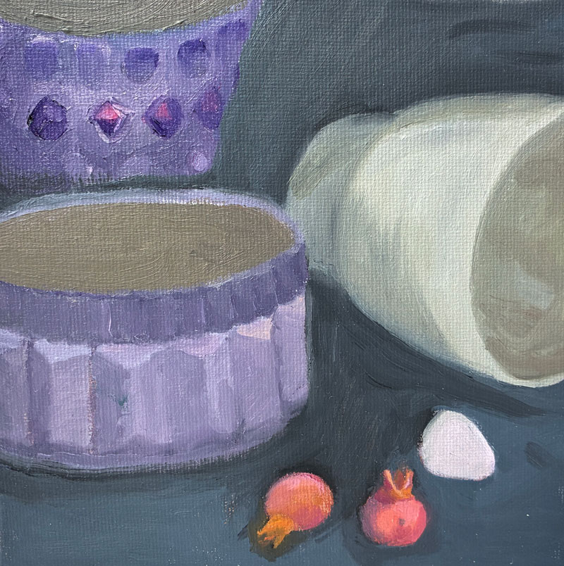
After two “wipers,” I finished a pass of this one:
Now, I say “a pass,” because even though I’m attempting to finish each painting in one sitting (à la alla prima), I was at a point where I could not add any more paint without it simply converging into the mud. So I thought I’d go back to the traditional method and wait for my paint to dry to the touch before adding more detail, finishing the insides of the cups, and perhaps editing.
A few days later, however, I was not keen to pick this one back up again, nor was I ready to start over with it before first learning more about what I’m doing wrong. I’ll save this one for the future.
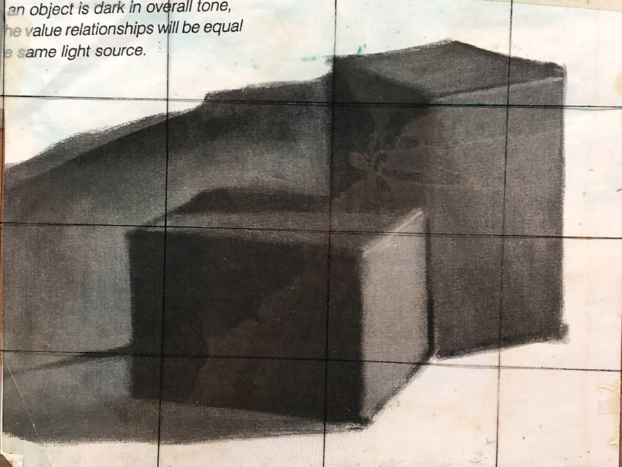
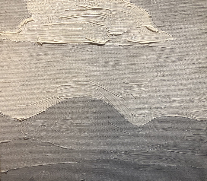
We’re still at the stage where all of our paintings for class have been in shades of grey: grey oven mitts, grey boxes, the beginning stages of grey horse heads (more on that to come). It makes sense — people perceive value before color, and mastering that in greyscale is much simpler and less distracting — but man, is it boring. Until now, I’ve been faithful to the method, figuring that painting one more grey oven mitt was just like Ralph Macchio waxing Mr. Miyagi’s car, but when I sat down to paint on Saturday and remembered I had run out of Portland Grey Medium, temptation got the better of me. I had recently been to a neighborhood estate sale, and had bought a big case of oils for $5 (to give you a better sense of the quality of these paints, they were mixed in with a bunch of Bob Ross acrylics), so figured what the hey, why not?
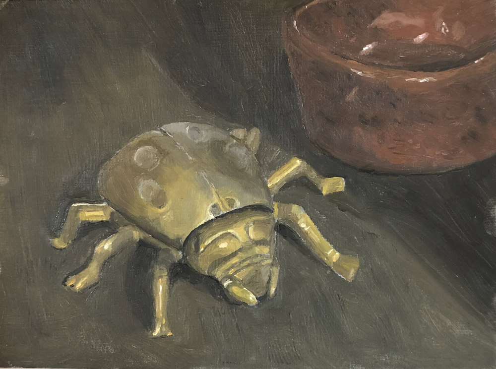
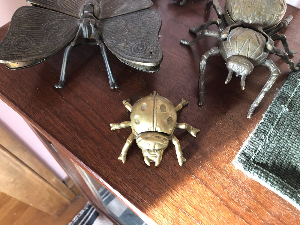
Good Lord but this was tough. There’s a reason, I’m learning, that people start out with less precise objects like apples and pears: Unless your apple is turquoise and shaped like a banana, it’s almost difficult to make an apple look unnatural — there’s so much acceptable variation. Not so with a machine-made, perfectly symmetrical brass ladybug sculpture with legs poking out every which way: You might not have ever seen one before, but you know what it’s supposed to look like. I drew and wiped off three times before I measured my way to a shape that was even remotely reminiscent of my model.
In his natural habitat.
As I’ve noted, I’ve been reading Carole Marine’s fabulous “Daily Painting,” and one thing she mentions is that she mixes almost all of her paint from three colors: Cadmium Red Light, Cadmium Yellow Light, and Ultramarine Blue. This seemed like an easier way to go than trying to get a sense of the dozen or so paints in my new box, and I didn’t have any other instructions to follow. Instead of simply adding black to a color to make it darker, she typically “greys” the colors she wants to recede, adding different combinations of the three basic colors to make them less saturated. So in this case, since my brass was primarily yellowish, I used mostly Cadmium Yellow Light with a speck of the other two colors for the brightest yellow, and then darkened them further with more red and blue as necessary. My darkest tones are really more of a dark olive green. But — I’m a rookie and this is a rookie painting, so why would you listen to me? Go experiment!
My biggest issue, once again, was light. Not only did the light on my model change throughout my session — making it look entirely different — but I had a bright florescent clamp light pointed directly on my canvas the whole time I was painting. To me, the colors I was using looked vibrant and alive, until I took away the light and…
Well, you see. (Or maybe you can’t — it’s over to the right….a little higher….)
I’m finding as I’m painting on my own that I’m breaking every rule we’re being taught at the school. Fat over lean? Bah! Carefully painting patches of color rather than shapes? Well, that one I should do — but I haven’t been. Shapes all the way. It’s been one thing to follow the correct procedure when I’m painting oven mitts and boxes, but a whole lot more difficult when painting something as complicated as this bug turned out to be. Besides, Carole Marine says she paints her backgrounds last, choosing her order based on the saturation of the colors, so perhaps there are other “correct” procedures as well…. So much to learn!
Things I did well:
I think I did a decent job capturing the way light fell on each object My bug has decent (though not perfect) proportions and looks three- dimensional (though I do see that the line down the center is off and the right front leg is too wide) Put a bit more thought into the composition so everything isn’t simply centered My little pinch pot has a decent texture and shape and was painted fairly quickly
Things I could improve
Too dark! Background was once again an afterthought — basically thrown together from my leftover paint. Should start thinking about using different brushstrokes and hues to make backgrounds more interesting
It was true that my first still life was a bit schizophrenic in its lighting and had some weird boob pimples, but it really wasn’t terrible. I’d certainly done a worse job on plenty of other things I’d attempted. And I’d enjoyed painting something that my copier couldn’t do a better job with. So once again, I decided to give myself a challenge.
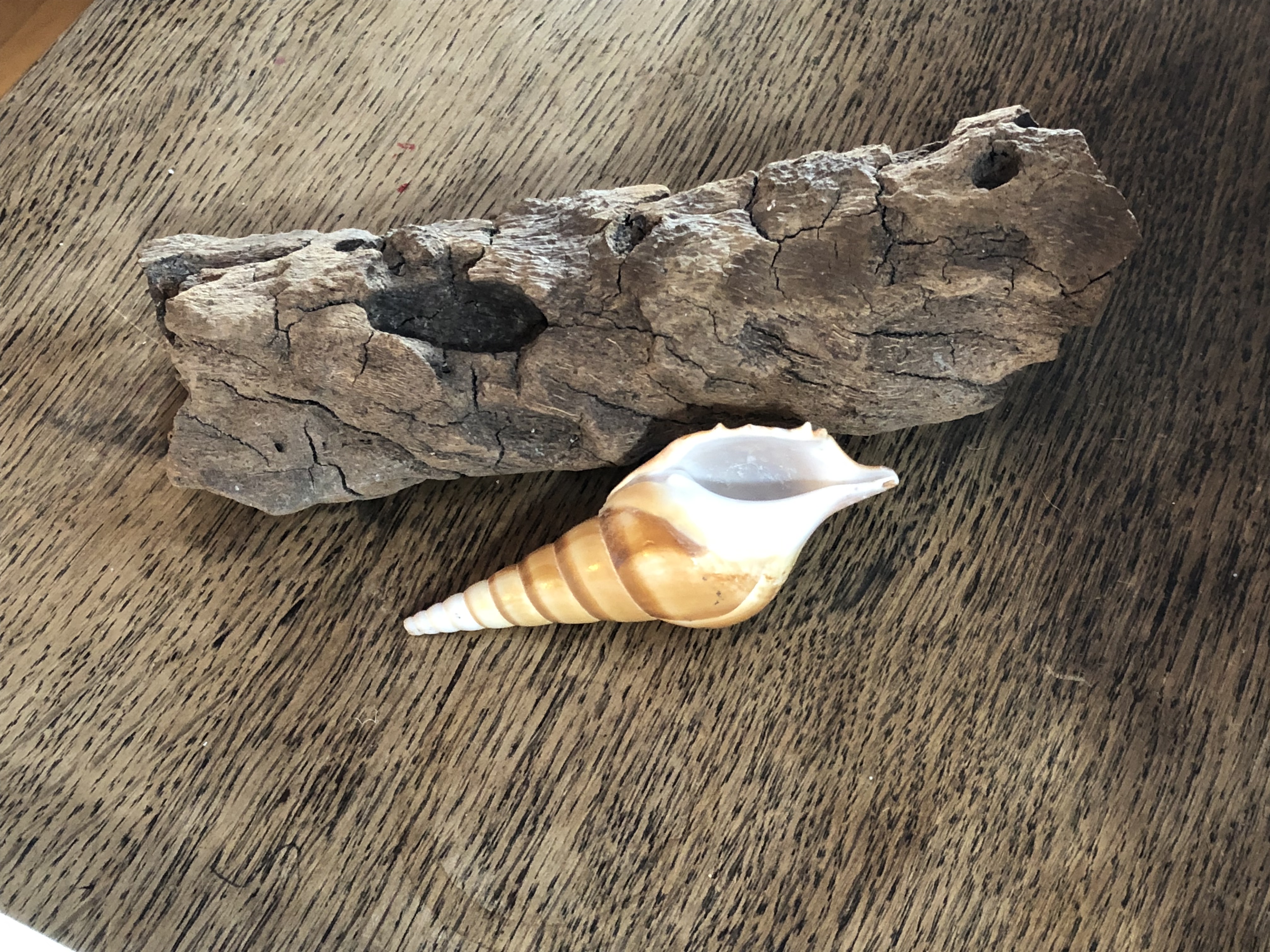
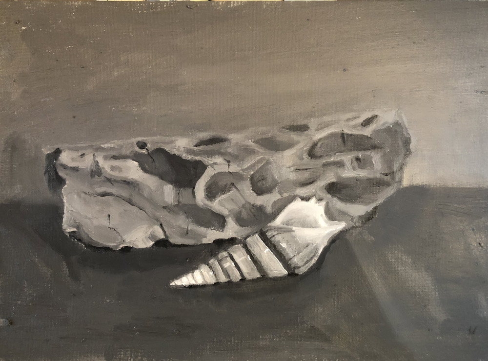
One good thing about being old is that I have TONS of stuff. Not expensive stuff, but small, interesting, highly-paintable things I’ve collected throughout the years — especially natural objects that I found in the woods or on the beach (though this shell was clearly bought somewhere — who finds shells like this?). I thought each of these two objects would be a challenging way to try texture, and would together provide an interesting contrast while sharing a beachy theme that made them cohesive (though I’m not worried about composition at this point).
My painting was done at a different angle, since I don’t have a standing easel.
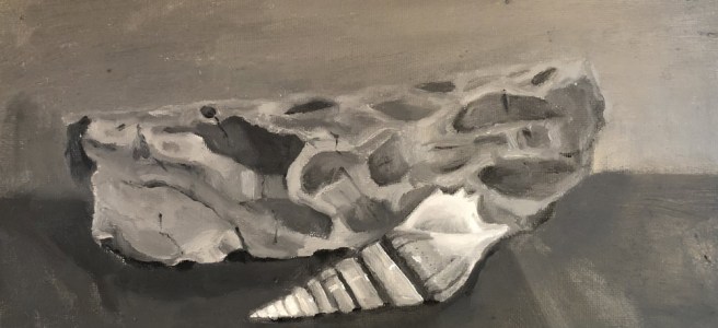
Now I wish I’d worried about composition. Blech. But there are some things here that I actually kind of like. I did a bang-up job with the top of my shell, and that was HARD. And I love the left side of my driftwood — I added a lot of interesting, blocky shading there that really shows the depth. But I can see the exact place where I started to get bored and lazy: pretty much in the exact center of the log. Everything to the right of that point is complete Amateurville Horror.
I’m struggling a bit — and this will be a question for Jim in my next class — with how much I’m supposed to draw. Of course I mapped out my largest shapes: the exterior of the driftwood and shell. And I did draw ovals for the largest indentations in the driftwood, and stripes for the spirals of the shell. But on the right side of the driftwood I mapped out next to nothing, in large part because the light when I did my initial drawing made most of the indentations look shallow and it didn’t seem worth it. As the sun came up, they looked…entirely different, but it seemed too late to map anything out, I was bored and lazy, and I winged it. And it shows.
I also had no idea what to do with the background, which was an old wooden table, as you see in the photo above. Should I attempt to replicate any of the grain, which in real life is so prominent? In the end, I just wanted to get it done — and, since I’d made the rookie mistake of not putting out enough paint, and what I had left of my mixed stuff was getting really thick and gummy — I just painted it pretty monochromatically. It was an afterthought — and again, it shows.
What I did well: Left side of the driftwood, which — to me — seems to have a spark of that unfussy, effortless(looking) blocky style that I love in modern painting The shell, while flawed, looks like…a shiny shell
What I could’ve improved: The composition — yawners Right side of the driftwood is lacking value and looks flat and unconvincing In real life, the shell is poking out slightly from the driftwood. That doesn’t come through in my painting — instead it just looks squat. I’m not sure what went wrong here — maybe the placement or value of the shadows? Again, that changed throughout my session, throwing me off. Background looks like an afterthought and entire subject appears to be floating in space.
Now that I knew how to shade, I figured the world was my oyster (and hey, the world was just a ball — and now I could paint that! ). So despite Jim’s admonitions for having gotten ahead of myself with my last rogue painting, I thought I’d dive in and try a still life. After all, I now had all the tools (including this handy-dandy Proportional Divider – how do I love thee!). Also, I’d been reading the highly motivational “Daily Painting,” by Carole Marine, and was inspired to try to fit painting into my life, well, daily.
Luckily, it was a Saturday, and Olive had a friend over, which meant she was entertained and I was free to have a marathon paint session. (Carole Marine talks about finishing small still lifes [lives?] within 1-3 hours, but I’m a very slow painter at this point.) As you may be realizing, I have a tendency to want to rush ahead (and that’s a GOOD thing), so I didn’t want to paint no stupid apple. Instead, I chose something a bit more challenging, but with very little color, so I wouldn’t be distracted (and wouldn’t be wanting what I just…couldn’t… have):
Was he the reason my hydrangeas wouldn’t grow?
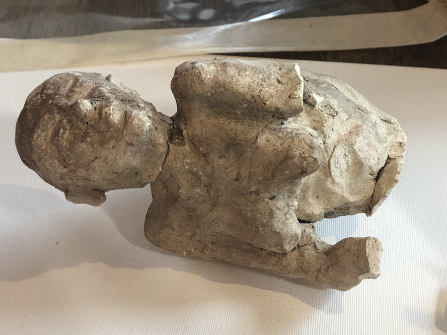
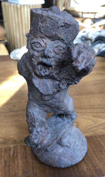
Until a couple of years ago, we lived in a house with a garden, and I was always digging in there and finding the coolest things: a marble foo dog; ancient farming equipment; two super-creepy iron sculptures which have nothing to do with this post but which I just have to show anyway; and the aforementioned slightly less cool…high school art project?…that I decided to use as my model.
Until this point, all of my paintings had been copied from another painting — working with a grid and very systematically plotting each point. I wasn’t even changing the scale or the positioning: The original paintings were the exact size we’d be painting them — we just created our paintings in the same corner of the canvas where they’d appeared on their clipboards, and taped off any overhang. When I’d sat down to paint a still life, I hadn’t thought about how big a leap it would be from our class assignments. After all, I knew how to shade now, and I already knew how to tone my canvas, and how to draw out my subject matter (and how to hold my paintbrush!). How hard could it be?
Turns out, very. Working without the grid, I found myself relying very heavily on my proportional divider. This is a tool that looks like an off-center X — on one side is a small pincer that you hold in front of your object to determine the length of a line or the width of a segment; on the other, a larger version of the same that opens or closes to show how that width would scale up or down, depending on your settings. It allows you to more easily scale up an item and still keep everything proportional, and is a godsend for those of us whose brains don’t work that way. But it’s slow to measure every little thing (as I’m always wont to do) and not always accurate, as a tiny miscalculation of the width on the small side can be a huge shift in width on the large side.
The other thing I found difficult was the lighting in my “studio.” Since I live in a small condo, my “studio” is really just a section of my living room. In attempting to make my painting more “daily,” I’ve carved out a period really — insanely — early in the morning, before anyone else is up and before I need to start work. This means I’m usually painting when it’s dark outside.
I wish I had a dedicated space in which to paint, but I can’t see it happening until, say, my daughter moves off to college (and unfortunately she’s not the next Doogie Houser). I’m loving learning to paint, but I’m not committed enough to, say, install florescent lighting in my beautiful public space.
Instead, I’ve been trying to make do, and my efforts have either been too minimal (where I can’t see my canvas or subject very well, and end up with little halos around everything) or too much (where I have a florescent bulb perched on a bookcase over my shoulder, making everything shadowy). I can’t seem to get it right.
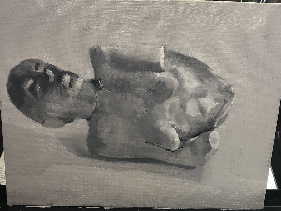
This first still-life shows my struggle. Since it was a Saturday, I was able to start in the afternoon, and the body shows that. But look at that weird dark face! By the time I got to that area, the sun had gone down, I had turned on my florescent, and the entire thing was in shadow, with my florescent spotlight dramatically illuminating the eye sockets and upturned nose. That would be fine it was consistent throughout the entire composition, but it’s completely out of place.
Likewise, I need to train myself to get up and take a break when I start to just. want. to. be. DONE. I’d reached that point before putting in any of the details in the stomach region, and it shows. Instead of the swirls of plaster, I’d basically just thrown in a mix of lighter and darker brush strokes, which looks cloudy rather than solid and scratchy.
Things I did well:
Top arm/shoulder shading and top boob Crack in plaster around neck (though the larger crack/hole is a bit much) Shadows under the body Proportions are reasonably accurate
Things I could improve:
Bottom boob looks like she has a skin disease Lighting on face Texture does not look rough enough (especially on stomach) Composition: Just plopped there, centered and floating in space.
At this point, I was already beginning to get a bit bored of our subject matter. It was bad enough that we were being forced to go back to the time before God invented color, but did we need to go back to when the world was flat as well? Especially because the assignment during the next class was to paint Dopey’s cousin, Pointy Dopey:
Sigh.
Luckily for us, however, before long we would finally be given the keys to the castle: shading!
Will I sound silly if I tell you just how excited I was for this assignment?
First Jim gave us a demonstration. Apparently there was more to it than simply smearing your paint together.
Careful, don’t cut yourself!
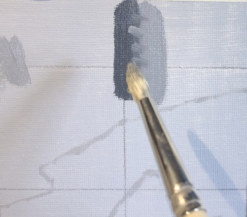
To soften an edge (for example, the edge of, say, a box) you first create your adjoining areas of color. (At this point, Jim began a story of his sister going to a sock hop — he must be older than I thought! — and his mother creating a dress for her out of two adjoining areas of fabric.)
Then you use a smaller brush to paint lines connecting the two areas. These could be one of the two colors or an intermediary color. (In the story — you guessed it — the lines were the thread.)
Finally, you take a large, clean, flat brush and brush over the two lines, wiping off your brush after each stroke. (I’m not sure how this fit into the story — it might’ve broken down a bit at that point.)
Then you go back and add sharpness where needed — and back and forth, back and forth until you’re satisfied.
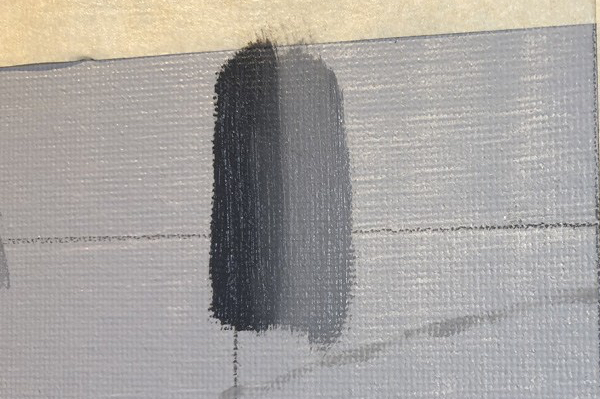
The difficult part of this assignment, though, was not the blurring (although that was harder than I expected once I tried it) — it was those dang angles! It seemed like every time I’d fiddle with the background shading, I’d shave off a bit of an angle here and there until the entire thing began to look quite Seussian. I’d been very careful in the drawing stage to use my brush as an “angle machine,” so it was pretty frustrating to see all that work go down the poop chute — plus I now needed to create them anew sans grid!
The finished product:
Could you please move those boxes out of my wa—What!? They’re paint?
In the few weeks I’ve been painting, I’ve realized how little I know about even its most basic tenets. I didn’t know — and now do — how to tone a canvas, how to clean and preserve my brushes, even how to hold a paintbrush. Now I was learning what I thought I knew as a four-year-old: how to put down paint.
After completing our drawings of Dopey and the Oven Mitt, it was time to fill them in. Prior to my rogue gun-jumping first painting, I would’ve thought that this process was easy-peasy — just like Paint by Numbers, right? Not, apparently, so fast.
As I’m learning, one of the keys to painting accurately is separating what you see from what you think you know. You think you know that the ocean is blue; if you don’t consciously work to erase that preconception, you’ll ignore the evidence before you and choose colors much less varied and interesting than what nature has presented. Likewise, you think your fingers are long and tapered, but from many angles they’re foreshortened and squat: Paint them as you think they are, and you’ll look like a cartoon.
It’s difficult work, erasing these preconceived notions. To do it, we need to rely on tricks that divorce our lines — which have no particular meaning — from the objects we’re painting, which are filled with it.
This process starts with our very first strokes. Rather than simply filling in our shape with paint, like we’ve all been taught to do throughout our lives, we instead paint in patches, silver-dollar-sized regions that might contain two or more different areas of color or value.
According to Jim, ideally you’d start with your darkest value, then medium, then light.
As I mentioned in my last post, we’re using the “fat over lean” process of painting — creating our paintings by laying down thin layers of paint that we then let dry before continuing to add to and revise. In order to keep the ability to revise the edges in future iterations, and to minimize the possibility that our surface will crack, we want to avoid the ridges that might come from having excess paint on our brushes when we come up to an edge. To do this we first touch down our brush well away from an edge and then paint toward it. Only when the paint has significantly thinned do we then paint along the edge.
Another way to make sure we’re not getting bamboozled by the “object-ness” of what we’re painting is to use a large hand mirror placed against our foreheads and reflecting on our painting and the subject we’re painting from, causing us to see them upside-down and backwards. This helps to break the connection between the shapes and lines that we’ve painted and the object that they represent, so that we can better see flaws in our angles, proportions, and values without the brain jumping in and trying to make our item look more vase-like, or hand-like, or in our case, oven-mitt-like.
So how did this all translate to Dopey and the Oven Mitt?
Remember, here was what I was painting:
And here’s the final product:
Wait — is that a perfect copy? Is she really that good?
No! Psych — they’re the same! I didn’t have access to the original, so I just showed my finished painting instead.
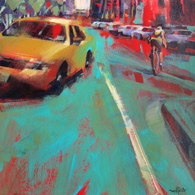
I’m a big fan of expressive painters like Carole Marine and Patti Mollica, and if you’re one of those people who can sit down for an hour or two, pile on the paint with a palette knife, and come away with something like this, you can just go f–
…find a quiet place to paint. This doesn’t apply to you.
Keep spreading that peanut butter, Patti!
Much improved!
But what if you’re a new painter, and it’s the visceral, immediate brushwork of Patti that makes your heart sing, rather than the smooth perfection of Leonardo? Shouldn’t you load up your brush, pour yourself an Old Fashioned (yum!) and go to town?
Now, what I did here is apparently a perfectly legitimate way to paint — it’s called alla prima, and it just means I did everything in one swell foop, creating the entire painting while everything was still good and wet. That would be all well and good if I liked it and didn’t want to go back.
But I don’t.
It’s ugly.
The trouble with alla prima for newbies like me is that it revs up the pressure. If you paint a big thick wet layer, it’s necessary to complete it in one sitting (or at least close-together sittings) for the obvious reason that it would be very difficult to revise all those ridges in the next go-round, and the less obvious — but more important — reason that painting a thin layer over a thicker layer will cause the surface to crack, as the top layer dries and the paint below remains wet and mobile at its core.
As a new painter, I’m still at the kids table. Don’t rush me when I’m trying to eat peas with a fork — that shit’s hard!
Instead, I want to be able to lay down a thin layer in the time I have allotted (usually the two hours of class), put the project down until the next class (or whenever), then pick it back up and refine, repeating as often as I like. (And if I don’t finish my layer, no worries!) I could even slap down a big, thick layer of expressive brushwork, alla patti, provided it’s on top. To avoid cracking, the rule you want to follow is “fat over lean”– always start with your leanest, thinnest layers (beginning with your toned canvas), and end with your thickest, most luscious.
But what about the amazing freedom that comes with painting fast, loose, and wet?
Wise woman, that Aunt Lydia.
In an upcoming post, I’ll return to “Dopey and the Oven Mitt,” to demonstrate how we created our layer (in this case, singular). Plus, the big reveal!
Most of the biggest fights I’ve ever had with my husband came down to the fact that I’m a take-charge, active person, and he’s a passive cow. (He might’ve framed these fights differently. It’s MY blog.) So after so sensitively drawing Dopey and the Oven Mitt, I was anxious to lay in some paint. I had a space above the fireplace ready for it, and I don’t like to wait. (And that’s a GOOD thing.)
Alas, class wasn’t for another week, and my drawing was still locked up in The Art Academy’s thermohygrometer-monitored (I assume) vaults. But now that I had da skillz, I could start over — I could keep moving ahead!
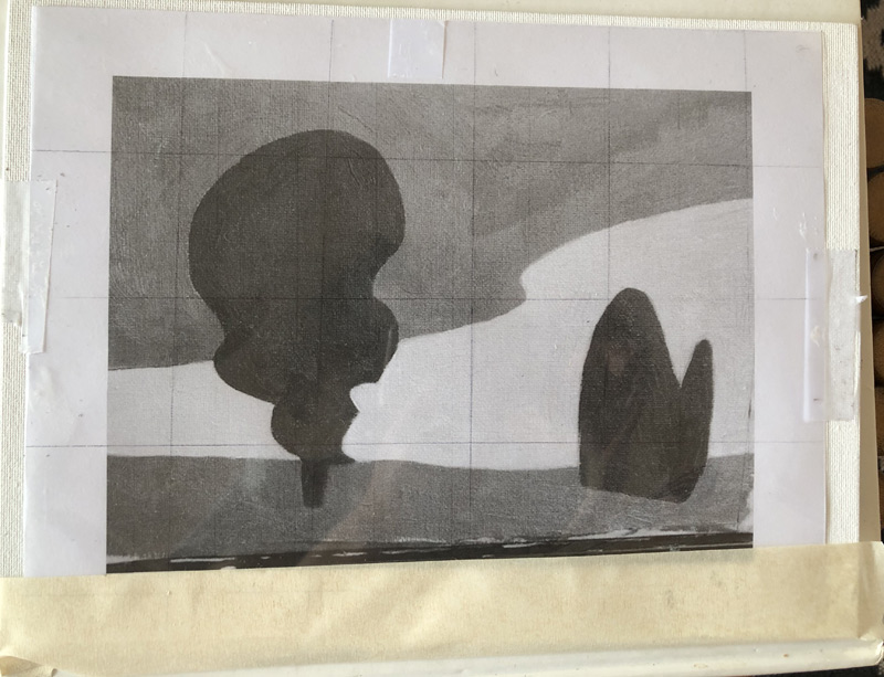
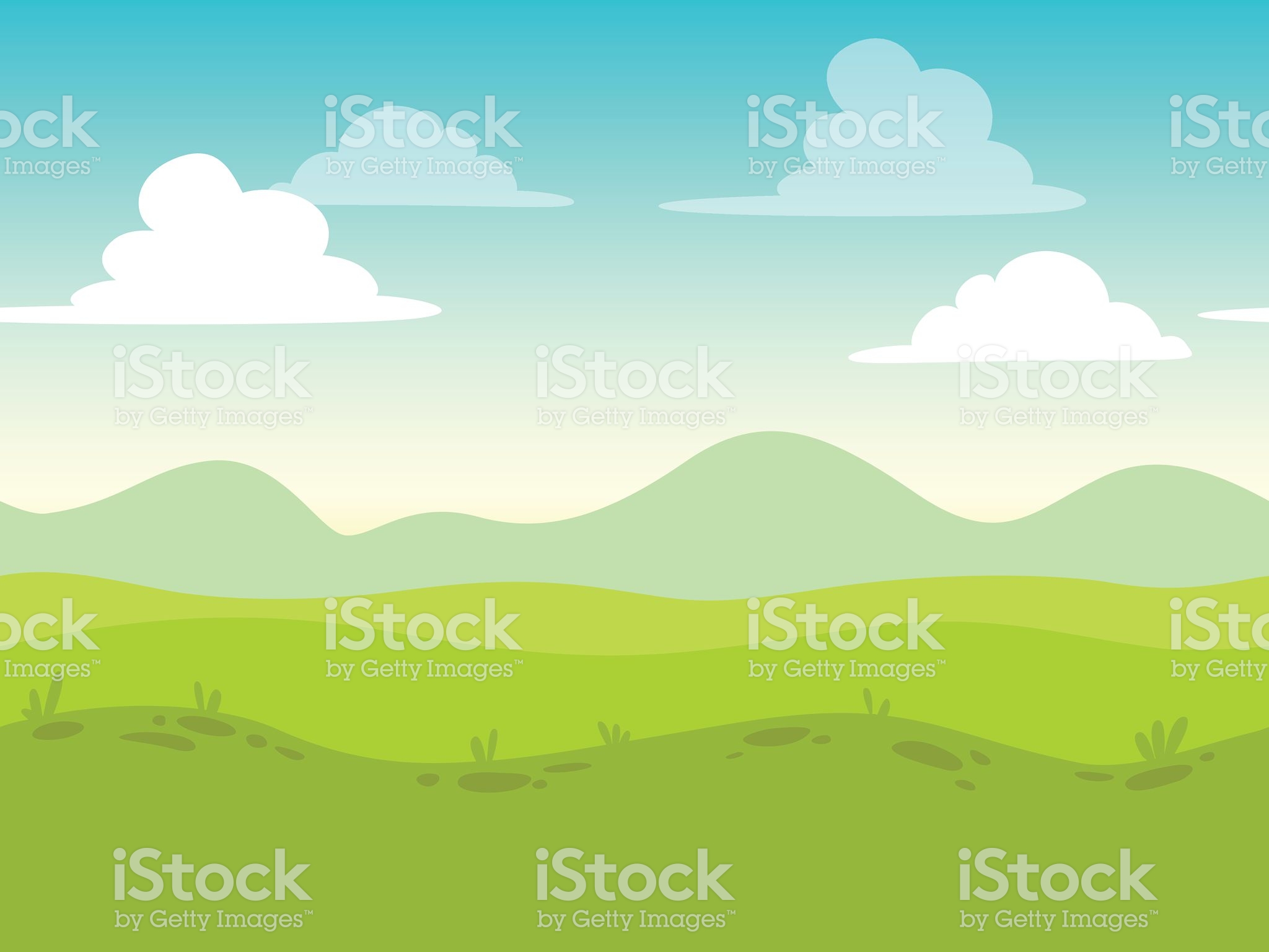
Unfortunately, I wasn’t able to find this particular work in any of my old art history books. Instead, I searched online for something with the same clean lines, and found this:
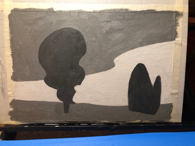
I knew I might have trouble with the little “iStock by Getty Images,” but the rest looked pretty easy. After all, I already knew how to tone my canvas, hold my paintbrush, prepare my palette, and draw with a grid. Also, I had been through childhood. I figured I got this.
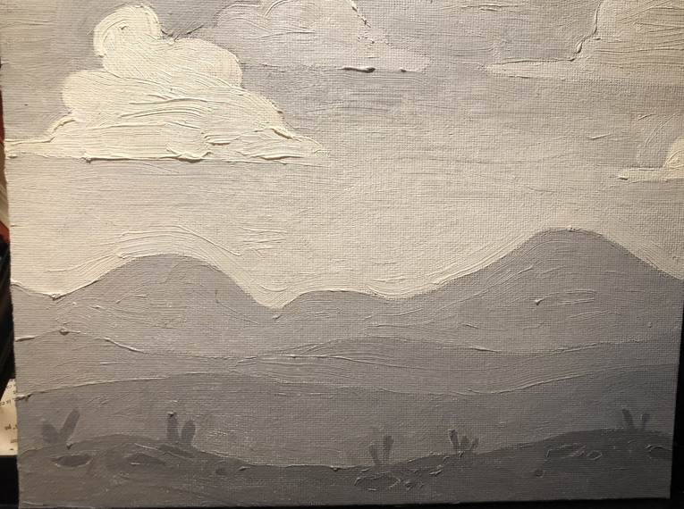
So after preparing my palette and grid and drawing my lines (and holding my paintbrush!), I picked out some greys to use. (I probably would’ve gone straight for color — I don’t like to wait — but we hadn’t bought any). And I painted.
Pretty good, right?
I mean, I knew I had some trouble with the little protuberances at the bottom — that I can blame on a bad lighting situation — but my curves looked pretty good, and I even did that cool gradient thing in the sky. We hadn’t even been taught that — extra credit!!
Then I brought it to class to show Jim.
I didn’t want to be one of those little suck-ups who does extra homework and then shows it off to the teacher — I know everyone hates that kid (I was that kid). So I framed it in terms of a question I really did want to know: When would I add the protuberances? Would I actually draw in those little details, or lay them in over the top of the other paint? But really, I wanted him to praise my natural talent. (I’m still a little suck-up at heart.)
He didn’t.
Jim is a very positive person, and I could see on his face that he was struggling mightily to say something kind. “It’s really great that you’re so…enthusiastic,” he managed. “But we’ll be talking more about the right way to put down paint in tonight’s demo.” The right way. Ouch.
The fact that there was a right way, though — even for such a simple painting — was obviously news to me. In my next post, I’ll show you what it was.