Fresh off the success of my “pigeon with a hat” painting, I thought I’d try something completely different: a duck in a hat! Maybe this will be my niche?
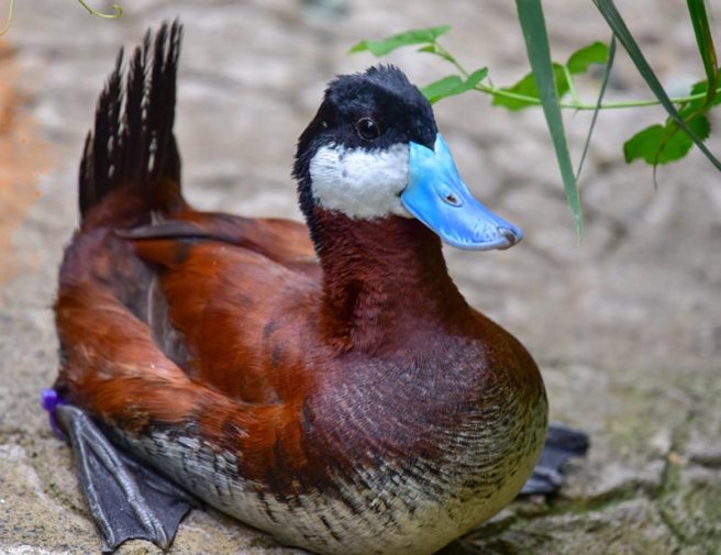
I’d originally anticipated painting a standard “barnyard” duck, but while looking for photos to study I came across this blue-billed marvel called a “ruddy duck.”
Copyright Sinclair Miller, Maryland Zoo in Baltimore
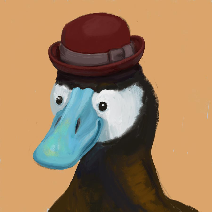
Here’s my original digital:
Good-lookin’ fella!
Apparently, my dapper gentleman is also a randy duck – the blue coloration only comes out when he’s hoping to mate (as does, of course, the stylin’ hat).
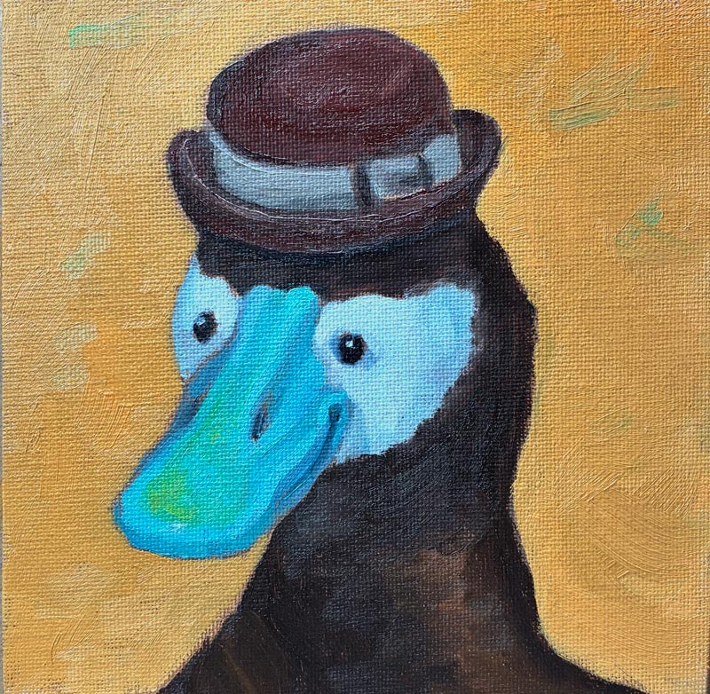
Since my pigeon was way off in her background-to-head ratio, I learned from my mistakes and blew up this feller larger in his frame than I’d originally drawn him. Then, rather than grid or freehand draw him like I did last time, I just printed out a black-and-white version of my digital drawing and used my graphite transfer paper to trace the lines of the black-and-white picture. But once again, I was foiled by my cheapness! Not wanting to waste too much printer ink, I used the “draft” setting, which created an image so washed-out and pixelated that I couldn’t follow the value changes, leading to mass confusion and a first painting that was yes, another “wiper.”
But we Irish-Lithuanians are made of strong stuff, and I set back in to try again. This time, I produced this:
Eek — need to up my photography game!
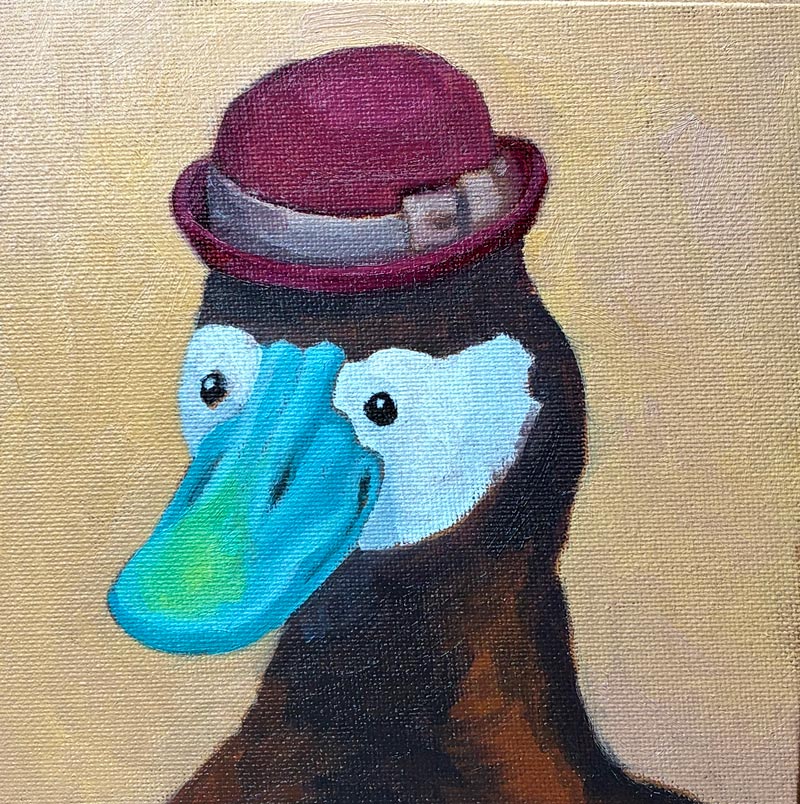
While it’s not terrible, and the beak turned out better than I’d expected in this second version, I made a giant mess of the hat — that little rim was tough! My background color, too, was not ideal: The orange—while a lovely color unto itself—is too saturated and draws attention away from the bill. Furthermore, Gemini had just told me that I should be painting with a 60/30 ratio of Gamsol to Walnut Alkyd, and my 50/50 mixture was too “fat.” So altogether, it seemed worth it to do one more pass, and begin to develop better processes and habits.
So, I went in for try 3, and produced this guy:
Mistakes, for sure — but altogether a very dapper gentleman!
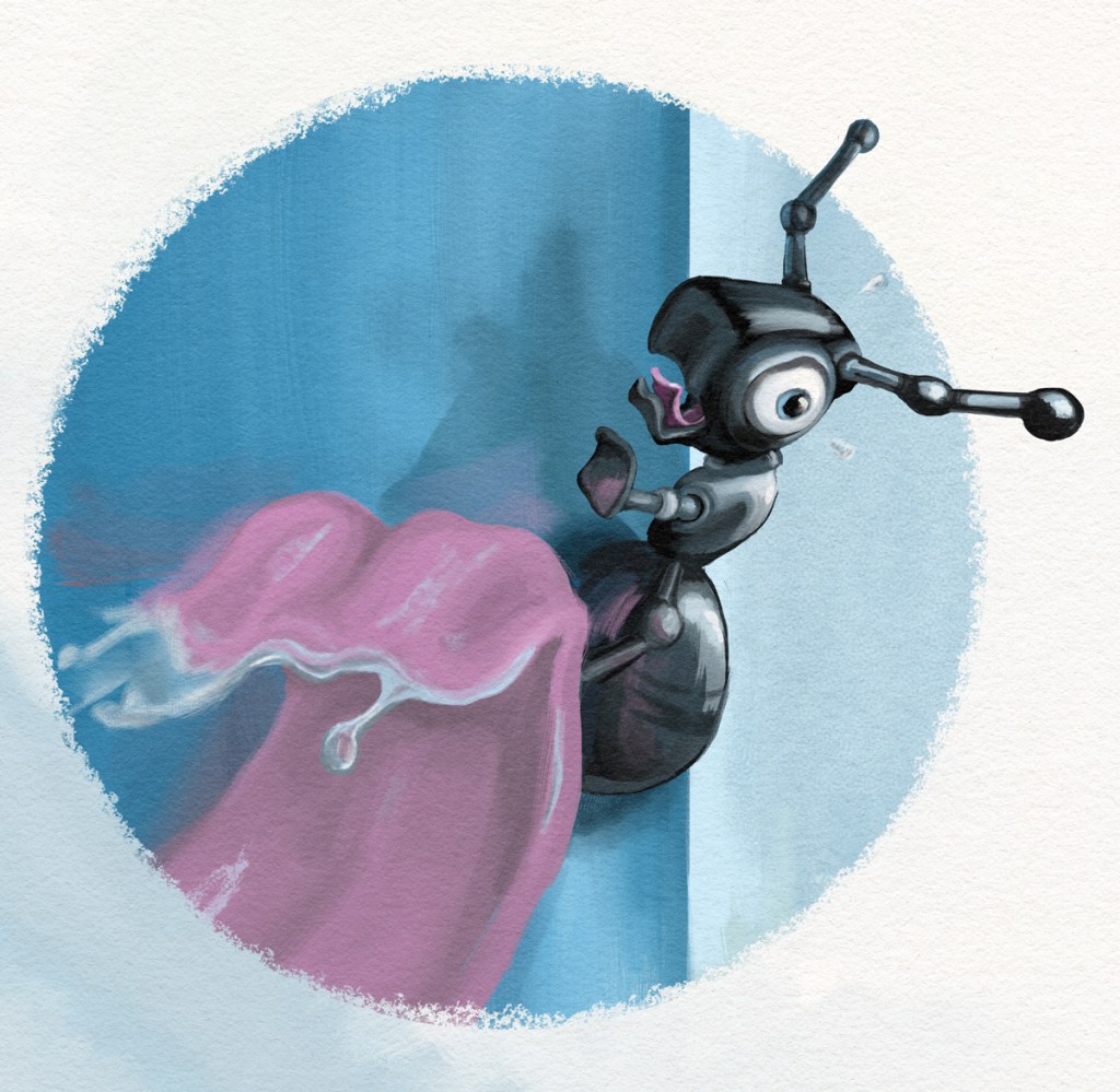
In my years of aspiring to be a children’s book illustrator, my “specialty” was emotive animals, like this terrified ant about to get scooped up by a hungry anteater:
So with my new dream of being an Etsy artist (no fine art aspirations for me!) I thought I’d see if I could create some original drawings that I would then attempt to recreate in actual paint.
What a pleasure to go back to digital after struggling with this new medium! And rather than worry about my finished product looking too “computer-y,” I could use my tools to figure out composition, expression, and color, and then give it the human touch in oils. This would also have the benefit of being reproducible, because I could grid it to create a template. I can almost smell the money!
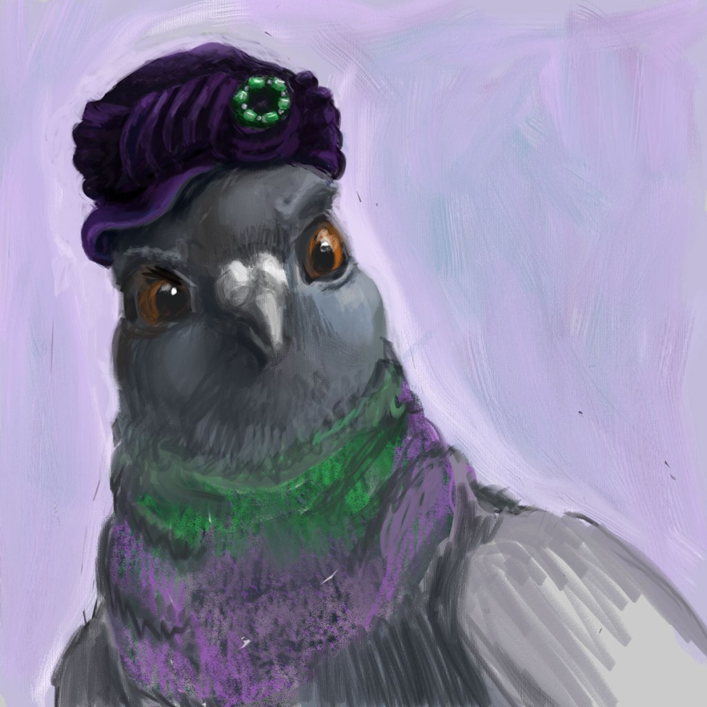
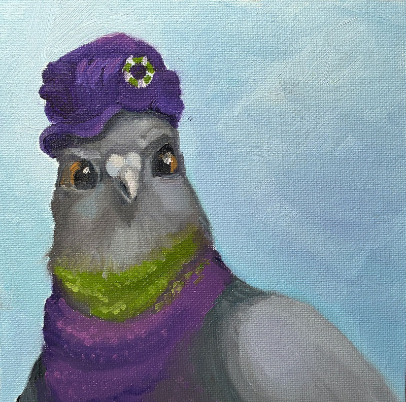
So, my first step was creating a picture of a pigeon in a hat. It’s rough, but I like her haughty expression and the rich purples and greens. I’m calling it “Well, I never!”:
Well, I never!
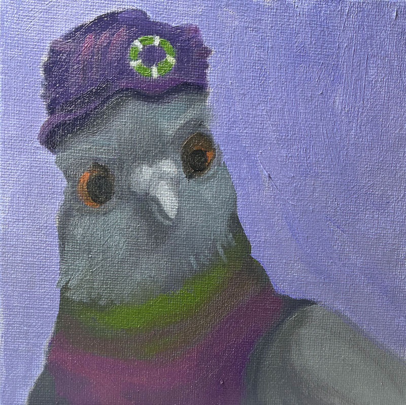
One thing I’d learned way back at the start of this blog was how to transfer an image onto canvas using a grid. In fact, I wrote a whole post about it. So I used Photoshop’s ruler with some guides, and marked the image on my screen into 6 1-inch squares, and then did the same on my canvas.
This method did indeed allow me to get (most of) the positioning correct, but it was time-consuming, and—frankly—pretty frickin boring, even for a tiny image. Moreover, I was once again tripped up by the actual painting, because in attempting to add detail in paint, everything got muddled again:
Clearly, I need professional advice! So I hopped over to one of my favorite cheap resources, Domestika, and watched the section on Portrait Painting with Oil that was part of this specialization series.
And I realized something — probably something obvious to anyone who’s been painting more than a week. I’d always heard that with alla prima, you were blending paint right on the canvas. But in the video, the artist mixed her paints for each section ahead of time. Sure, there was some blending on the canvas, and some in-between tones that she mixed up on the fly. But she wasn’t just getting close enough and then attempting to correct it on the canvas like I was. Instead, she was being planful — putting down all of her darkest tones (one stroke at a time), and then moving down the line until she’d finished every stroke of the subject’s skin.
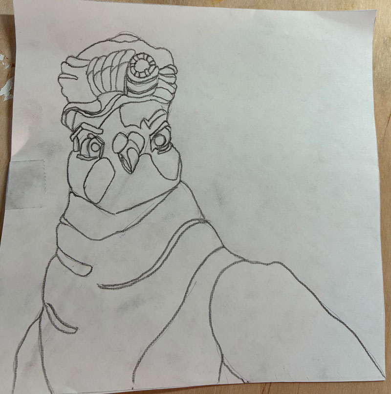
Worth a try! So, I started again — this time following the advice of my bestie Gemini and using Saral graphite transfer paper to first draw my pigeon on paper before transferring it to canvas:
Unfortunately, I did two things very wrong here. One — I attempted to avoid drudgery by free-drawing rather than gridding, which led to her having way too small a head and too big a background, and just being a bit “off” in her expression and physicality. Then, I thought it made sense for me to understand where all of my value changes were, so I added those lines right into my drawing, just like a paint-by-numbers. Yikes! Line overload! I ended up losing my way in them and having to once again edit on the canvas — though thankfully not as much as before.
But, but! I still think this represents a big leap forward for me. I’m sure I’ll cringe when I look back at this in a few months, but right now I’m feeling pretty proud!
Why painting 4 you ask? What became of 2 and 3? While I’ve sworn to document even my dismalest of efforts, I’m also not going to finish a painting that’s completely irredeemable (I’m lazy, remember. I’m also cheap — I’d rather save the paint and reuse the canvas).
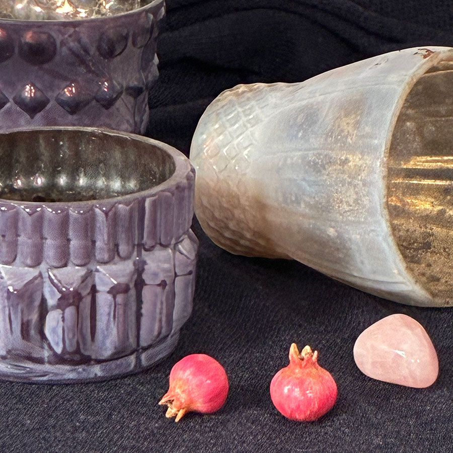
Since my bottle painting was such a raging success, I jumped right into another still life, this one even harder (cause that’s how I roll). Although I was painting from life and not a photo, this was the subject:
Pretty, right? Also very, very difficult. Now, over the years—since learning to draw from imagination at the tender age of 48—I’ve gotten pretty good at being able to picture something in my mind and draw it from any angle. But I need to really understand the form first, and I could not, for the life of me, understand the form of that purple candleholder at the left front. It has these sort of wedge shaped pieces radiating out like spokes, but the wedges are slightly rounded, and the top of the wedges are more triangular than the bottoms, which follow a gentle curve. Looking at it from a distance in my still life box, the random dark glaze plays all sorts of tricks of the eye so the whole thing just wasn’t making sense any more, and my paint kept getting gloppier and more muddled as I edited and edited.
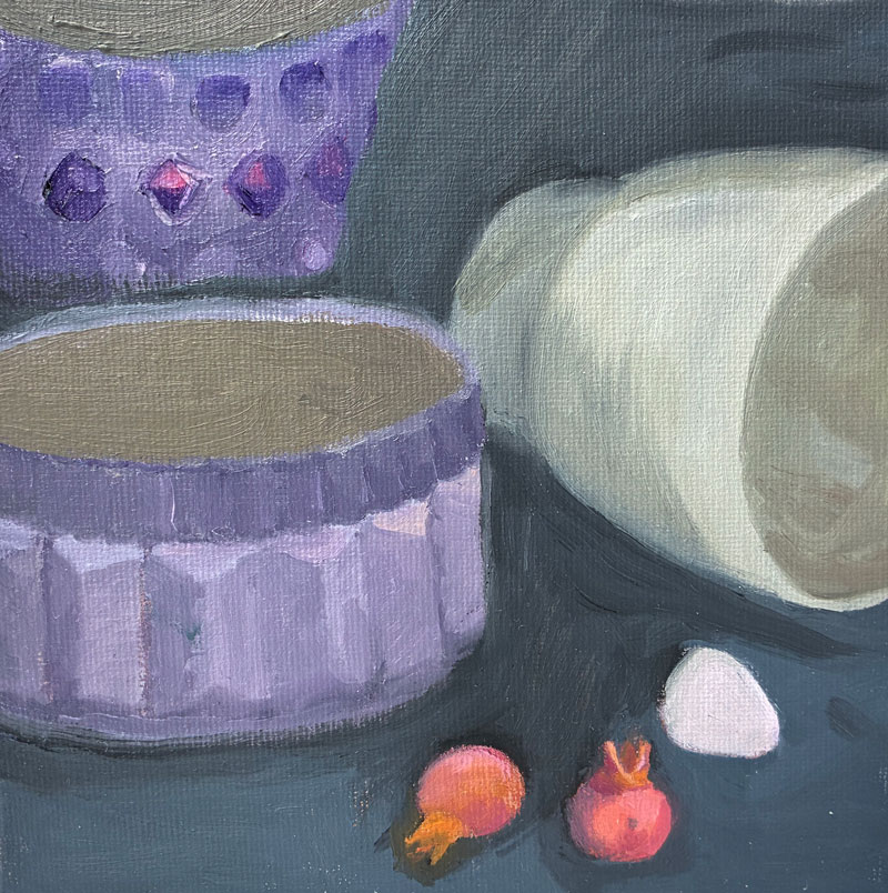
After two “wipers,” I finished a pass of this one:
Now, I say “a pass,” because even though I’m attempting to finish each painting in one sitting (à la alla prima), I was at a point where I could not add any more paint without it simply converging into the mud. So I thought I’d go back to the traditional method and wait for my paint to dry to the touch before adding more detail, finishing the insides of the cups, and perhaps editing.
A few days later, however, I was not keen to pick this one back up again, nor was I ready to start over with it before first learning more about what I’m doing wrong. I’ll save this one for the future.
In 1964, a Swedish tabloid unveiled the work of an “unknown French artist” by the name of Pierre Brassau. Critics rushed to praise him, with one prominent reviewer stating that “Pierre is an artist who performs with the delicacy of a ballet dancer.” The rub? “Pierre” was actually “Peter,” a seventeen-year-old, paint-eating, tantrum-throwing chimpanzee, gifted a set of paintbrushes to test whether critics could tell the difference between modern art and monkey art (yes, yes, I know chimps aren’t monkeys).
While Pierre’s work is more abstract than mine (…is attempting to be), our process is similar: alla prima, or wet-on-wet, a method by which a painting is completed in a single session rather than constructed from thin layers over a period time. Back in the early days of this blog, I was taking classes to learn to paint with this second (slooooowwww) method – as the Old Masters did – while also having a messy, dirty, passionate affair with the first. And when I decided to go back to painting, the first thing I did was dig up my old copy of Daily Painting, by the queen of effortless (-seeming) alla prima, Carol Marine.
Carol Marine
Oh, Carol. She’s like one of those fabulous French women who throw on mom jeans and a t-shirt and look like an it-girl, while me in the same clothes is more like Cousin-It-girl. Somehow the unstructured messiness of it all looks dynamic, passionate, effortlessly cool in her pieces, while in mine it looks like, well, monkey art:
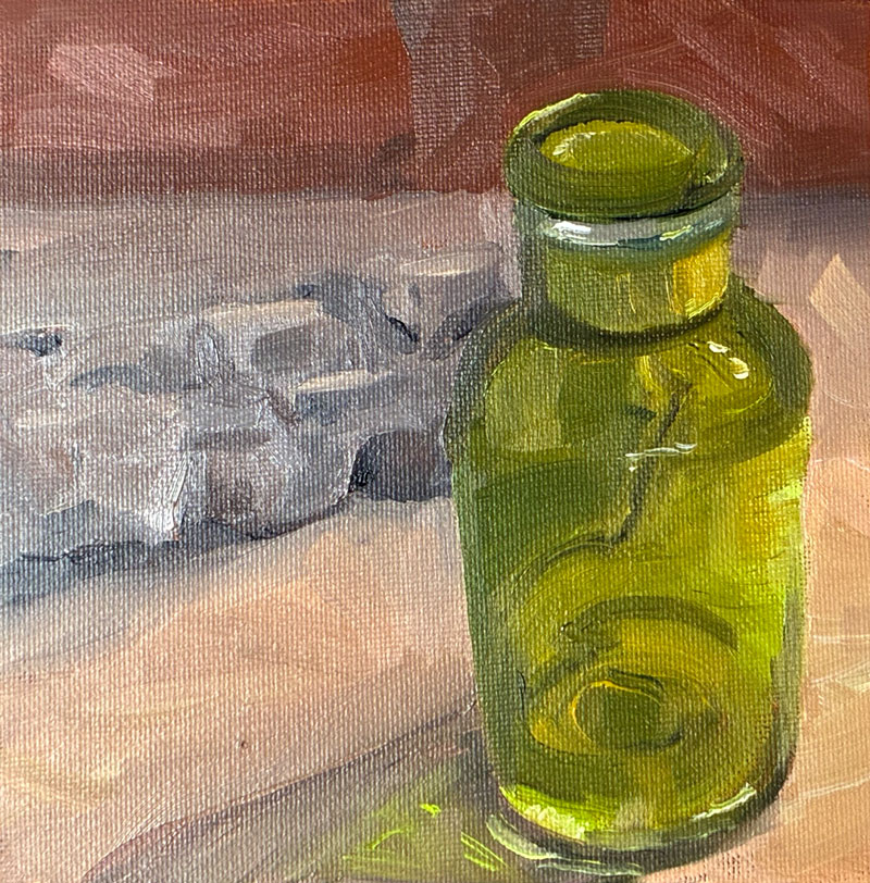
Looking at it now, I’m going to take back some of my charming self-deprecation to admit that there are actually aspects of this piece that I like. (Since writing this post, I’ve created a second painting that’s much worse than this one. You’ll see that one soon.) My bottle does indeed look like transparent glass. After wiping off my first attempt (and cursing myself for once again starting off with something too hard), I sketched out only those lines and value changes that were necessary to understand the form of the bottle, instead of once again getting lost in all those persnickety little details that the alla prima method struggles with. And taking Carol’s advice, I started my painting with the most saturated, pure patch of color – in this case, the chartreuse-y light on the right of the bottle – and once applied, left it the hell alone. So by that measure, I done good.
But what the heck is up with those proportions? Well, here rears the ugly head of my most prominent vice: laziness. In preparation for this still life, I’d made a still life box to control my light source – just a cardboard box with holes punched in the top and side for lights as seen on many a YouTube video.
Lazy moment #1 occurred when I realized my light-holes were too small and – rather than recut them – thought I’d use two rechargeable mini book lights instead of something more professional and permanent. And somewhere in the middle of painting, one of those lights died, and (lazy moment #2), I didn’t bother to replace the battery, thinking I could still see well enough.
But I couldn’t. That piece of driftwood in the back became a fuzzy hunk of grey, and (lazy moment #3), I thought I’d just paint it from imagination (instead of grabbing a new battery from the friggin next room) — which led me to envision it from the side rather than from the same top-down perspective I’d used for the bottle. Which led me to attempt to alter the top of the bottle to make it more side-on. And etc., etc. You give a mouse a cookie and all that.
And that’s the issue with alla prima, and why I fear it may not be for me. I’m much more of a “pantser” than a “planner,” and I love my control-Z. My process for artwork has always been to figure things out as I go along, and that just doesn’t work for a style that demands I get things right the first time.
But at least I’ve learned not to eat my paint. Onward!
Soon after I’d finished my trying-way-too-hard still life of stones, vase, and bowl, a couple of things happened that threw me out of my routine and kept me away from painting for awhile. The first (non-painting-related) was that I got a splinter. Since I realize that sounds pretty silly, let me say that I went through childbirth without drugs and I still think this experience might’ve been more painful. It was the kind of splinter that the doctor asks if you’d like to keep as evidence, and it was right in the meaty part of my foot. Suffice it to say, I wasn’t walking for while, let alone going to the gym (which had become, over the last 6 months, a valued part of my morning routine). It wasn’t long before I began to feel flabby, driftless, and depressed. Ugh.
The other painting-related thing that coincided was that I showed Jim the three latest paintings I’d done on my own: shell, bug, and stones. While I didn’t expect gushing (though a little part of me hoped for it!), I also didn’t expect…crickets. He looked at them silently a long time. Finally he asked, “What’s the light situation in the room where you paint?” I told him that light had been an issue for me — since I was trying to fit in an hour or so of painting every morning in between gym and work, I’d start when it was dark out, and then, when possible, do a bit more in the afternoon when it was light. Often that meant that I was seeing a very different view with each session: different details were apparent, and the differing shadows often dramatically affected the shapes and positions of the objects I was painting (which, in retrospect, was probably the reason for the warped wooden bowl in my last painting). I knew, of course, that this wasn’t ideal, but I didn’t realize it was a big deal — I’d been compensating (to some degree) by doing the shadow part of my drawing right before I started painting, so at least my shadows would be marked correctly. But to Jim, it was a non-starter.
“You’ve got to get your light situation under control,” he told me. “Don’t bother painting until you’ve fixed it.” Then, for the next ten minutes, he sketched out with me the position of all of my windows and gave me ideas for covering each. (My paintings must’ve really been bad, because he also sent me an email the next morning telling me “Don’t paint! You’ll never create a good painting until you have the right light!”)
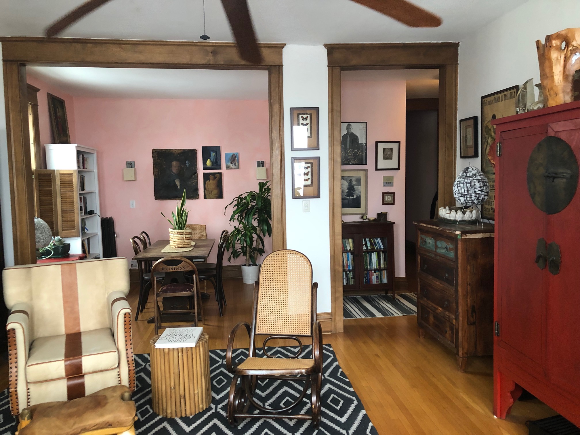
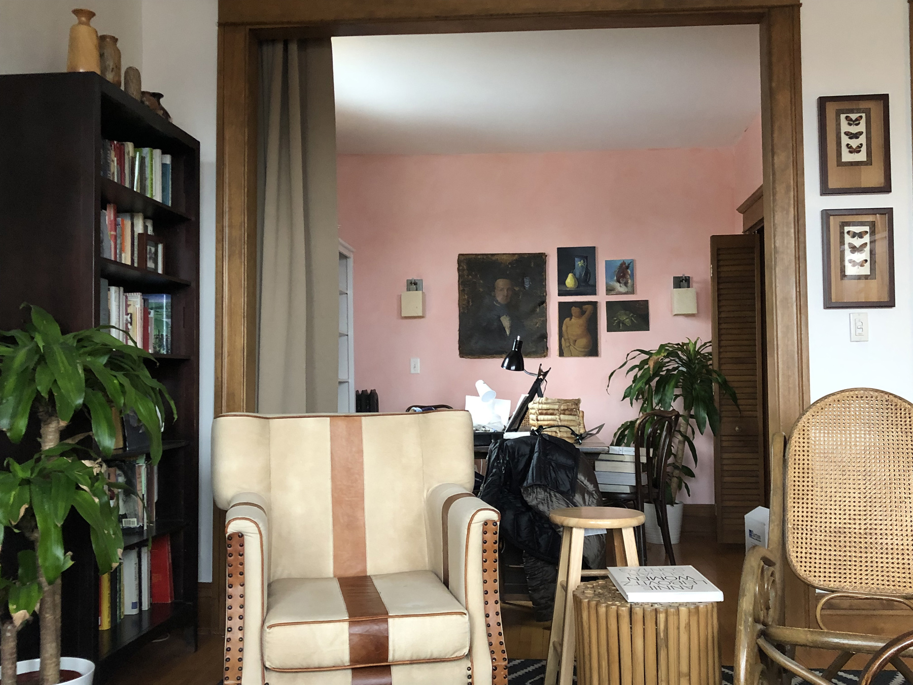
As I’ve mentioned before, I paint in an alcove off of my living room — a very public area. To my mind, it’s a beautiful room — I was so proud of my decorating job that last year I emailed Clever, Architectural Digest’s blog for poor people, to ask them to feature it in their home tour (I’m sure they’ll get back soon).
Hello, Gorgeous!
It’s bad enough that now that area is filled with crap — tabletop easels, lights, etc. (in fact, it’s making me sad looking at this “before” picture!) — the idea of modifying it to reduce the light (the very reason we bought the place!) was, well, not going to happen. But Jim seemed to understand my concerns and talked me through some fixes that could be removed when I wasn’t painting — a shower curtain, for example, that could be hung over the larger opening.
In the end, I invested in a system through RoomDividersNow that adds a track along the ceiling in about half the room, and a floor to ceiling room-dividing blackout curtain. That way I can simply drag the curtain to cover all three openings when I’m creating a still-life, and make it like midnight in there so I have complete control of my light. Then, I can tie back the curtain out of sight when I want everything pretty again (of course, I’d also need to pick up my shit).
This whole situation has gotten me thinking about sacrifices. I’d like to be good at painting, because it’s something I enjoy. There’s no real payoff for me in the future — I’m not, say, sacrificing the money and time to go to business school because I anticipate getting that back in the end. Other people understand that kind of sacrifice. But it’s difficult to justify — especially to myself — time and money spent trying to improve at something that’s simply for myself alone. And, unfortunately, so many of these sacrifices seem to come at the beginning of the learning process, when you can’t even tell yourself (and others) that you’re talented and somehow owe it to the world to nurture your gift. At this point, I’m a hack, and I might always be a hack, so why am I pouring money into art supplies, classes, ridiculously expensive room divider ceiling tracks? Why am I uglifying a room that’s always given me pleasure and pride? Why is my husband spending time with our daughter while I’m in my little curtained-off room? Does any of this make sense?