Can a shaky-handed art neophyte learn how to paint like the Old Masters?
Author: jcaritas
I'm a shaky-handed art neophyte, on a mission to learn to paint like the Old Masters, and to blog about it every step of the way. I'm also a partner at Tamarack Environmental Media Cooperative (though you'd never guess it from the number of times I use the words "paper towels" in my blog). I live with my husband Pete and daughter Olive in Saint Paul, MN. https://messtomastery.blog
Three weeks ago, my dog died. I’d lost other pets before, but Buddy was my shadow – my “heart” animal – and I wasn’t there to comfort him at the end. I’d written a long post about my grief and anguish, but I didn’t post it, and now I don’t want to.
Instead, let’s talk about painting.
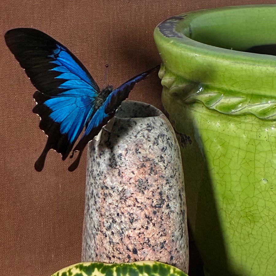
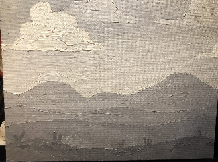
One of the struggles I’ve had – even when I took my first painting classes in my first go-round with this blog – is that I cannot seem to get my lighting right. I recently made strides with the lamp that lights my canvas and palette – investing in a fabulous dual-head “Duo Pro” to reduce the glare I was getting – but my still-life set-up is still pretty grim. I keep hearing that virtually anything will do – just buy a cheap clamp light! – but the shadows that I’m getting are way too…shadowy… and every scene I set up appears as a nighttime scene.
Which it is. Because the university where I work brought us back to the office four days a week (blech), and in Minnesota, that means that most days I’m never in my home during daylight (again, blech). It also meant that this particular still life was set up from what I could find in my studio (aka “the living room”) at 5 a.m. while trying not to wake my family.
In other words, me no likey.
The original set-up
But hey, I’ve got Photoshop! As much as I would love to be someone who consistently paints from life and not photos, it’s just not logistically workable for me – I don’t have room to keep a still life set up, I’ve got a lighting problem, I’m not always going to be able to paint something in a single sitting. So in this case, I thought I’d take my lousy photo of my lousy still life, and see if I could make something less lousy to paint.
One thing I’ve found helpful when choosing a composition is to zoom way, way out on a photo and see if it still makes sense at a tiny size: Does my eye go to the right place? Does it still look harmonious? Can I even tell what I’m looking at? Looking at my photos of this set-up, I realized there were simply too many competing values, and it was the leaf (as the most detailed and high-contrast item) rather than the butterfly (my intended focal point) that caught my eye.
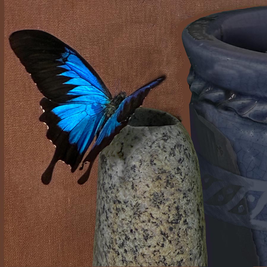
I started by working in Photoshop to crop out the leaf, mute the pot, lighten the butterfly shadow and bump up the saturation of his wing… everything I could do to ensure that the butterfly was the uncontested focal point.
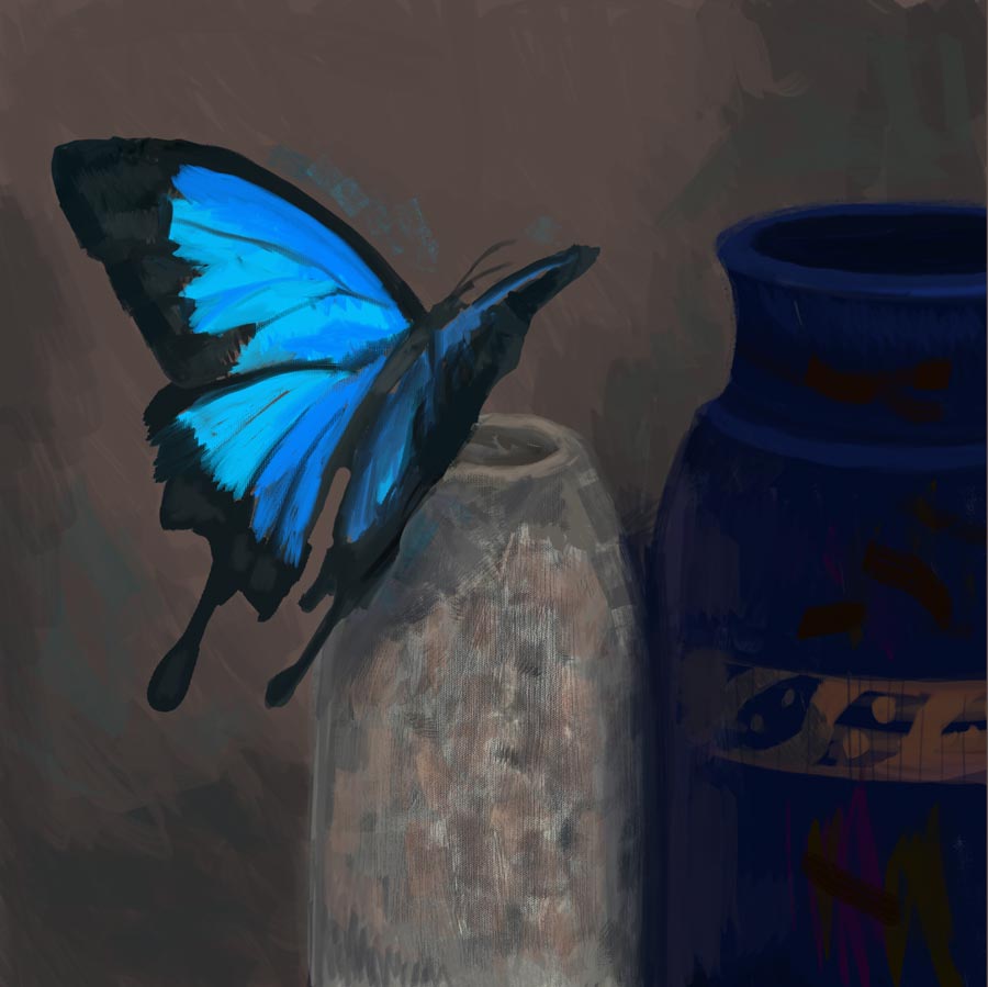
But that didn’t seem like enough — everything was still too mid-value and blah. So I continued to pick, until I’d basically recreated the whole thing in digital paint, completely reinventing the pot in the process:
A much cleaner composition!
This is why I’m moving away from digital — as much as I enjoyed “painting” this, it still looks pretty darn digital. But it does give me something to paint that simply wasn’t available to me in real life. (I wish I did own this pot, though — it’s pretty cool!)
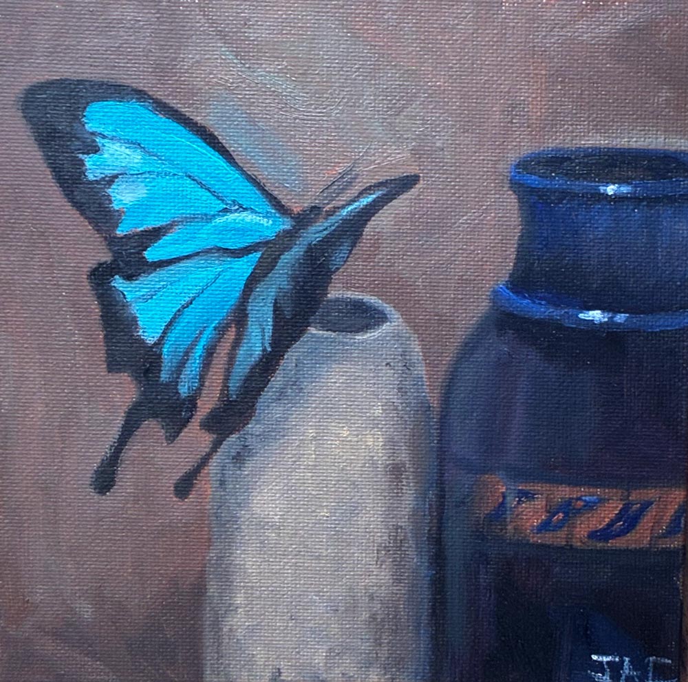
The finished product
This still isn’t great — it’s a bit…lifeless (even disregarding the dead insect that it’s built around). And unfortunately, I didn’t pay enough attention to my eye line, and the perspective is off. But I think I managed to take a sow’s ear and make it… a slightly prettier sow’s ear.
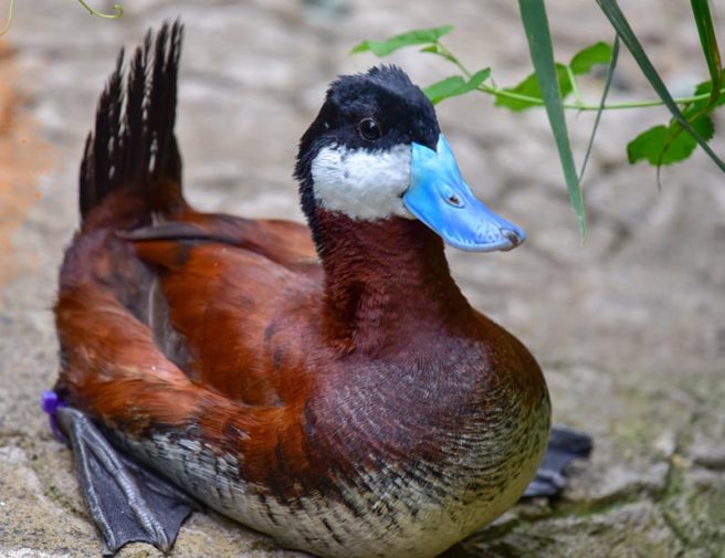
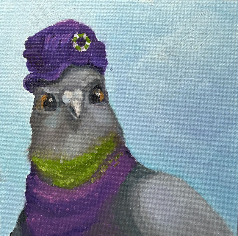
Fresh off the success of my “pigeon with a hat” painting, I thought I’d try something completely different: a duck in a hat! Maybe this will be my niche?
I’d originally anticipated painting a standard “barnyard” duck, but while looking for photos to study I came across this blue-billed marvel called a “ruddy duck.”
Copyright Sinclair Miller, Maryland Zoo in Baltimore
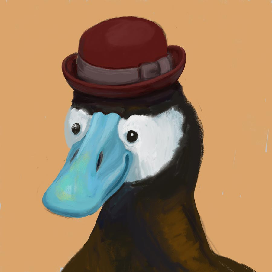
Here’s my original digital:
Good-lookin’ fella!
Apparently, my dapper gentleman is also a randy duck – the blue coloration only comes out when he’s hoping to mate (as does, of course, the stylin’ hat).
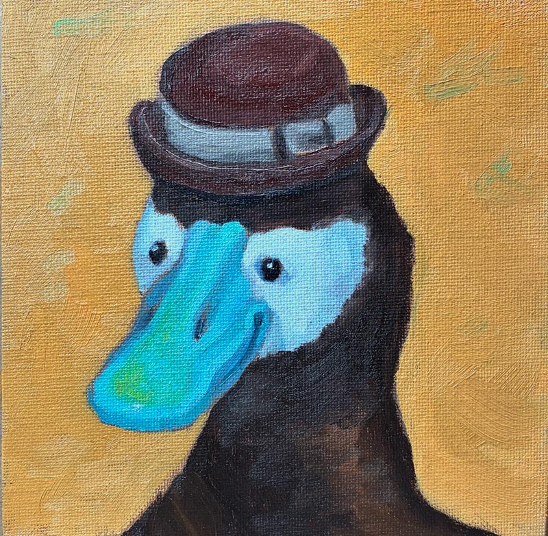
Since my pigeon was way off in her background-to-head ratio, I learned from my mistakes and blew up this feller larger in his frame than I’d originally drawn him. Then, rather than grid or freehand draw him like I did last time, I just printed out a black-and-white version of my digital drawing and used my graphite transfer paper to trace the lines of the black-and-white picture. But once again, I was foiled by my cheapness! Not wanting to waste too much printer ink, I used the “draft” setting, which created an image so washed-out and pixelated that I couldn’t follow the value changes, leading to mass confusion and a first painting that was yes, another “wiper.”
But we Irish-Lithuanians are made of strong stuff, and I set back in to try again. This time, I produced this:
Eek — need to up my photography game!
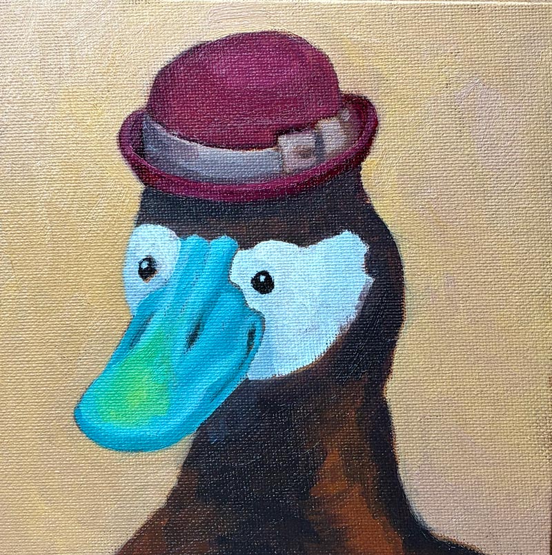
While it’s not terrible, and the beak turned out better than I’d expected in this second version, I made a giant mess of the hat — that little rim was tough! My background color, too, was not ideal: The orange—while a lovely color unto itself—is too saturated and draws attention away from the bill. Furthermore, Gemini had just told me that I should be painting with a 60/30 ratio of Gamsol to Walnut Alkyd, and my 50/50 mixture was too “fat.” So altogether, it seemed worth it to do one more pass, and begin to develop better processes and habits.
So, I went in for try 3, and produced this guy:
Mistakes, for sure — but altogether a very dapper gentleman!
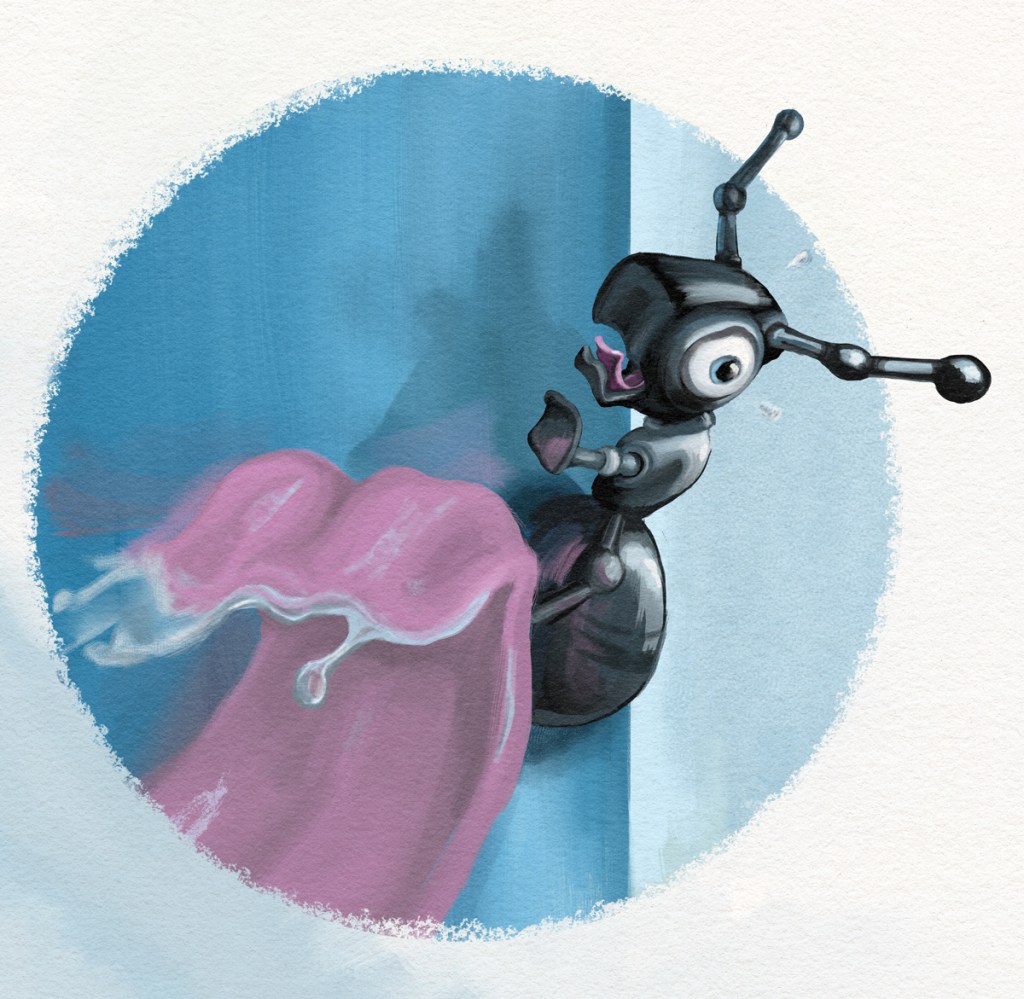
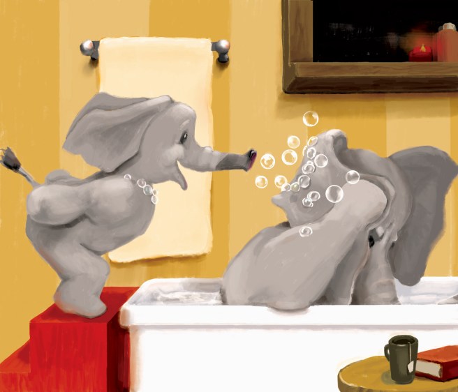
In my years of aspiring to be a children’s book illustrator, my “specialty” was emotive animals, like this terrified ant about to get scooped up by a hungry anteater:
So with my new dream of being an Etsy artist (no fine art aspirations for me!) I thought I’d see if I could create some original drawings that I would then attempt to recreate in actual paint.
What a pleasure to go back to digital after struggling with this new medium! And rather than worry about my finished product looking too “computer-y,” I could use my tools to figure out composition, expression, and color, and then give it the human touch in oils. This would also have the benefit of being reproducible, because I could grid it to create a template. I can almost smell the money!
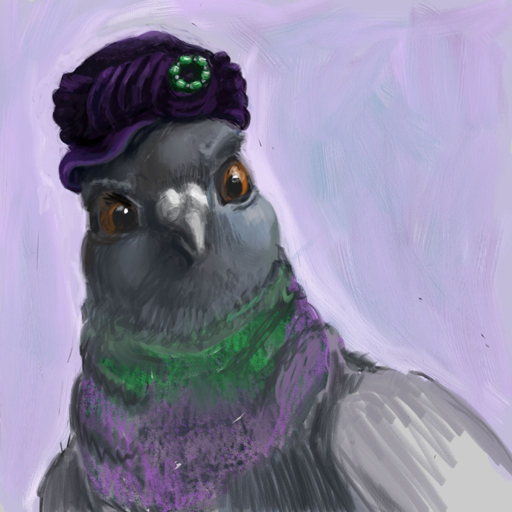
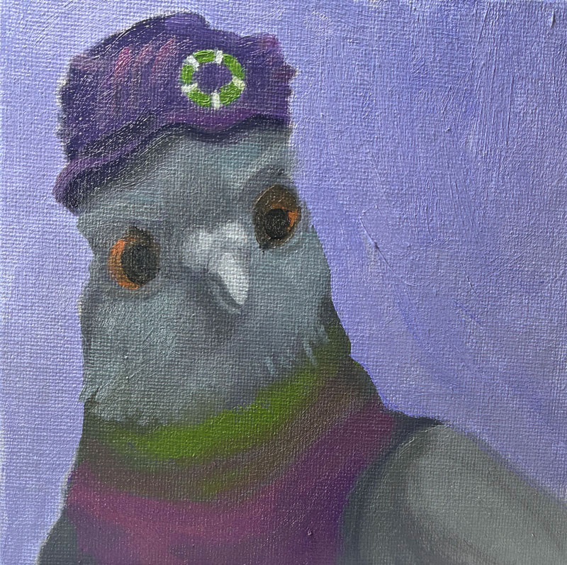
So, my first step was creating a picture of a pigeon in a hat. It’s rough, but I like her haughty expression and the rich purples and greens. I’m calling it “Well, I never!”:
Well, I never!
One thing I’d learned way back at the start of this blog was how to transfer an image onto canvas using a grid. In fact, I wrote a whole post about it. So I used Photoshop’s ruler with some guides, and marked the image on my screen into 6 1-inch squares, and then did the same on my canvas.
This method did indeed allow me to get (most of) the positioning correct, but it was time-consuming, and—frankly—pretty frickin boring, even for a tiny image. Moreover, I was once again tripped up by the actual painting, because in attempting to add detail in paint, everything got muddled again:
Clearly, I need professional advice! So I hopped over to one of my favorite cheap resources, Domestika, and watched the section on Portrait Painting with Oil that was part of this specialization series.
And I realized something — probably something obvious to anyone who’s been painting more than a week. I’d always heard that with alla prima, you were blending paint right on the canvas. But in the video, the artist mixed her paints for each section ahead of time. Sure, there was some blending on the canvas, and some in-between tones that she mixed up on the fly. But she wasn’t just getting close enough and then attempting to correct it on the canvas like I was. Instead, she was being planful — putting down all of her darkest tones (one stroke at a time), and then moving down the line until she’d finished every stroke of the subject’s skin.
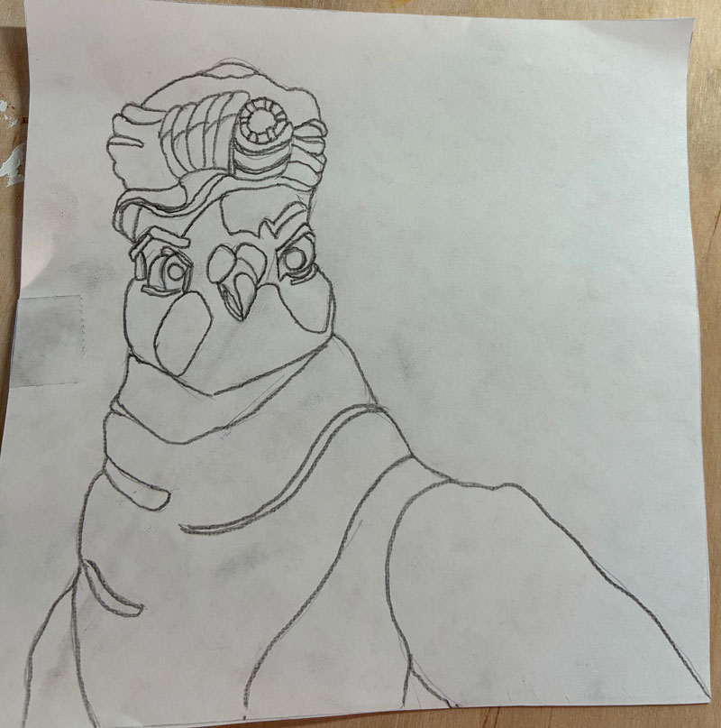
Worth a try! So, I started again — this time following the advice of my bestie Gemini and using Saral graphite transfer paper to first draw my pigeon on paper before transferring it to canvas:
Unfortunately, I did two things very wrong here. One — I attempted to avoid drudgery by free-drawing rather than gridding, which led to her having way too small a head and too big a background, and just being a bit “off” in her expression and physicality. Then, I thought it made sense for me to understand where all of my value changes were, so I added those lines right into my drawing, just like a paint-by-numbers. Yikes! Line overload! I ended up losing my way in them and having to once again edit on the canvas — though thankfully not as much as before.
But, but! I still think this represents a big leap forward for me. I’m sure I’ll cringe when I look back at this in a few months, but right now I’m feeling pretty proud!
Why painting 4 you ask? What became of 2 and 3? While I’ve sworn to document even my dismalest of efforts, I’m also not going to finish a painting that’s completely irredeemable (I’m lazy, remember. I’m also cheap — I’d rather save the paint and reuse the canvas).
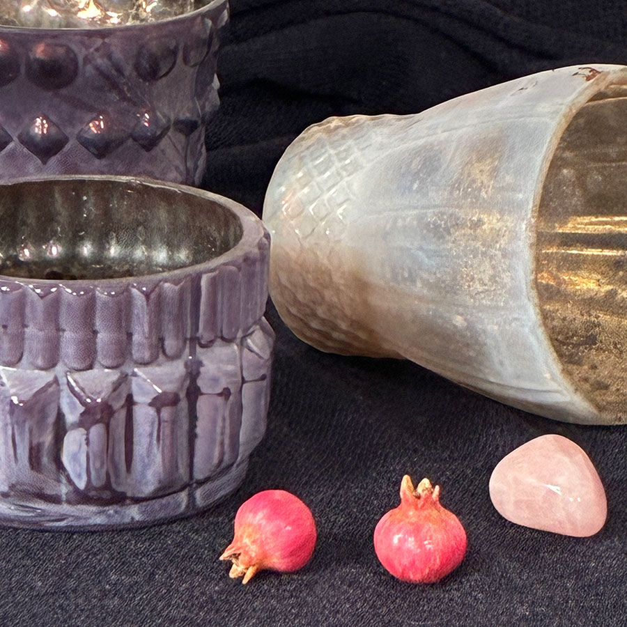
Since my bottle painting was such a raging success, I jumped right into another still life, this one even harder (cause that’s how I roll). Although I was painting from life and not a photo, this was the subject:
Pretty, right? Also very, very difficult. Now, over the years—since learning to draw from imagination at the tender age of 48—I’ve gotten pretty good at being able to picture something in my mind and draw it from any angle. But I need to really understand the form first, and I could not, for the life of me, understand the form of that purple candleholder at the left front. It has these sort of wedge shaped pieces radiating out like spokes, but the wedges are slightly rounded, and the top of the wedges are more triangular than the bottoms, which follow a gentle curve. Looking at it from a distance in my still life box, the random dark glaze plays all sorts of tricks of the eye so the whole thing just wasn’t making sense any more, and my paint kept getting gloppier and more muddled as I edited and edited.
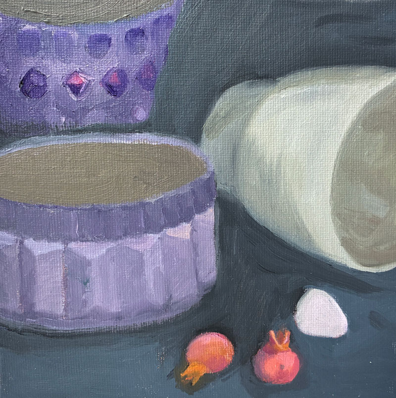
After two “wipers,” I finished a pass of this one:
Now, I say “a pass,” because even though I’m attempting to finish each painting in one sitting (à la alla prima), I was at a point where I could not add any more paint without it simply converging into the mud. So I thought I’d go back to the traditional method and wait for my paint to dry to the touch before adding more detail, finishing the insides of the cups, and perhaps editing.
A few days later, however, I was not keen to pick this one back up again, nor was I ready to start over with it before first learning more about what I’m doing wrong. I’ll save this one for the future.
In 1964, a Swedish tabloid unveiled the work of an “unknown French artist” by the name of Pierre Brassau. Critics rushed to praise him, with one prominent reviewer stating that “Pierre is an artist who performs with the delicacy of a ballet dancer.” The rub? “Pierre” was actually “Peter,” a seventeen-year-old, paint-eating, tantrum-throwing chimpanzee, gifted a set of paintbrushes to test whether critics could tell the difference between modern art and monkey art (yes, yes, I know chimps aren’t monkeys).
While Pierre’s work is more abstract than mine (…is attempting to be), our process is similar: alla prima, or wet-on-wet, a method by which a painting is completed in a single session rather than constructed from thin layers over a period time. Back in the early days of this blog, I was taking classes to learn to paint with this second (slooooowwww) method – as the Old Masters did – while also having a messy, dirty, passionate affair with the first. And when I decided to go back to painting, the first thing I did was dig up my old copy of Daily Painting, by the queen of effortless (-seeming) alla prima, Carol Marine.
Carol Marine
Oh, Carol. She’s like one of those fabulous French women who throw on mom jeans and a t-shirt and look like an it-girl, while me in the same clothes is more like Cousin-It-girl. Somehow the unstructured messiness of it all looks dynamic, passionate, effortlessly cool in her pieces, while in mine it looks like, well, monkey art:
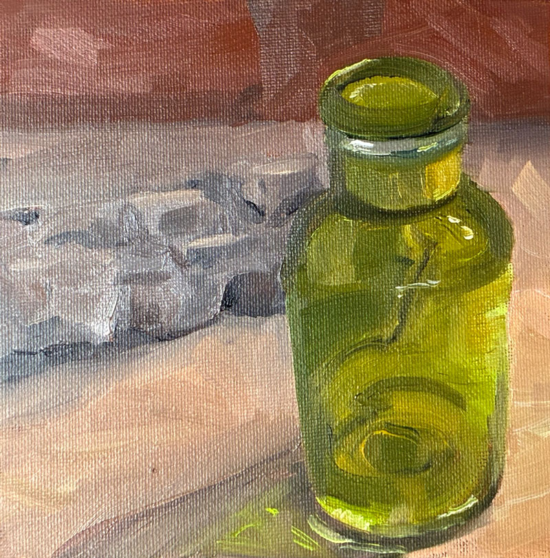
Looking at it now, I’m going to take back some of my charming self-deprecation to admit that there are actually aspects of this piece that I like. (Since writing this post, I’ve created a second painting that’s much worse than this one. You’ll see that one soon.) My bottle does indeed look like transparent glass. After wiping off my first attempt (and cursing myself for once again starting off with something too hard), I sketched out only those lines and value changes that were necessary to understand the form of the bottle, instead of once again getting lost in all those persnickety little details that the alla prima method struggles with. And taking Carol’s advice, I started my painting with the most saturated, pure patch of color – in this case, the chartreuse-y light on the right of the bottle – and once applied, left it the hell alone. So by that measure, I done good.
But what the heck is up with those proportions? Well, here rears the ugly head of my most prominent vice: laziness. In preparation for this still life, I’d made a still life box to control my light source – just a cardboard box with holes punched in the top and side for lights as seen on many a YouTube video.
Lazy moment #1 occurred when I realized my light-holes were too small and – rather than recut them – thought I’d use two rechargeable mini book lights instead of something more professional and permanent. And somewhere in the middle of painting, one of those lights died, and (lazy moment #2), I didn’t bother to replace the battery, thinking I could still see well enough.
But I couldn’t. That piece of driftwood in the back became a fuzzy hunk of grey, and (lazy moment #3), I thought I’d just paint it from imagination (instead of grabbing a new battery from the friggin next room) — which led me to envision it from the side rather than from the same top-down perspective I’d used for the bottle. Which led me to attempt to alter the top of the bottle to make it more side-on. And etc., etc. You give a mouse a cookie and all that.
And that’s the issue with alla prima, and why I fear it may not be for me. I’m much more of a “pantser” than a “planner,” and I love my control-Z. My process for artwork has always been to figure things out as I go along, and that just doesn’t work for a style that demands I get things right the first time.
But at least I’ve learned not to eat my paint. Onward!
Five years ago (yikes!) I wrote my final post for this blog, having succeeded in my goal of painting like the Old Masters.
Haha. No.
In fact, as you can see from the cringeworthy pancake image displayed at the top of that post, my trajectory had gone in a very different direction — digital. Since my goal over the past five-plus years had been to write and illustrate a children’s book, keeping things on the computer seemed to make sense: I could compose, edit, resize and reposition, experiment, all without the drudgery of thumbnailing or the need to start over to make changes. How easy, convenient, wonderfully freeing!
But even though I loved the process, I never quite loved the results. While I became better at capturing the emotion and positioning of my characters, I couldn’t help feeling that there was an “uncanny valley” quality to my brushstrokes. I was attempting to simulate oil painting…
…but no one would confuse the two, no matter how many pressure-sensitive brushes and canvas-simulating overlays I used. Meanwhile, my dream of being in bookstores felt further away than ever. I’d taken class after class in both writing and illustrating – even diving into an intensive semester at Hamline’s MFA in Writing for Children – but, frankly, no one wants to buy what I’m selling.
So. I’m taking a step back. Rather than continuing to create work that lives only in my computer, reliant on outside gatekeepers to see the light of day, I’ve decided to go back to my original passion: oil painting. I’ll be once again delving into still lives (lifes?), but more than that, I want to see if I can transfer the skills I built from five years of creating narrative art into original paintings… that I can then sell on Etsy for oodles of money. And once again, I’ll be documenting everything: the bad, the ugly, and hopefully eventually the good(ish).
In my last post, I wrote about programs that have helped me begin to overcome the main challenge in learning to draw: understanding form in 3-d space. In this post, I want to give a shout out to my absolute favorite resources in a bunch of different categories. And hey, if anyone’s reading this and wants to share theirs as well, please do!!
Anatomy
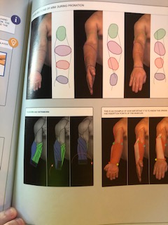
Proko’s anatomy classes are da bomb, no doubt. But for me, the benefits of them were the model poses (and subsequent draw-alongs) and the e-books. Sure, I’d watch the videos, and they were cute and sometimes laugh-aloud funny — but I don’t really learn that way. I’d watch them once, but any information I absorbed was really through the e-books — videos are simply too fast for my middle-aged brain. Sometimes, unfortunately, the e-books didn’t show enough different poses to make me understand (especially with the forearms — don’t know what God was thinking with those things) and in those cases I needed other references. I have lots of anatomy books, but the ones I find myself referring to most often, are:
Artistic Anatomy by Paul Richer and Robert Beverly Hale. Honestly, this is less of a shout-out than a half-hearted mumble. I don’t particularly like this book: Most of it is text (I wonder if anyone, anywhere has ever read it?), and the limited number of drawings at the end are really grainy and, again, limited in number. BUT every muscle is labeled, and we do see at least a few different angles of each body part, making it the best book I have for looking up a particular muscle by name. If anyone knows of a better one, though, do tell.
Morpho, Simplified Forms by Michel Lauricella. This is a teeny tiny book of unlabeled sketches of different body parts, with muscles broken down by group rather than individually. When I have trouble getting my mind around the shape of something (such as those dang twisty forearms), it’s been helpful to refer to this to see it broken down into its, well, simplified form.
However, my most favorite of all anatomy books is:
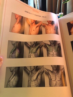
Anatomy for Sculptors by Uldis Zarins and Sandis Kondrats. This is the most money I’ve ever spent on a book. Ever. I think my fingernails were sweating as I pressed the order button. But I don’t regret buying it — what I regret is all the other ones I bought when I should’ve just pulled the trigger on this one to begin with. What I like about this book is that each area of the body is photographed in several different poses, and then each of these photo sets is repeated with the muscle groups overlayed in a particular color. This same color is used every time you see those muscles in other poses, so it really clarifies what’s happening when a particular muscle seems to be in the neck in one pose and the butt in another (perhaps a SLIGHT exaggeration). Like this:
There’s very little text or labeling here, but they do have helpful little asides throughout that help you understand some of the trickier areas. Like this:
Nope, still not getting it. But most people probably will. (As an aside: One odd thing about this book is that many of the women models seem taken from Pornhub [ahem — so I’m told] while the men have pixelated, um, parts. Personally, this latter fact doesn’t bother me — most likely I wouldn’t be drawing those parts anyway in my eventual goal of illustrating children’s books. But, FYI.)
Facial Expression and Portraiture
As much as I like Proko for anatomy, he really phoned it in with his portrait class. Honestly, it offered so little value above the free content that I actually wrote and complained. (And if they’d offered me anything other than excuses you wouldn’t be hearing about it now. KARMA.)
This category has one VERY clear winner:
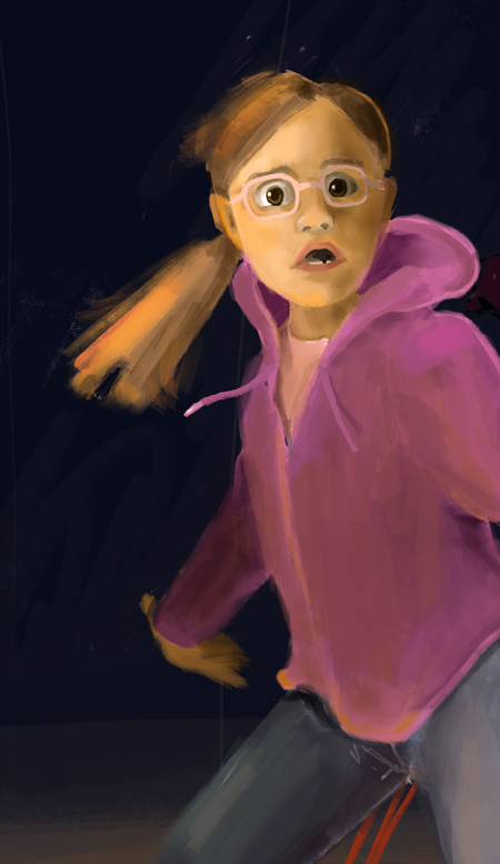
The Artist’s Complete Guide to Facial Expression by Gary Faigin. If you’re interested in narrative art, you MUST buy this book. If you’re interested in portraiture, you MUST buy this book. The beginning chapters break down each feature in great detail, with finished drawings that indicate how each is affected by age and sex. Later chapters break down how each feature is affected by the six basic emotions — sadness, anger, joy, fear, disgust, and surprise — and the nuances in between (the differences between horror and terror; between the [surprisingly similar] grief and laughter). In addition to the very finished portraiture examples, the author also includes an encyclopedia of emotions represented in more of a cartoon style, to really synthesize what each feature is doing in each expression. Ever been completely mystified by how the Pixar folks achieve those micro-expressions? It’s all in the facial muscles. This book will give you the key.
I’m currently leaning on this book heavily as I attempt to draw a picture of a girl jumping up after being frightened by a bear while camping:
Coming for your job, Mr. Lasseter!
Lighting
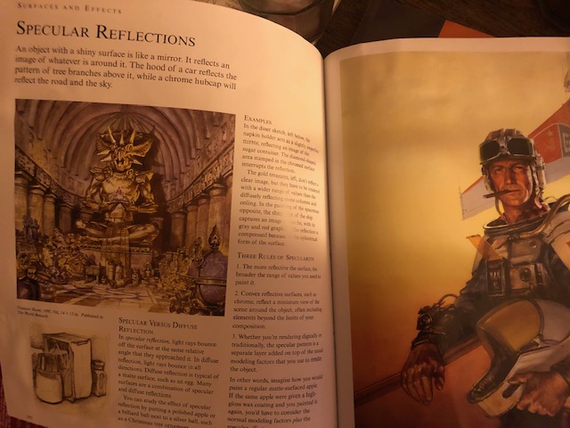
Color and Light by James Gurney. Once again, I feel like I’m choosing all of the books that everyone seems to know already, but there’s a reason a classic is a classic. Whether or not you appreciate Mr. Gurney’s style, he knows his stuff when it comes to lighting a scene. This book is geared toward painters, but the principles are applicable for anyone. It’s not a read-through book — more of an encyclopedia — but mine is already well-worn and I’ve barely begun in my “art journey.”
Clearly, Mr. Gurney could’ve lighted this better.
Each principle is allotted one page, with a smallish amount of text, and a few examples from the author’s own work. The writing is very accessible, and it’s brief and clear enough for you to completely absorb it when you’re in the middle of a project and looking for the solution to an art puzzle. While much of it is beyond what I’ll probably ever need, it’s answered all the questions I’ve had so far, and the rest is there when or if I’m ready. Drawing an underwater scene and want to understand how the light should be distorted? Don’t know where to begin with a limited palette? Gurney’s your man.
Alright, I’m going to be lame and stop here — breaking out my other suggestions to a Part Three. Apparently, I’m a prattler, and I’m also tired — after all, I’m now fift— now a little older than I was last week.
Last weekend, I had a birthday. I turned fif–. Excuse me. I turned fift-.
Still working on that. Suffice it to say, it was a big one.
When I started this blog, I was just a tender, nubile lass of 48. My goals — apart from the bathtub full of money — were to motivate myself to keep up with an art and writing practice, and to have a record of my progress. I’d imagined I could be a resource for people wanting to learn to paint: I could pass on what I learned in my studies, and any readers I had could learn side-by-side with me.
I’ve since learned that people prefer to learn from folks who know what they’re doing. Go figure.
So in this (two-part) post, I’m going to turn it over to the experts. All of the resources that have brought me “aha” moments. But first, a bit of history.
I was not a kid who drew. That was Richie Lamb (SO cute). I was the kid who loved to read, and who wrote short stories, and who wanted to be a veterinarian. In college, I was an art history major, but only because I liked pretty things and had no idea what I wanted to do with my life (I’d discovered that being a vet was the world’s saddest job). I took a drawing class there, as well as a few other drawing and painting classes throughout my adulthood, and then started weekly painting classes at The Art Academy at the culmination of this blog.
You’ve probably taken similar drawing classes. The teacher puts apples on the tables, and everyone does their best to make their apple look better than the person’s sitting next to them. Every few moments someone sticks their pencil out in front of them to measure the exact angle of their stem. The next week it’s bottles. Bottles are harder, and people studiously try to capture the itty bitty reflections and the lettering on the label. You think yours looks pretty good, compared to the person sitting next to you.
At The Art Academy, it was the same. “There’s no reason to know how to draw in order to paint,” our teacher would say. “Just use your brush as an angle machine.” And so we drew with grids, breaking our canvas into squares and measuring every angle with our brush handles until it was a decent — if robotic — outline of the picture propped up next to us.
Doing this weekly, I got better at it. I no longer relied on my “angle machine” for every line — I could judge the direction and steepness of most of them closely enough. If someone had asked me at that point if I could draw, I would’ve said “Sure, if I’m looking at something.”
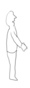
But if I tried to draw WITHOUT looking at something, it would look like this:
(That’s a person, by the way.)
WTF? What was I missing? How were some people able to create entire scenes of things that never happened? As much as my teachers tried to convince me that “anyone can learn to draw,” I really believed that only the Richie Lambs of the world (sigh!) would ever do it well. There was something I simply wasn’t born with.
When people who can “see” as an artist try to teach someone who can’t, it either comes off as overly tangible (a cat is simply two circles with five rectangles sticking out of them) or as so much mumbo jumbo (drawing is “seeing,” “believing,” “a lie”). And while I now know that much of that mumbo jumbo is actually true, it does little to help people understand what missing ingredient separates those who can from those who can’t.
I want to back up for a second, because I don’t want to come off as pretending to be some great artist. Clearly I am NOT. But the difference between where I started at 48:
… and where I am at fif– ahem — where I am now:
…is the difference of starting to SEE — of being able to put lines on paper and feel my way around a shape in 3d space, knowing as I do so which way I need to move, and more accurately discerning when I’ve judged incorrectly.
Clearly I’ve become fluent in mumbo-jumbo-ese. So I’ll just give you the regimen (part one).
Drawabox.com. To use a cliche, this is the equivalent of playing scales. It’s the most basic of basics — retraining your muscle memory to draw with your arm rather than your wrist, creating hundreds of boxes and checking how close you got to meeting at their vanishing points. Then cylinders. Then, if you want to go further, organic shapes like leaves. For some people, this would be unimaginable drudgery, but I’ve always thrived on this sort of busywork, especially when I feel like I’m laying a foundation. Every time I needed a break from work, or I was bored and waiting for something, out came the sketchbook. It took a couple of months of drawing boxes, but I was eventually able to visualize them in different positions, and fairly accurately draw them to their vanishing points. (I wasn’t quite sure yet WHY this was helpful, but I went with it.) And it became second nature to use my arm rather than my wrist for longer strokes, making my line quality much more confident and sure. (Bonus: Their content is FREE!)
Proko.com. After I’d gone as far as I wanted with Drawabox, I needed a new daily regimen. A friend of mine suggested Proko for figure drawing, and I jumped right in with the paid version (they have loads of free stuff as well; I can’t vouch for that). After months of drawing nothing but boxes and cylinders, it was a relief to draw humans, but… I’ll be honest: I sucked. I’d hoped to be further after my months of drudgery. It was true — definitely, unquestionably true — that my line quality was better. But comparing my ability to capture gesture from the model poses with that of the uber-talented instructor was humbling and disheartening. Much of the time, my “bean” (a form made from two oblongs that we used to synthesize the shape of a pose) was facing the wrong direction; on no occasion was I within the realm of accurate. Had I learned nothing? Furthermore, in his video critiques, the instructor kept criticizing students for “drawing the contours,” which seemed to me the art-equivalent of the thoroughly unhelpful “don’t be afraid of the ball.” If not the contours, what was I supposed to be drawing?
One of the issues I was finding was that Proko models are bumpy. Covering their arms, legs, and torsos were muscles I didn’t know existed (sorry, dear husband!) and that seemed to be in different places in every pose. While we could ignore these while drawing “the bean,” eventually the instructor was adding many of them to his drawing as “landmarks.” I couldn’t understand this. The church on the corner is a landmark, because it’s ALWAYS ON THE CORNER. It doesn’t sometimes appear two blocks up and shaped like a bank.
I realized that I didn’t know enough about the human body to be able to draw it intuitively. I was drawing the bumps, but I didn’t know what the bumps were, so I was once again simply relying on my “angle machine.” I’d always heard that you shouldn’t study anatomy until you’re comfortable with gesture, or your figures will be stiff, and that might be good advice. But I didn’t think I’d be capable of drawing gesture without better understanding anatomy. So I doubled down and invested in the 3-part Proko anatomy class. (Full disclosure: I attempted to memorize the dictionary in high school because I thought it would help me with my SATs. That’s just how I roll. This process may be more than many people need.)
This is where I started to understand what I’d gained by starting with Drawabox. When faced with an entire, contorted, bumpy body, I’d been overwhelmed and stymied. But when faced with drawing, say, the form of a ribcage, and then eventually visualizing where that ribcage would be placed, and how it would be rotated in certain poses, it was much more manageable to understand how it lived in 3-d space. My drawings — compared with the instructor’s drawing of the same — began to be more accurate. What’s more, I learned and began to understand the bones and muscles, so I was able to see the “landmarks” — tiny depressions or curves that were sometimes mere shadows on the surface but that helped to define form and proportion, and place other features.
Have you ever read Roald Dahl’s “The Wonderful Story of Henry Sugar”? (You MUST!) In this book within a book, Henry Sugar has just read the account of a man who can see without his eyes, Imhrat Kahn. Figuring he could use this skill to cheat at gambling, Henry undertakes a years-long meditation practice to attempt to harness the ability. Finally:
Sometime within the tenth month, Henry became aware, just as Imhrat Kahn had done before him, of a slight ability to see an object with his eyes closed. When he closed his eyes and stared at something hard, with fierce concentration, he could actually see the object he was looking at.
“It’s coming to me!” he cried. “I’m doing it! It’s fantastic!”
I had my Henry Sugar moment several months into my drawing regime. Until that moment, I’d only drawn what my regimen had told me to draw: boxes or cylinders, ribcages or pelvises, or –badly — the swoop of the human form. I’d never attempted to draw something from imagination, because, well, that just wasn’t something I did. But now I attempted it. I drew a giraffe.
I’m not going to claim it was a great giraffe — I’m not familiar enough with a giraffe’s body to visualize it well enough for accuracy. But as I moved my pencil on the page, I wasn’t just drawing the outline of a giraffe. My pencil was understanding how the giraffe’s body lived in 3-d space, with foreshortening and form. I suddenly understood what had been meant all along by “don’t draw the contours,” and “drawing is seeing.” I was starting to see. And it was fantastic!
Obviously, there’s more to drawing (and digital painting, which I like, and do) than this, and in part two of this post I’ll explore some of the other resources that I’ve found invaluable while learning about light, color, composition, facial expression, and digital painting.
As I expected, my last post must’ve been something really special, because it gave me FOUR TIMES the number of views I usually get.
That’s right. FOUR VIEWS! Thanks for coming back, Mom!
Without a doubt, the most difficult part of attempting to get some artistic recognition is the feeling of yelling into the abyss. New post I stayed up all night to write? Crickets. Big batch of manuscripts I kissed on my computer before sending off? Hellooo–ohhh–ohhh-ohhh…. At this point, I might even appreciate some hate mail, just to know I’m not alone out there.
(Actually, please don’t do that. I’m not ready.)
I realize that part of my problem is my aversion to social media. Oh sure, I go on Facebook as a middle-of-the-night lurker in my college alumni group and some other special interest groups. But I’m an introvert with a small group of real-life friends, and there comes a point where it’s just not possible to expand my “friends” group. It’s simply too embarrassing. I’ll happily accept the invitation of someone I’ve met who reaches out to me, but reach out to someone else, when I have, like, 30 “friends”? Umm, c-c-can I be your friend, p-p-please?
No.
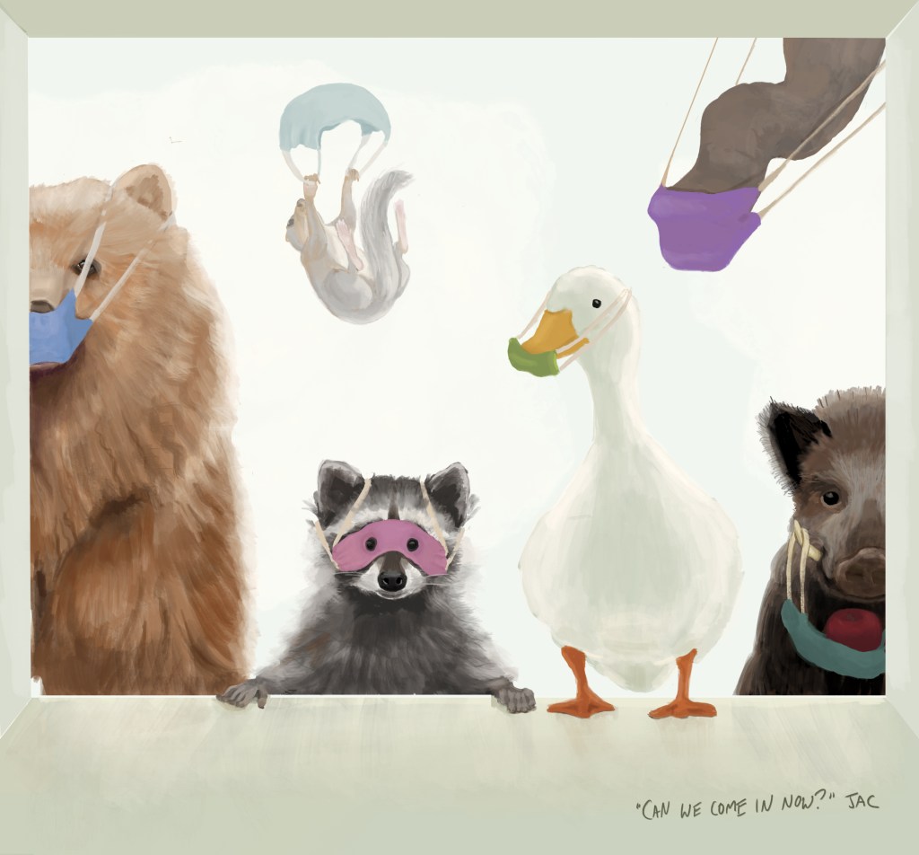
So how can someone as uncool as I am get my work out there, without seeming mercenary? Well, here’s my latest attempt: shamelessly topical subject matter, which I’ll now enter into all the billions of contests that exist on social media. I mean, cute animals in masks?
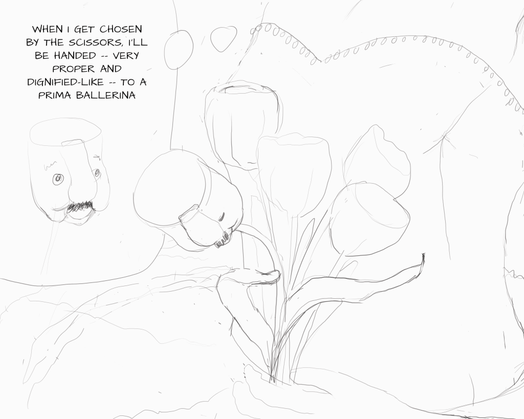
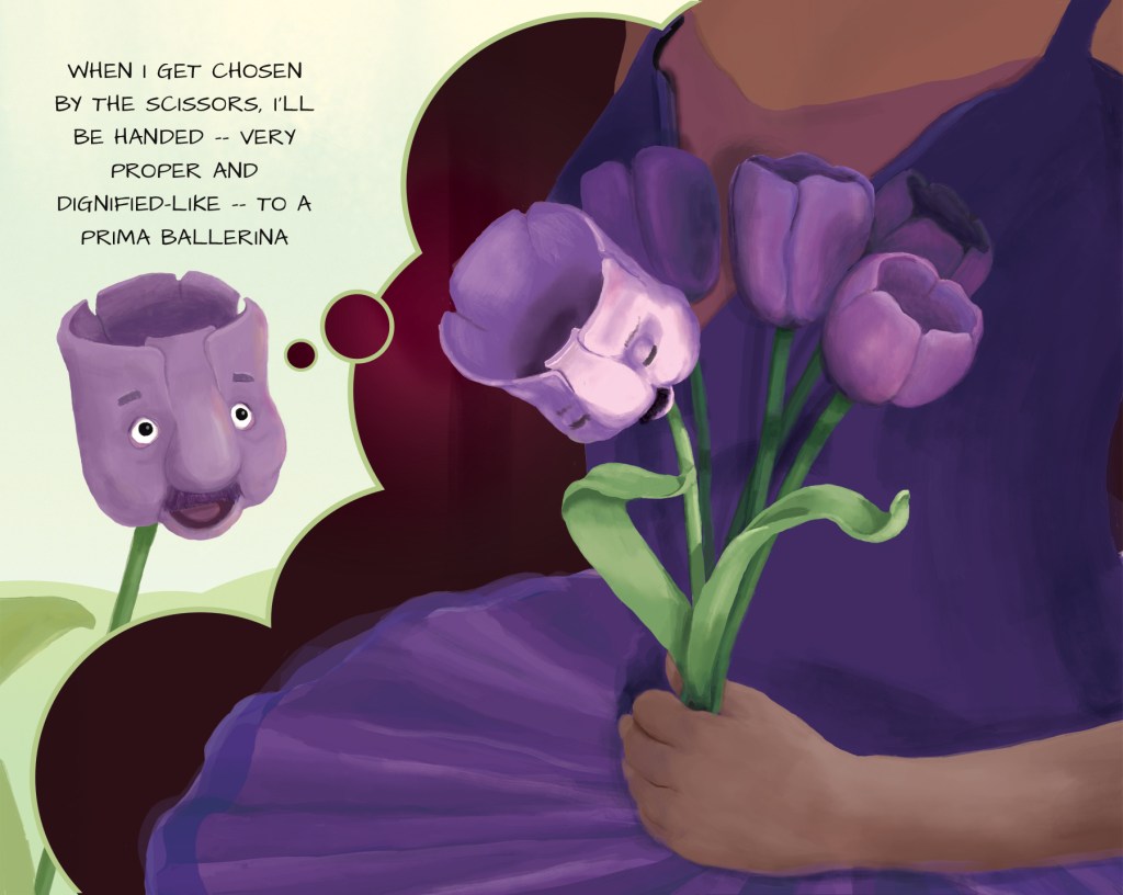
Whoo-hooie — two down! I have to say, I’m pretty darn tickled with the way this one came out, though that could just be the afterglow of a particularly difficult birth, tricking me into thinking my ugly baby is beautiful. And good God, this was difficult. A bowing flower! A spotlight! A HUMAN HAND!
Another year from now, and I might look back on my crowing with absolute horror — I hope I do! — but when I look back at my earlier posts to where I started, I do feel I’ve earned my pat on the back. And accomplishing this has already given me more confidence in my illustration abilities — this week I need to design a logo for a client who asked for “a tree of life with birds in the branches, surrounded by dogs” (someone needs to explain to my client what a logo is, I think), and it feels within my grasp, and fun! That’s HUGE!
One thing that was enormously helpful in creating these two illustrations has been the thumbnailing process. Since I was unable to take my regular painting class at The Art Academy, I’m instead taking their “Manga, Superheroes, and Comics” online class (the class is supposedly for both kids and adults, but when I signed up they called me to ask the age of the child. Umm…49.). Although the class isn’t exactly what I’m looking for to accomplish my picture-booking goals, it has given me some good critiques and a couple of valuable tips — first and foremost the importance of forcing myself to do multiple thumbnails. I’m a web/graphic designer, and in twenty-five years of creating mockups, I’ve never once sketched out a little black-and-white image of my page ahead of time — I’d just pick a couple of directions and flesh them out to pixel-perfection. How much time I could save — and how much better my work could be — if I first took the time to explore multiple possibilities before committing.
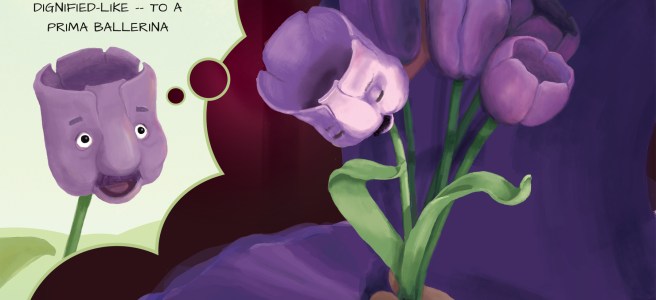
To give you an idea of how this particular composition came about, let’s look at my first idea. Until I put it down on “paper,” this was what I had in my head:
Thank goodness I didn’t stop there! Although the scene is supposed to be about the sheer happiness of the tulip achieving his dreams, the angle of his face doesn’t allow any emotion — the viewer is gazing into the abyss of his head.
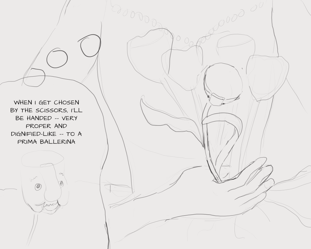
I was supposed to do five thumbnails, so I soldiered on: Here I could at least see his face, but we’re so zoomed in on the body that I worried it wouldn’t read as a ballerina.
So onto the next:
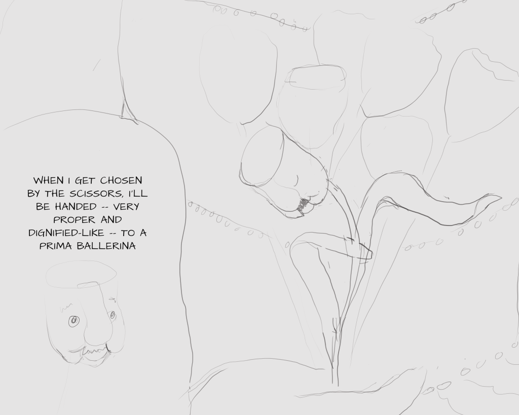
Here I pulled back a little so we’re both seeing the face and the ballerina’s dress, but in trying to make the tulip appear to be bowing, I’ve put him in a terribly contorted position.
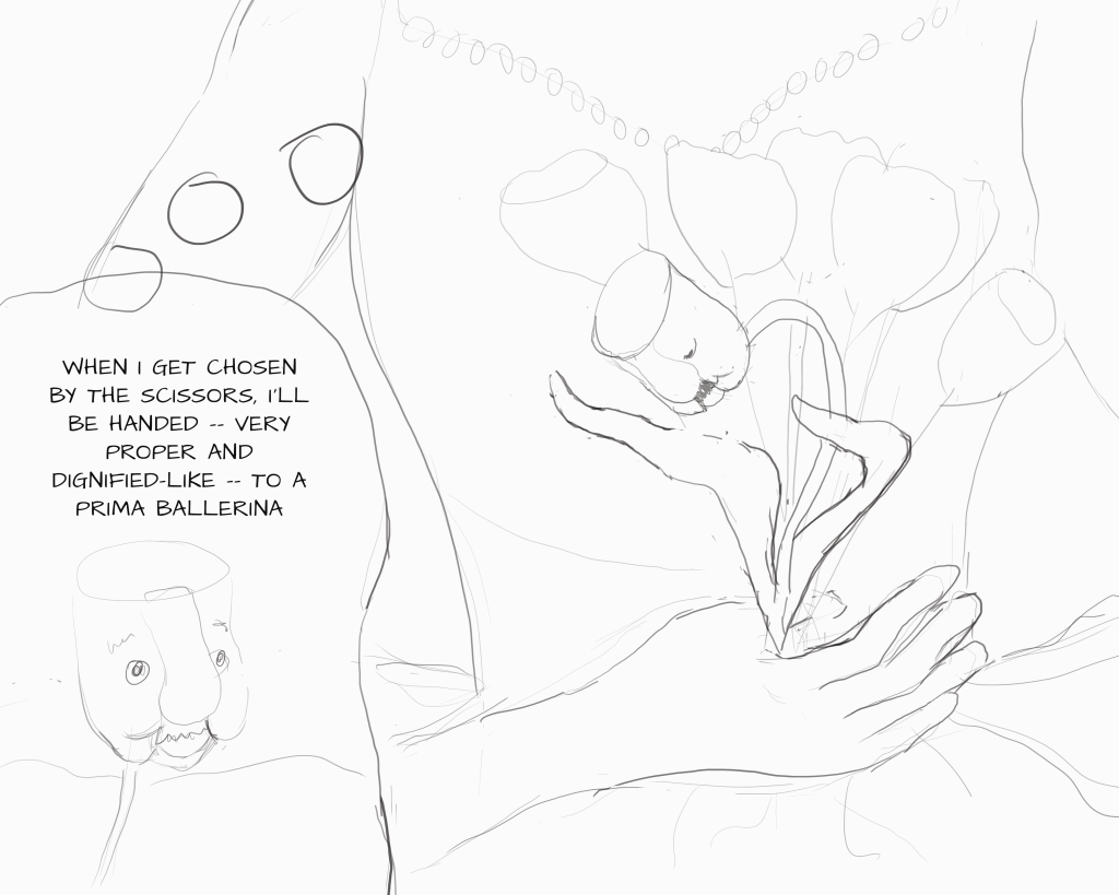
So, finally, I did this one:
Much better! I could’ve continued — the guideline was 5+ — but I was pretty happy with this composition and figured I’d be tweaking as I went. And indeed, my final illustration did veer from my thumbnail, in large part because my class critique revealed that people didn’t interpret the larger image as the imagination of the tulip.
In this case, each of my thumbnails was correcting the flaws in the previous one, but that certainly won’t always be the case — for my previous illustration in this series, my thumbnails were simply five different placements of the main characters.
I do hope I can remind myself in future to create a variety of views for each image, even if I’m already “certain” I know how it will look, and even if it feels like a boring and unnecessary step. My work will certainly be better for it.