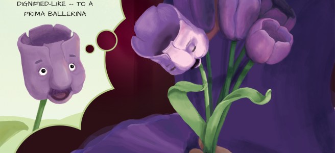
Whoo-hooie — two down! I have to say, I’m pretty darn tickled with the way this one came out, though that could just be the afterglow of a particularly difficult birth, tricking me into thinking my ugly baby is beautiful. And good God, this was difficult. A bowing flower! A spotlight! A HUMAN HAND!
Another year from now, and I might look back on my crowing with absolute horror — I hope I do! — but when I look back at my earlier posts to where I started, I do feel I’ve earned my pat on the back. And accomplishing this has already given me more confidence in my illustration abilities — this week I need to design a logo for a client who asked for “a tree of life with birds in the branches, surrounded by dogs” (someone needs to explain to my client what a logo is, I think), and it feels within my grasp, and fun! That’s HUGE!
One thing that was enormously helpful in creating these two illustrations has been the thumbnailing process. Since I was unable to take my regular painting class at The Art Academy, I’m instead taking their “Manga, Superheroes, and Comics” online class (the class is supposedly for both kids and adults, but when I signed up they called me to ask the age of the child. Umm…49.). Although the class isn’t exactly what I’m looking for to accomplish my picture-booking goals, it has given me some good critiques and a couple of valuable tips — first and foremost the importance of forcing myself to do multiple thumbnails. I’m a web/graphic designer, and in twenty-five years of creating mockups, I’ve never once sketched out a little black-and-white image of my page ahead of time — I’d just pick a couple of directions and flesh them out to pixel-perfection. How much time I could save — and how much better my work could be — if I first took the time to explore multiple possibilities before committing.
To give you an idea of how this particular composition came about, let’s look at my first idea. Until I put it down on “paper,” this was what I had in my head:
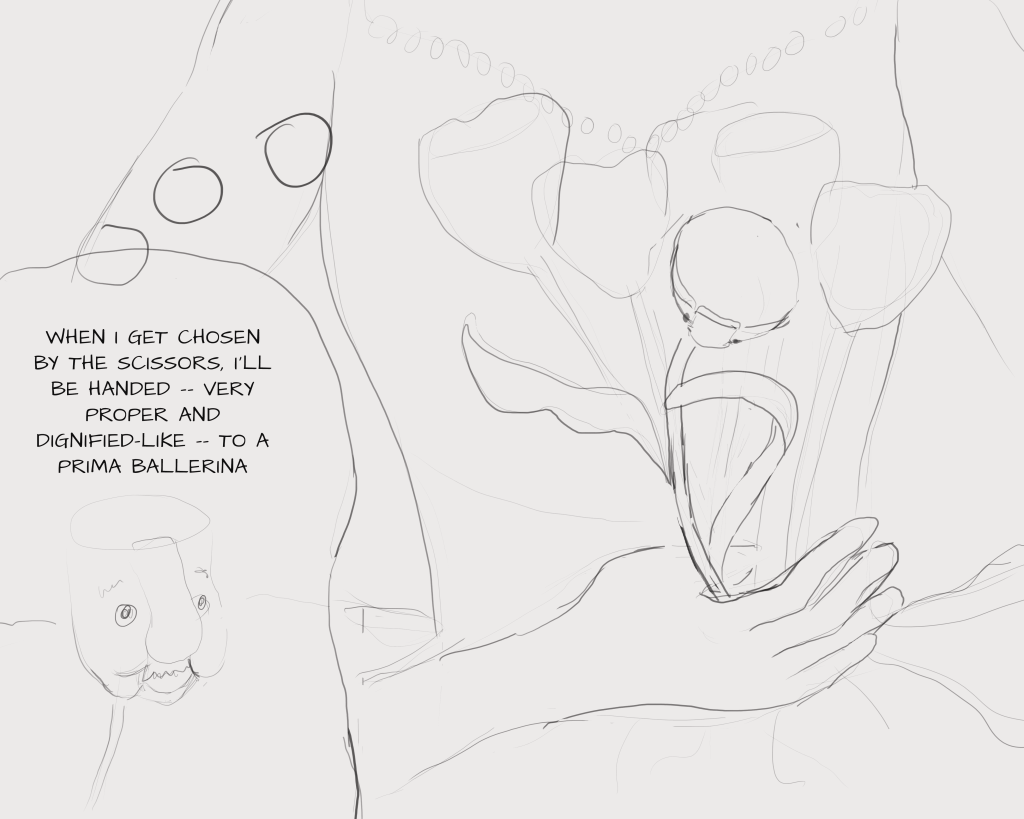
Thank goodness I didn’t stop there! Although the scene is supposed to be about the sheer happiness of the tulip achieving his dreams, the angle of his face doesn’t allow any emotion — the viewer is gazing into the abyss of his head.
I was supposed to do five thumbnails, so I soldiered on:
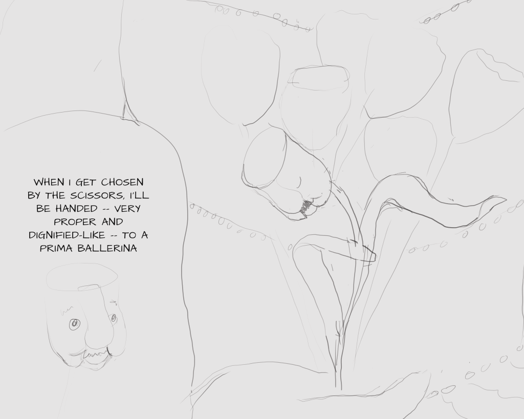
Here I could at least see his face, but we’re so zoomed in on the body that I worried it wouldn’t read as a ballerina.
So onto the next:
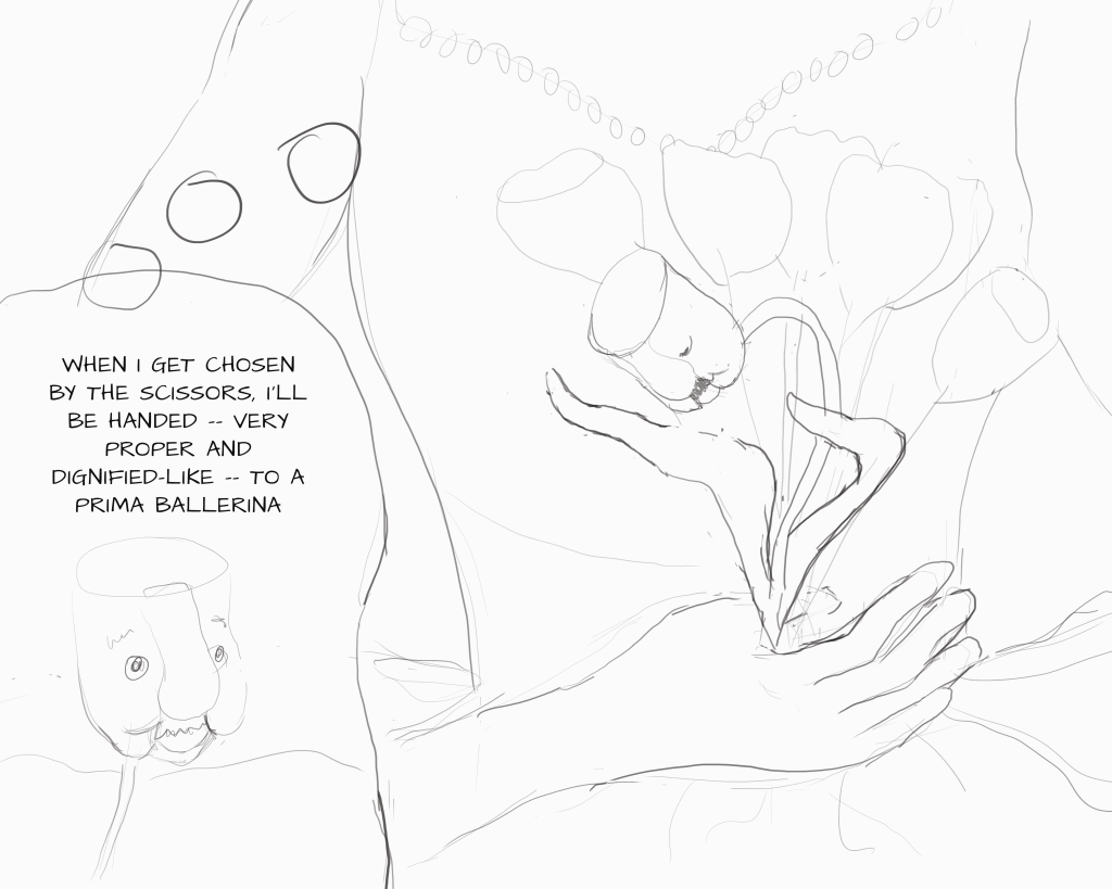
So, finally, I did this one:
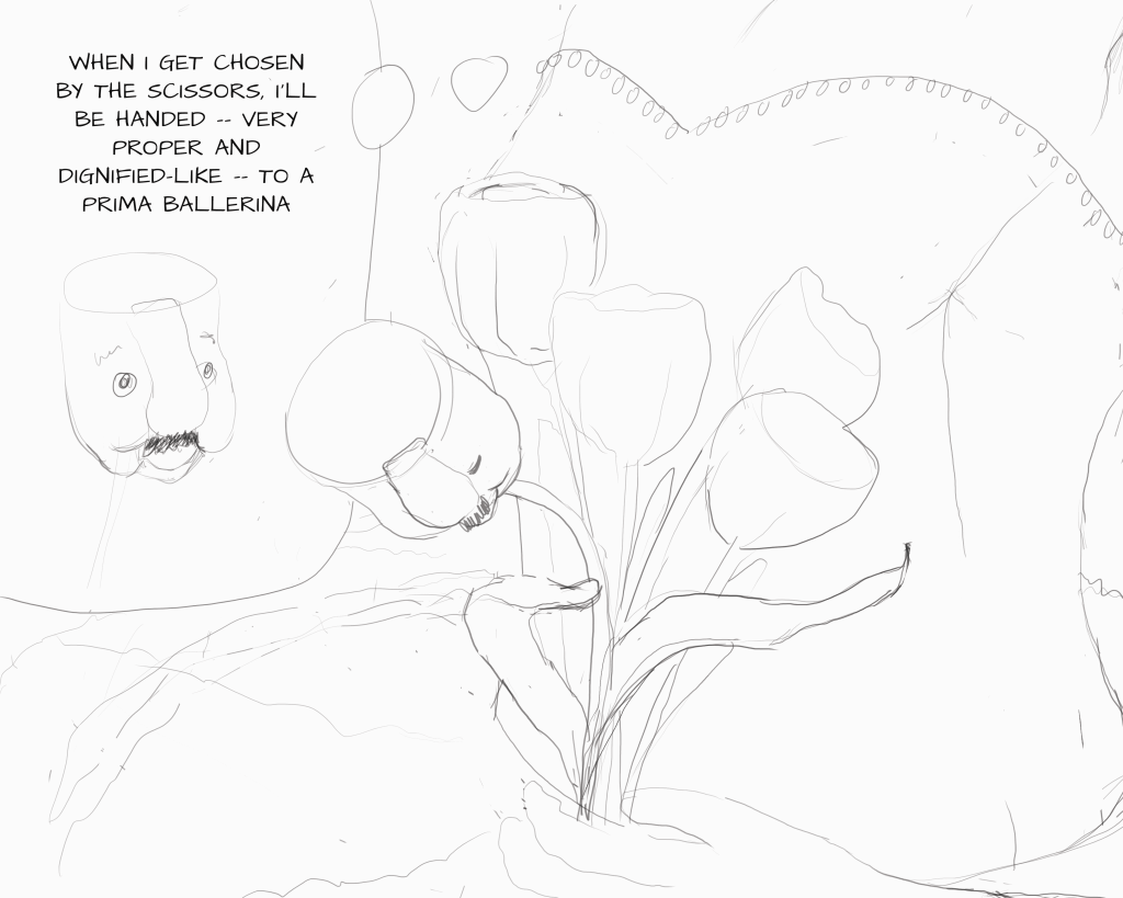
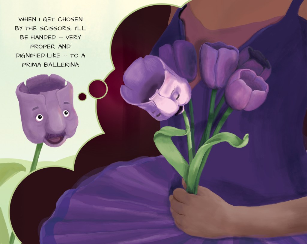
In this case, each of my thumbnails was correcting the flaws in the previous one, but that certainly won’t always be the case — for my previous illustration in this series, my thumbnails were simply five different placements of the main characters.
I do hope I can remind myself in future to create a variety of views for each image, even if I’m already “certain” I know how it will look, and even if it feels like a boring and unnecessary step. My work will certainly be better for it.
